
Aconcagua: Mapping the Flow of Human Emotion Across Space and Time
Aconcagua: A Novel Spatiotemporal Emotion Change Analysis Framework
Aconcagua is a novel spatio-temporal emotion change analysis framework that maps and monitors public sentiment using geo-tagged Twitter data. It leverages emotion-weighted density estimation and ST-DCONTOUR clustering to identify regions of high positive or negative sentiment, transforming them into a temporal "change graph" for systematic tracking.
TL;DR
Aconcagua is a pioneering framework that treats the collective emotional state of a city or region as a living, breathing spatial entity. By analyzing Twitter data, it identifies "emotion clusters"—geographic hotspots of happiness or distress—and tracks how they move, grow, shrink, or vanish over time using a graph-based temporal monitoring system.
Background Positioning
In the realm of Sentiment Analysis, we have moved beyond simply asking what people feel to asking where and for how long. Aconcagua sits at the intersection of Geographic Information Systems (GIS) and Social Sensing, moving the field from static sentiment heatmaps toward dynamic Spatio-temporal Storytelling.
Problem & Motivation: Why Static Maps Aren't Enough
While tools like "We Feel" have mapped global emotions before, they typically offer a "weather map" snapshot that lacks historical continuity. The core challenge in spatial emotion analysis is Change Understanding. If a positive sentiment region in Manhattan shrinks from Monday to Tuesday, is it because the emotion faded, or did it migrate to Brooklyn? Previous image-based change detection (like those used in satellite remote sensing) cannot handle the abstract, shifting boundaries of human sentiment clusters.
Methodology: From Tweets to Change Graphs
The Aconcagua pipeline is built on a rigorous four-stage process:
1. Emotion Quantization
Using the VADER sentiment tool, each tweet is assigned an emotional score between -1 (negative) and +1 (positive).
2. Density Estimation & Clustering
The framework uses Emotion-Weighted Density Estimation. Instead of just counting tweets, it creates a continuous mathematical surface where the "height" represents the intensity of emotion. The ST-DCONTOUR algorithm then draws "contours" around these peaks to create polygons representing distinct emotional regions.
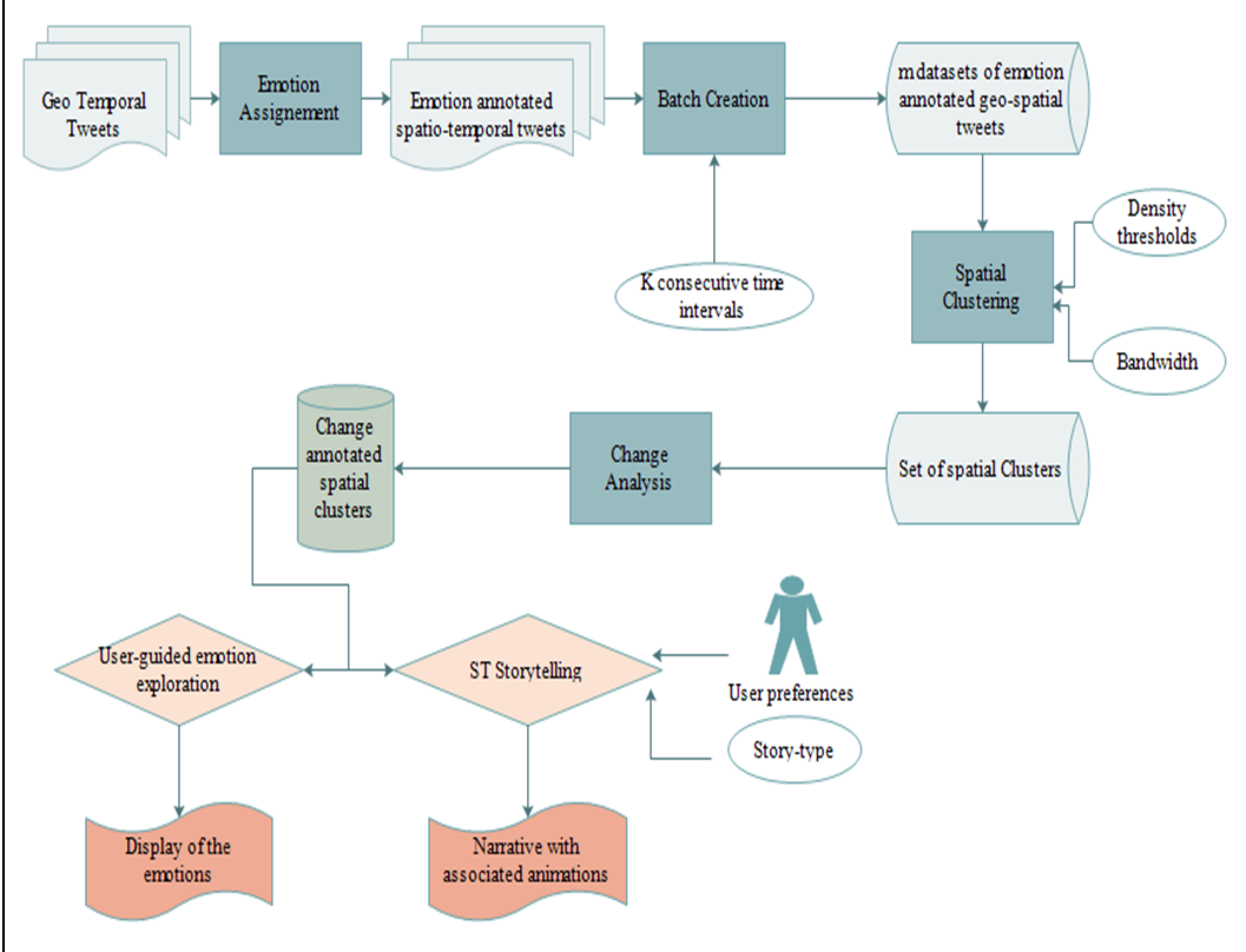 Figure 1: The Aconcagua System Architecture, showing the flow from raw Tweets to the final Change Story.
3. The Change Monitoring Engine (The "Aconcagua" Core)
This is where the magic happens. The framework defines change using spatial predicates:
- Agreement: Measures the spatial overlap between cluster in batch and cluster in batch .
- S-Continuing: If overlap , the cluster is considered the same entity persisting in time.
- Growing/Shrinking: Defined by containment ratios and area changes.
These relationships are managed via PostGIS SQL queries, allowing the system to be highly extensible—new definitions of "change" can be added simply by writing a new SQL predicate.
Experiments & Results: The New York Case Study
The authors tested Aconcagua on data from New York State. A key visualization reveals the emotional structure of the New York City/Long Island area.
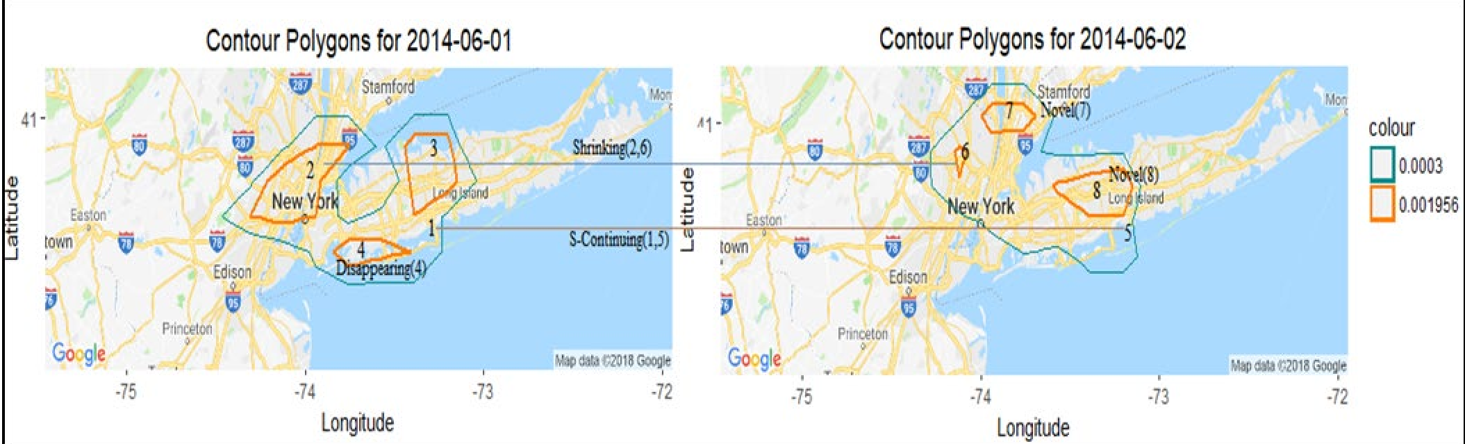 Figure 2: Tracking positive emotion shifts in NYC/Long Island. Note how the broad cluster (green) persists while internal "intense" zones (orange) appear and disappear.
By analyzing June 1st against June 2nd, the system automatically generated a narrative: "Cluster 1 (medium-positive) continues... Cluster 2 (intense-positive) shrinks... and two novel clusters emerge." This transforms raw GPS-tagged text into a coherent Change Story.
Critical Analysis & Conclusion
Takeaway
Aconcagua successfully bridges the gap between low-level data points and high-level human semantic understanding. Its use of a Change Graph allows for complex queries like "Where are the emotion flip-floppers?"—regions that oscillate between extreme happiness and sadness.
Limitations
- Data Bias: The reliance on Twitter (now X) data inherently biases the results toward specific demographics.
- Lexical Limits: VADER is a rule-based tool; modern LLMs (like GPT-4) would likely provide much higher sentiment accuracy today.
- Spatial Granularity: The "bounding box" approach to regions of interest may oversimplify complex urban topographies.
Future Outlook
The authors envision this framework as a tool for the United Nations’ World Happiness Report. By adding a temporal dimension, policy-makers could see not just which countries are happy, but which regions are experiencing "emotional decay" or "resilience" in the face of local events.