
TA4GIP: Bridging the Gap Between Tweets and Policy-Making Through Visual Analytics
Analyzing and Visualizing Government-Citizen Interactions on Twier to Support Public Policy-making
The paper introduces TA4GIP (Twitter Analytics for Government Intelligence and Public Participation), a visual analytics tool designed to help policy-makers monitor and interpret government-citizen interactions on Twitter. By integrating sentiment analysis and diverse visualization techniques, it provides a comprehensive overview of public engagement across various government sectors.
TL;DR
Social media has turned public policy-making into a two-way street, but governments are often "data rich but insight poor." This paper introduces TA4GIP, a software tool that uses sentiment analysis and advanced visualizations to help non-technical officials understand how citizens react to announcements. By analyzing 30,000+ tweets from the Mexican government, the research proves that visual tools can pinpoint exactly which topics spark anger, trust, or engagement.
Context & Motivation: Beyond One-Way Broadcasting
Most government agencies use Twitter as a digital megaphone—blasting out updates without truly measuring the "heartbeat" of the citizenry. The challenge isn't a lack of data; it's the interpretation gap. Policy-makers aren't data scientists; they cannot manually read thousands of comments to find out why a health initiative is causing "fear" or why an education post went viral.
The authors argue that for "Government 2.0" to succeed, we need intuitive, visual interfaces that translate complex text mining into "at-a-glance" intelligence.
Methodology: The TA4GIP Architecture
TA4GIP operates on a client-server model. The server handles the heavy lifting—connecting to Twitter APIs, cleaning data (removing stop-words), and performing sentiment analysis using the NRC Affect Intensity Lexicon. The client side allows users to filter by timeframes and sectors (e.g., Health, Labor, Education).
The Visual Toolkit
The core innovation lies in the diversity of the visualizations used to dissect engagement:
- Extended Hasse Diagrams: Determine the "quality" of engagement by showing combinations of likes, retweets, and comments.
- Radar & Bubble Charts: Map the emotional spectrum (Joy, Trust, Fear, etc.) based on Plutchik's psychological model.
- Sankey Diagrams: Visualize the flow—does a video lead to more comments than a text-only link?
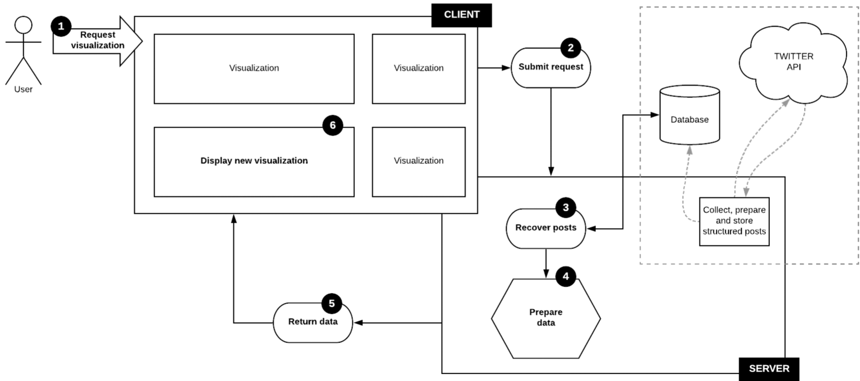 Figure 1: The TA4GIP system architecture showing the flow from raw Twitter data to client-side visualization.
Insights from the Mexican Case Study
The researchers tested TA4GIP on five Mexican government secretariats. The experiment yielded several high-value "Aha!" moments:
- Activity vs. Engagement: Simply posting more doesn't always work, but in the Mexican case, sectors like Environment and Labor showed a strong correlation between post frequency and citizen response.
- The "Trust" Baseline: Across all sectors, "trust" was the most common emotion. However, the Health sector saw significant spikes in "fear" during specific announcements in October, providing a clear signal for officials to adjust their messaging.
- Media Strategy: The Education Secretary successfully generated high volumes of comments (deep engagement) by primarily sharing links, whereas other sectors relied on images to get "likes" (shallow engagement).
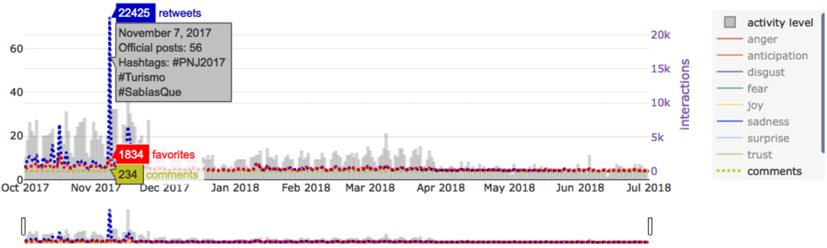 Figure 2: Radar Charts showing the emotional distribution across different government sectors. Note the prominence of Trust and Anticipation.
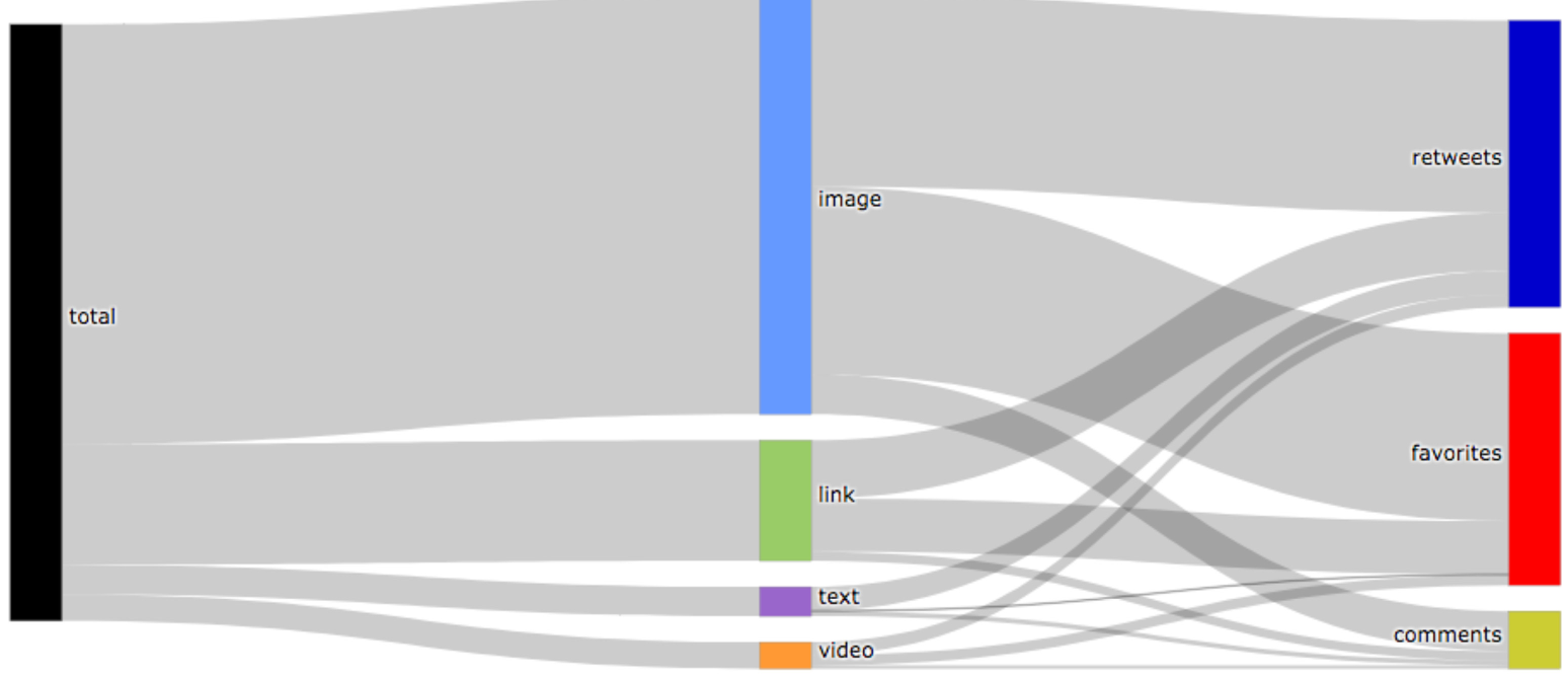 Figure 3: Sankey Diagram mapping the relationship between the type of resource shared (Link, Image, Video) and the resulting citizen interaction (Retweet, Favorite, Comment).
Critical Analysis & Conclusion
Takeaway
TA4GIP proves that visual analytics can democratize data science for public officials. By turning a "sea of tweets" into a dashboard of "emotional peaks" and "resource flows," governments can pivot from reactive damage control to proactive policy refinement.
Limitations & Future Work
The tool currently uses a static lexicon for sentiment, which can struggle with sarcasm, local slang, or the nuance of political discourse (e.g., is "corruption" a sentiment or a topic?). Furthermore, the current prototype does not filter out bots/trolls, which can heavily skew public opinion metrics.
The next frontier for this research is "Dynamic Visualization"—moving from static screenshots to real-time interactive dashboards that notify policy-makers the moment a policy announcement begins to trigger "anger" vs. "joy" in the digital public square.