
The Illusion of Clarity: Why Adding Diagrams Often Fails to Solve the Bayesian Bias
Assessing the Effect of Visualizations on Bayesian Reasoning through Crowdsourcing
This paper investigates the effectiveness of various visualization techniques, including area-proportional Euler diagrams and glyph grids, on Bayesian reasoning tasks. Through a large-scale crowdsourcing study (N=168, then N=480), the authors evaluate whether visual representations can mitigate the "base rate fallacy" in laypeople.
TL;DR
Even when we provide clear diagrams, people struggle immensely with probabilistic reasoning. A major study involving crowdsourced participants reveals that standard visualizations (Euler diagrams and glyphs) barely improve accuracy when paired with traditional text. The breakthrough? Removing numerical values from the text entirely forces the brain to "estimate" visually, which actually leads to more accurate (though not perfect) judgments than trying to calculate with numbers.
The "Base Rate" Trap
Imagine a medical test that is 80% accurate for a disease that affects only 1% of the population. If you test positive, what are the chances you actually have it? Most doctors guess 70-80%; the actual answer is closer to 8%. This is the Base Rate Fallacy.
For decades, researchers thought "Natural Frequencies" (saying "10 out of 1000" instead of "1%") and diagrams were the silver bullet. This paper challenges that optimism by testing these theories on a diverse, "real-world" population via crowdsourcing.
Methodology: The Design Space of Uncertainty
The authors didn't just test one diagram; they mapped out six distinct visual strategies to see which logic resonated most with the human brain:
- V1 & V2 (Euler Diagrams): Using area-proportional circles to show how groups overlap.
- V3 (Frequency Grids): Using discrete dots to allow for "counting."
- V4, V5, V6 (Hybrids): Combining the boundaries of Euler diagrams with the countable units of frequency grids.
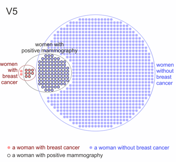 Figure 1: The study compared Euler diagrams (V1, V2), grids (V3), and hybrid approaches (V4-V6) for the mammography problem.
Experiment 1: A Reality Check
The results from the first experiment were a "failed replication." Unlike previous lab studies using university students, the crowdsourced participants found the visualizations largely unhelpful.
- Accuracy was dismal: Text-only groups had an exact answer rate of only 6%.
- Visualizations didn't save the day: There was no statistically significant difference in error rates between having a diagram and not having one.
- The Overconfidence Gap: Despite being wrong, most participants reported being "reasonably confident."
The Turning Point: "Less is More"
The authors hypothesized that when people see numbers in text, they try (and fail) to perform complex mental math, ignoring the diagram. In Experiment 2, they tried a radical approach: removing the numbers.
In the V4b (No Numbers) condition, the text merely described the scenario (e.g., "A small minority... a large proportion..."), and the participant had to look at the diagram to find the answer.
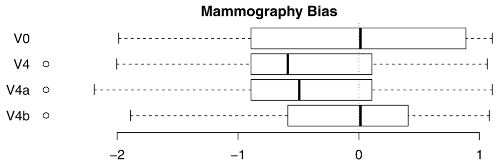 Figure 2: Bias in answers. Note how V4b (the number-free version) is centered much closer to zero bias compared to conditions where numbers were provided.
Key Results:
- Significant Improvement: V4b (Diagram + No Numbers) led to the lowest mean error reported in the study.
- Accuracy vs. Precision: While people rarely got the exact decimal point correct in V4b (since they were estimating), their answers were much closer to the truth than those who tried to calculate and fell into the base-rate trap.
Critical Insights & Takeaways
The study provides a sobering view of human intuition but offers a clear path forward for technical communication and UI design:
- The "Calculation Inhibition" Effect: Numbers in text act as a cognitive distraction. If you want a user to understand a relationship, don't give them a math problem; give them a visual estimation task.
- Crowdsourcing as a Stress Test: Academic findings derived from 20-year-old psych students often crumble when applied to the heterogeneous, distracted "crowd." This study highlights the need for Ecological Validity.
- Limitations: Even with the best visuals, people remained roughly "3 times off" the correct probability. We have yet to find a way to make Bayesian reasoning truly "effortless."
Future Outlook
This work suggests that for medical pamphlets or legal evidence, the best way to communicate risk might be to stop overwhelming people with percentages and start using holistic, number-light visualizations that leverage our brain's natural ability to compare areas and densities.
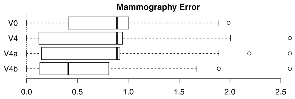 Figure 3: Error rates across experiment 2. V4b clearly outperforms the text (V0) and traditional text+visual (V4) formats.