
Visualizing the Invisible: How Interface Design Bridges the Privacy Gap in Social Networks
Audience visualization influences disclosures in online social networks
This paper investigates how "Audience Awareness" through interface design influences information disclosure in Online Social Networks (OSNs). It introduces radial visualization and numeric audience indicators to bridge the gap between users' privacy preferences and their actual sharing behaviors, identifying distinct benefits for both OSN users and non-users.
TL;DR
Online privacy is often a "black box" where users share data without truly grasping who can see it. Research from Indiana University and Purdue University demonstrates that by simply adding radial visualizations or numeric audience counts to disclosure screens, we can help users align their sharing behavior with their actual privacy preferences. While visualization helps "scaffold" the concept for new users, hard numbers are the most effective deterrents for seasoned social media veterans.
The Problem: The "Imagined" Audience
In the physical world, we adjust our speech based on our surroundings—you wouldn't reveal a secret in a packed stadium the same way you would in a private room. However, Online Social Networks (OSNs) lack these architectural cues. The audience is often invisible or merely imagined.
Current interfaces rely on abstract text labels like "Friends of Friends" or "Public." The authors argue that this lack of "Audience Awareness" causes a disruption between what people want to keep private and what they actually post—a core pain point in Human-Computer Interaction (HCI).
Methodology: Testing Visual Cues
The researchers conducted a large-scale study (n=1,322) at the Indiana State Fair, capturing a diverse demographic range. They tested three specific interface types:
- Text (Control): Standard OSN terminology (e.g., "Friends").
- Numbers: Explicit recipient counts (e.g., "500 million" for network-wide).
- Visualization: A radial graph representing expanding social circles.
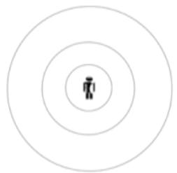 Figure 1: The radial graph visualization used to represent the gradient of social circles.
Participants were asked how likely they were to share sensitive data like phone numbers, addresses, and photos under these different conditions.
Key Insights: Newbies vs. Power Users
The study revealed a fascinating split in how different users process privacy information:
1. For Non-Users: Visualization is Key
For people unfamiliar with OSNs, the radial visualization was the most effective. It acts as "scaffolding," helping them translate real-world mental models (neighborhoods, social circles) into the digital realm.
- Result: Non-users shown the visualization shared significantly fewer sensitive items compared to those shown only text.
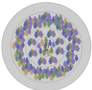 Figure 2: Mean number of items disclosed by non-users. Visualization led to more cautious behavior.
2. For OSN Users: Numbers "Shock" Behavior
Experienced users already have a mental model of social media, but it is often optimistic or inaccurate. For them, hard numbers (e.g., "1.6 billion people online") served as a reality check.
- Result: OSN users shared the least amount of information when presented with explicit numbers rather than abstract graphics.
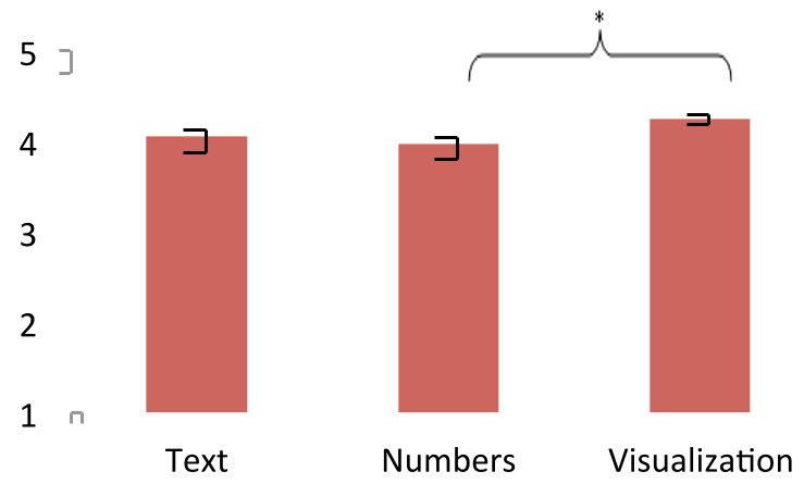 Figure 3: Mean number of items disclosed by OSN-users. Numeric indicators proved most persuasive.
Why This Matters: Design Implications
This research moves beyond just "identifying" a privacy problem; it provides a roadmap for designers to fix it:
- Onboarding: New users should be greeted with visual metaphors (circles/radials) to help them understand scale.
- Contextual Warnings: When an experienced user changes a setting to "Public," the interface should explicitly display the potential audience size (e.g., "Visible to 2B+ people") to trigger a more realistic risk assessment.
- Dynamic Scaffolding: Interfaces shouldn't be static; they should adapt to the user's level of experience and the sensitivity of the data being shared.
Critical Analysis & Conclusion
While this 2011 study laid the groundwork, its findings are more relevant today than ever as OSN "friends" lists have ballooned into thousands. However, a limitation is that the visualization used was "rudimentary." Modern interfaces could benefit from combining personalization (showing actual faces of people in a circle) with numeric scale.
Takeaway: Privacy isn't just a policy problem; it's a design problem. By making the audience visible through data visualization, we can empower users to protect themselves without requiring them to be security experts.