
Charting the Human Element: Why We Interact with Maps the Way We Do
Charting new ground: modeling user behavior in interactive geovisualization
The paper introduces a Map Interaction Framework designed to model user behaviors in interactive geovisualization. By employing Human-Computer Interaction (HCI) methodologies like think-aloud protocols and grounded theory, the authors successfully map low-level interface actions to high-level analysis goals, such as hypothesis formation and verification.
TL;DR
Geovisualization has moved far beyond static paper maps, yet the "science of the user" has lagged behind. This paper presents a foundational Map Interaction Framework that decodes the relationship between clicking a mouse and forming a scientific hypothesis. By observing how experts and novices navigate complex crime data and campus maps, the authors reveal that better tools don't necessarily make us faster—they make us more thorough.
Perspective: The Interactivity Gap
In the world of GIS (Geographic Information Systems), we often focus on data precision and rendering speed. However, as the authors point out, we know startlingly little about the Inductive Bias of the users themselves. Why do some users zoom in and out obsessively while others stare at a zoomed-out view?
The researchers argue that to build truly "user-centered" maps, we must understand the cognitive bridge between an Action (like Panning) and a Goal (like Identifying a Correlation).
Methodology: Grounded Theory in the Lab
The team conducted two distinct pilot studies using the "Think-Aloud" method, where participants narrated their inner logic while using Google Earth and ArcMap.
- Pilot 1 (The General User): Navigating a university campus. They found that high interactivity (using a mouse wheel vs. buttons) led to "deeper exploration"—users looked at the map at more levels of abstraction just because they could.
- Pilot 2 (The Expert vs. Novice): Analyzing crime datasets. This is where the real insights emerged. Experts used the map as a gateway to underlying data tables, while novices were "trapped" by visual representations, often jumping to conclusions based on surface patterns.

The Core Mechanism: The Interaction Model
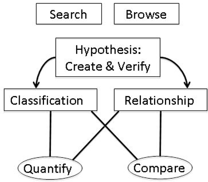
The authors propose a hierarchical model where every click serves a higher purpose. At the top sits Hypothesis Formation/Verification. Beneath that, users toggle between Classifying Data and Determining Relationships.
Behavioral Divergence
The study highlighted a fascinating "Expert Strategy" for searching:
- Novices: Zoom until labels are readable -> Pan manually -> Scan visually.
- Experts: Open Attribute Table -> Sort by Name -> Select Row -> "Zoom to Selected."
This demonstrates that experts view the map not just as a picture, but as a visual index for an underlying relational database.
Deep Insight: Is Efficiency the Enemy of Analysis?
One of the most provocative findings is that "greater control and interactivity appeared to lead to a deeper exploration." In typical SaaS design, we want to minimize "Time to Task Completion." In Geovisualization, the goal might be the opposite. If an interface makes it "too easy" to find a single point, the user might skip the critical step of exploring the surrounding context, leading to weaker analysis.
Critical Analysis & Future Outlook
Contribution: This work is a vital "bridge" paper, connecting the technical world of GIS with the psychological world of HCI. It provides a vocabulary (Table 2) for describing user behavior that is still used in UI/UX design for spatial apps today.
Limitations: Being a 2008 study, the "interaction styles" are limited to mouse and keyboard. In the modern era of touch-screens and AR/VR, the framework needs a significant update to account for multi-modal gestures.
Takeaway: If you are designing a data-heavy map, don't just optimize for speed. Optimize for Abstractions. Give users the tools to jump between the "What" (Attribute Tables) and the "Where" (Spatial Visualization) seamlessly, as that is the hallmark of expert-level reasoning.