
From "Hairballs" to Insights: Leveraging Chord Diagrams for Social Network Analysis in Process Mining
Reflections on the use of chord diagrams in social network visualization in process mining
This paper introduces the application of Chord Diagrams to visualize social networks within Business Process Management (BPM) and Process Mining. By mapping organizational resources to circular arcs and their interactions to connecting chords, the method provides a hierarchical abstraction for dense event log data, improving clarity compared to traditional node-link graphs.
TL;DR
Process Mining often struggles with "visual overload" when analyzing how people interact within a business process. This paper proposes moving away from traditional messy node-link graphs toward Chord Diagrams. This circular visualization approach offers a cleaner, interactive way to identify who is doing the heavy lifting, how work is handed over, and where "subcontracting" bottlenecks occur in dense organizational data.
The Visualization Crisis in BPM
In Business Process Management (BPM), we often look at "Social Networks" to see how teams collaborate. We use metrics like Handover of Work (who passes the baton?) and Subcontracting (who outsources a task and gets it back?).
The problem? Most tools use Sociograms (nodes and lines). When you have hundreds of employees and thousands of interactions, the result is a "hairball"—a dense tangle of lines where it’s impossible to tell which department is overloaded or where the primary flow of work resides.
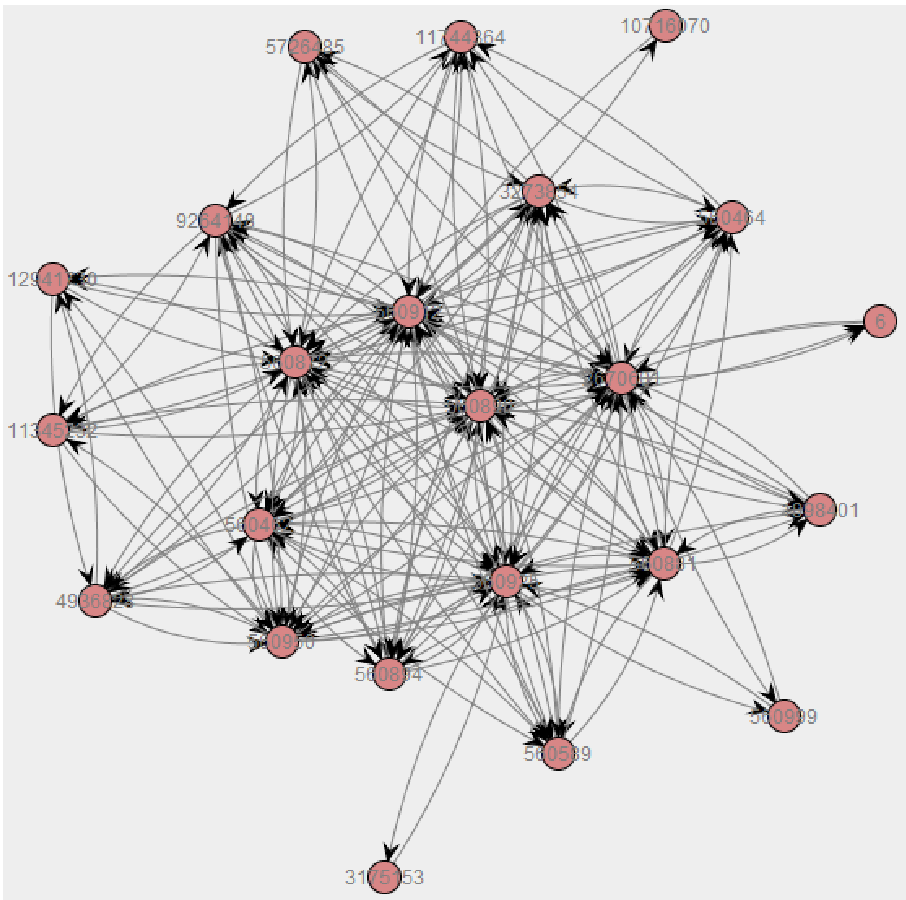 Figure: A standard social network model mined from a real log file, demonstrating the "hairball" effect.
The Chord Diagram Logic
The author suggests a shift in perspective. Instead of floating nodes, we place resources on the circumference of a circle:
- Arcs (The Boundary): Each segment represents a person or role. Its length indicates their total level of involvement.
- Chords (The Connections): The paths connecting two arcs represent the relationship.
- Asymmetry: If person A sends 100 emails to person B, but B only sends 5 back, the "chord" will be wider at A's end than B's end. This is a massive improvement over simple arrows.
Methodology: Interaction & Color
To make the data even more digestible, the paper emphasizes three qualitative features:
- Interactivity: Hovering over a specific resource highlights only their connections, instantly filtering out the noise of the rest of the organization.
- Color Coding: Chords inherit the color of the "dominant" partner (the one with the higher association contribution), making the direction of social power visible at a glance.
- Selective Labeling: Using tooltips (hints) to keep the interface clean while providing raw data on demand.
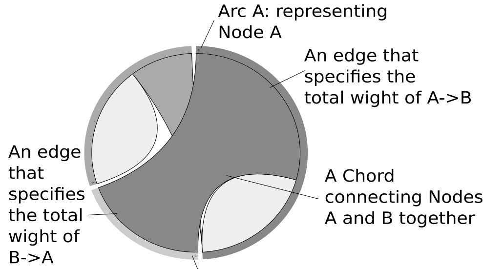 Figure: The basic concept—Arc lengths and Chord widths representing quantitative interaction.
Experiments: Real-World Evidence (BPIC'15)
Using real logs from Dutch municipalities (BPIC'15), the author compared the two methods. While the traditional graph was a mess of crossing lines, the Chord Diagram revealed:
- Resource Abstraction: You could immediately see that resource "1898401" was a central hub.
- Association Direction: It became clear which workers were "initiators" versus "receivers."
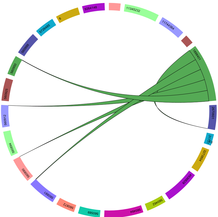 Figure: The interactive filtered view allows the user to isolate the social footprint of a single resource.
Critical Insight & Conclusion
The Chord Diagram isn't a perfect replacement—for instance, it natively hides "isolated" nodes that have no connections, which might be important for auditing "ghost" employees. However, for dense, high-volume process data, it is superior to traditional graphs.
The Takeaway: As Process Mining moves into the era of Big Data, our visualization techniques must evolve from "showing everything" to "showing structure." Chord Diagrams provide the necessary abstraction to turn event logs into actionable organizational intelligence.
Future Outlook
The next step for this research is human-centric usability testing. While the math and logic hold up, the real test is whether a business manager can identify a process bottleneck faster with a Chord Diagram than with a traditional flowchart.