
ChurnVis: Deciphering Social Network Churn Through Multi-Attribute Visualization
ChurnVis: Visualizing mobile telecommunications churn on a social network with attributes
ChurnVis is a visual analytics system designed to track and explain subscriber churn in mobile telecommunications by mapping social network components and their attributes over time. By combining social network inference from call records with pixel-oriented displays, the system enables the analysis of influence-driven churn across networks with hundreds of millions of edges.
TL;DR
ChurnVis is a specialized visualization system that helps telecommunications analysts understand why and how customers leave. Rather than treating subscribers as isolated dots, it analyzes "churn components"—groups of connected friends who leave together. By using a clever two-stage pipeline and pixel-oriented displays, it scales to social networks with hundreds of millions of edges while strictly maintaining data privacy.
The Motivation: Churn is a Social Virus
In the mobile industry, "churn" (losing a customer) is expensive. Traditionally, companies used static attributes like age or location to predict who might leave. However, research suggests churn is contagious. If your inner circle of friends switches providers, you are significantly more likely to follow.
The challenge for the authors was two-fold:
- Scale: How do you visualize a network with nearly a billion connections on a standard laptop?
- Privacy: How can analysts explore real consumer behavior without the raw, sensitive data ever leaving the secure corporate servers?
Methodology: The Two-Stage Pipeline
The core "magic" of ChurnVis lies in its architecture, which splits the heavy lifting from the visual exploration.
1. The Server-Side "Heavy" Pipeline
Raw Call Detail Records (CDR) are processed on secure servers. The system builds a social network where links represent frequent calls. It then identifies Churn Components—subgraphs of connected individuals who have churned. Instead of exporting the whole graph, it generates Summary Histograms (anonymous demographic summaries).
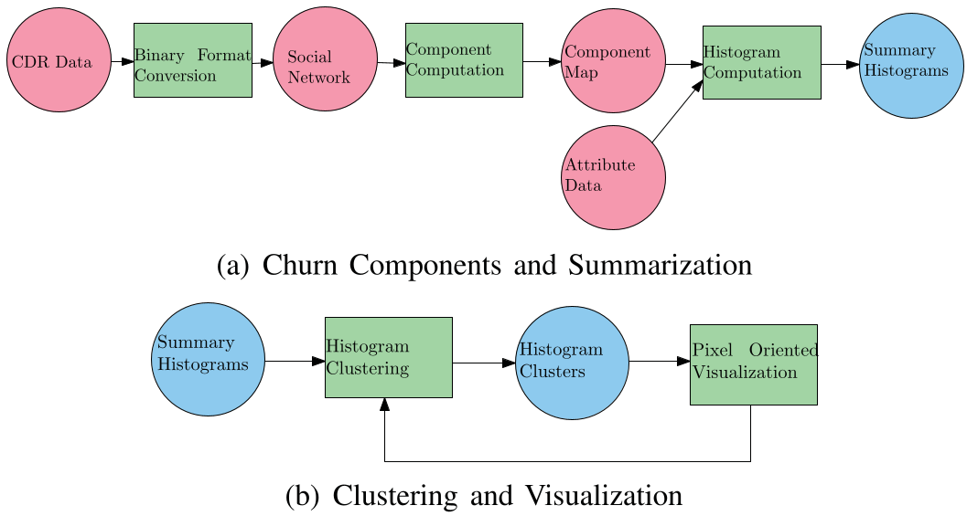 Figure 1: The dual pipeline keeps private data (red) on servers while allowing local analysis (blue).
2. The Visualization Pipeline (Pixel-Oriented Display)
On the analyst’s laptop, the system clusters these components using k-means. To show hundreds of components and dozens of attributes (like phone model, payment type, and call frequency) simultaneously, it uses a pixel-oriented display. Each tiny rectangle represents a value; color intensity represents the proportion of users in that group sharing that attribute.
Real-World Insights: Finding the "Phantom Churners"
The authors deployed ChurnVis at a telecommunications consulting firm. The results weren't just academic; they uncovered specific business anomalies:
- The Churn Flag Problem: Analysts found a cluster of "churned" components that were actually still adding money (top-ups) to their accounts. This revealed that the provider's automated churn-detection algorithm was flagging people as "gone" far too early.
- Handset Correlations: A specific Nokia model was found to be almost exclusively used by customers on hybrid payment plans, suggesting a marketing or bundling success that was previously invisible.
 Figure 4: A screenshot highlighting the anomaly where "churned" users (grey) were still topping up (tan).
Critical Analysis & Conclusion
The real value of ChurnVis is its Inductive Bias toward social structure. By forcing the analyst to look at components rather than individuals, it naturally highlights the diffusion of behavior.
Limitations:
- The system uses simple Breadth-First Search (BFS) for component finding. Modern community-detection algorithms (like Louvain or Infomap) might provide more nuanced clusters.
- The pixel-oriented display has a steep learning curve, as noted by the organization's sales team.
Future Outlook: This work paves the way for "Privacy-Preserving Visual Analytics." By moving the computation to the data (server-side) and only moving the abstractions to the user, we can analyze sensitive social structures at a scale previously thought impossible.
Takeaway: ChurnVis proves that in massive graphs, the "shape" of the network and the attributes of its clusters often tell a more compelling story than individual data points ever could.