
Line Charts vs. Radar Charts: Which Actually Wins for Visualizing Emotions Over Time?
A comparative evaluation of techniques for time series visualizations of emotions
This paper presents a comparative evaluation of four visualization techniques—Line Chart, Stream Chart, Radar Chart, and Circle Chart—designed to track the temporal evolution of eight basic emotions based on Plutchik's model. Utilizing Twitter datasets regarding real-world crises, the study establishes a performance hierarchy for time-series emotion visualization.
TL;DR
In the world of sentiment analysis, we often see beautiful Radar Charts and complex Stream Charts used to depict the public's mood. However, a rigorous comparative study by Sheidin et al. reveals that the humble Line Chart remains the king of efficiency and accuracy for most analytical tasks. While Radar Charts are "enjoyable" due to their aesthetic and animations, they significantly hamper the speed of temporal comparisons.
Problem & Motivation: The Chaos of Emotional Data
Understanding how public emotion shifts during an event—like a natural disaster or a political protest—is crucial for stakeholders ranging from brand managers to government agencies. But emotions are multifaceted (Plutchik’s model defines eight: Joy, Trust, Fear, Surprise, Sadness, Disgust, Anger, and Anticipation).
The core challenge is scalability and clarity. How do you represent eight overlapping emotional variables across a timeline without creating a "spaghetti" mess or a confusing geometric shape that users can't decode?
Methodology: Testing the "Big Four"
The researchers selected four archetypal visualizations to battle it out:
- Line Chart: Each emotion as an independent line.
- Stream Chart: Emotions stacked as layers to show total volume.
- Radar Chart: A circular plot where each "spoke" represents an emotion, with time handled via animation or interactivity.
- Circle Chart: A concentric radial map where color represents value and rings represent time.
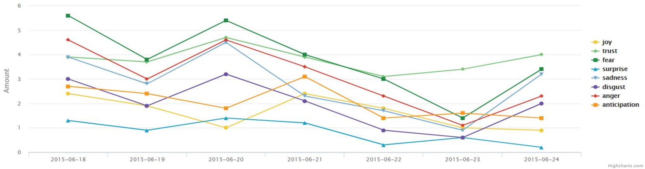 Figure 1: Comparison of (a) Line Chart, (b) Stream Chart, (c) Radar Chart, and (d) Circle Chart.
Forty participants were tasked with answering questions ranging from finding specific values (Elementary) to identifying broader trends (Synoptic) and domain-specific questions (e.g., "On which day was the overall emotional intensity highest?").
Key Insights: Performance vs. Aesthetics
1. The Line Chart is the Pragmatic Champion
The study found that for almost every task involving concrete values or comparisons at a specific moment, the Line Chart was the fastest. Participants preferred it because it was "easy to learn" and familiar. However, the authors noted a catch: when lines overlap, accuracy can drop unless colors are chosen with extreme care.
2. Stream Charts for the "Big Picture"
If your goal is to show the total emotional response at once, the Stream Chart is superior. It allows users to perceive the aggregate "volume" of emotions more effectively than separate lines.
3. The Radar Chart Trap
Despite its popularity in academic literature for representing Plutchik's Wheel, the Radar Chart was the "slowest" performer. Participants enjoyed the animations, but they struggled to compare different days or different emotions simultaneously.
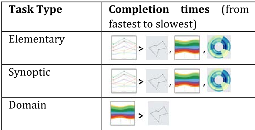 Table 1: Completion time hierarchy by task type.
Design Guidelines for Future UI/UX
Based on their findings, the authors propose several "Design Guidelines" (DGs):
- DG-1: Use Line Charts as the default for temporal emotional analysis.
- DG-3: Implement Smart Interactivity. When tracking 8+ emotions, allow users to "hide/unhide" specific streams to reduce clutter.
- DG-4: Don't just follow traditional color models. Plutchik's original colors (e.g., two shades of green for fear and trust) can cause confusion; use high-contrast color palettes instead.
- DG-6: Use Radial Visualizations with caution. They are complex, require high mental effort, and often frustrate users during actual data analysis.
Critical Analysis & Conclusion
This research highlights a classic tension in Data Vis: Aesthetic Appeal vs. Functional Utility. The Radar Chart is "sexy" and maps well to the psychological theory of circular emotion wheels, but it fails the user in a high-pressure analytical context.
Limitations: The study used students rather than expert data analysts, and the dataset was limited to one-week intervals. Future research should investigate if these findings hold for long-term trends (months or years) where the "spaghetti" effect of Line Charts might become even more pronounced.
Final Takeaway: If you are building a dashboard to monitor brand sentiment or event-based trends, stick to the Line Chart for analysis, but consider a Stream Chart for the high-level "Executive Summary" view.