
Social Reflector: Mapping the Pulse of Our Digital Conversations
Conversational Lives: Visualizing Interpersonal Online Social Interactions
The paper introduces "Social Reflector," a multi-interface visualization application designed to facilitate personal reflection on Facebook interactions. By mapping disparate data like status updates, comments, and "likes" into three distinct visual strategies (WordCloud, Clock, and Circles), the tool provides users with insights into their digital social life-streams.
TL;DR
Our online social lives are often a blur of scrolling and instant reactions. Social Reflector is a visualization system that transforms chaotic Facebook data into structured "mirrors" for self-reflection. By visualizing interaction rhythms and conversational "weight," it helps users bridge the gap between how they think they interact and how they actually do.
Academic Context: This work sits at the intersection of Information Visualization (InfoVis) and Reflective Practice, moving beyond the "what" of social data to the "so what" of human relationships.
The "Impulsive" vs. "Reflective" Gap
Most social media platforms are designed to keep us in an impulsive state—reacting to the newest post, the latest notification. The authors argue that this "forward-moving impetus" prevents us from forming reasoned opinions about our social impact. We are often wrong about who our closest digital allies are or which of our posts actually foster meaningful dialogue.
Methodology: The Three Mirrors
The Social Reflector utilizes three distinct visualization strategies to provide "distance" from the data, allowing for a macro-level view of one's digital life.
1. The WordCloud: Assessing Conversational Potential
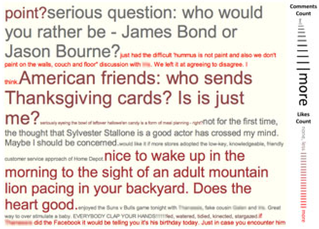
Unlike standard tag clouds, this interface scales status updates based on Comments (font size) and Likes (color saturation). This distinguishes between "passive validation" (likes) and "active engagement" (comments).
2. The Clock: Visualizing Activity Rhythms
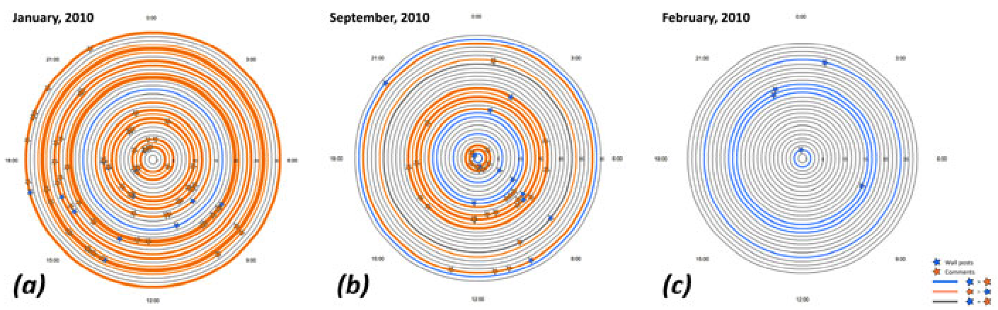
Using a "tree ring" metaphor, the Clock maps a month of activity. Blue icons represent outbound posts, while orange icons represent incoming feedback. This radial layout immediately reveals the balance between how much we speak versus how much we are heard.
3. The Circles: Interpersonal Flow
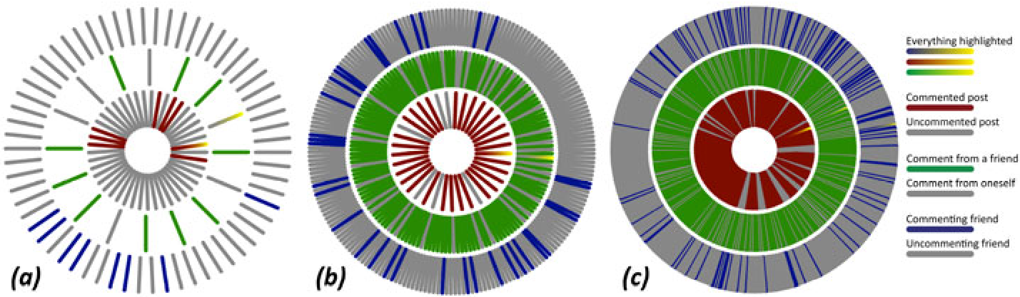
This interface focuses on the ego-centric network. Users can trace the connection between a specific post, the comments it generated, and exactly which friends were involved, providing a granular look at social ties.
Key Results: A Reality Check
The evaluation with 20 users yielded profound insights into human social perception:
- The Perception Gap: Participants frequently discovered "lurking" friends who contributed significantly more (or less) than perceived. One user was shocked to find a person they didn't consider "close" was responsible for 5% of their total interaction.
- Activity Overestimation: Many users significantly adjusted their self-characterization on the "Profile Maintenance vs. Social Interaction" scale after seeing their sparse data in the Circles view.
- Legibility over Complexity: The WordCloud was the most preferred interface because it offered immediate, legible value regardless of how large or active the user’s network was.
Critical Insight & Future Outlook
While the Social Reflector succeeds in prompting reflection, it faces a scalability challenge. As shown in the study, "High Activity" users found the radial and circular layouts cluttered.
The Takeaway? Visualization is not just about making data "pretty"; it's about cognitive offloading. By shifting social history from memory to a visual interface, we can move from mindless consumption to mindful connection. Future systems will likely integrate AI-driven thematic analysis to not just show when we talk, but what we are evolving into through our digital conversations.
Final Thoughts
As our lives become increasingly "distributed" across various platforms, tools like Social Reflector remind us that our digital footprint is not just a log of events, but a living narrative of our interpersonal evolution.