
Crowd-sourced Cartography: Mapping the Pulse of the City Through Social Movement
Crowd-sourced cartography: measuring socio-cognitive distance for urban areas based on crowd's movement
This paper introduces "Crowd-sourced Cartography," a framework for generating socio-cognitive maps using location-based social network (LBSN) data. By analyzing more than 150,000 geo-tagged tweets, the method calculates "socio-cognitive distance" based on crowd movement patterns rather than just physical proximity, visualizing urban accessibility through a combination of Multi-Dimensional Scaling (MDS) and Weighted Voronoi Diagrams.
TL;DR
Researchers have developed a method to redraw urban maps based not on kilometers, but on "socio-cognitive distance." By mining geo-tagged Twitter data, this framework identifies significant urban clusters and visualizes how "close" they actually are based on crowd movement. The result is a socio-cognitive cartogram that reveals the hidden structural dynamics of a city that standard GPS maps miss.
Problem & Motivation: The Gap Between Maps and Reality
Why does a neighborhood five miles away sometimes feel "closer" than one just a mile away? Traditional geography relies on Euclidean distance—the straight line between two points. However, human experience is shaped by accessibility, social trends, and movement habits.
The authors argue that as urbanization accelerates, we need maps that reflect the dynamic complexity of urban life. Existing tools like commute maps show travel time, but they don't capture the "social influence" or the psychological proximity created by where people actually choose to spend their time. The goal of this paper is to shift from reference cartography to socio-cognitive cartography.
Methodology: From Tweets to Clusters
The researchers utilized a four-stage pipeline to turn raw social media data into a meaningful map:
1. Extracting Movement from Lifelogs
By filtering geo-tagged tweets by User ID and timestamp, the system reconstructs "moving segments." This provides a trajectory of how individuals migrate between different parts of the city throughout the day.
2. Identifying Social Urban Clusters
Using the NNClean algorithm to remove noise and DBSCAN for density-based clustering, the system identifies "Social Urban Clusters"—areas with high social activity.
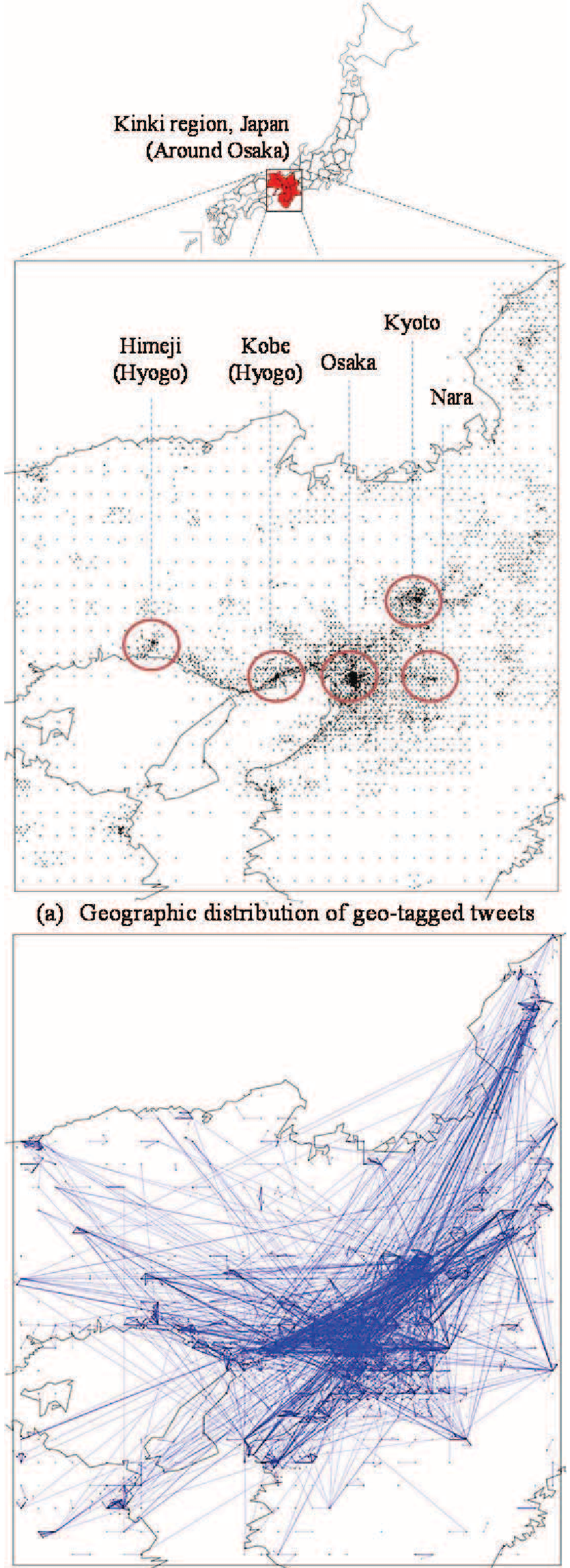 Figure: The procedural pipeline from data collection to map generation.
3. Measuring Socio-Cognitive Distance
The core innovation is the distance formula: Where ExpDist (Experiential Distance) is inversely proportional to the number of people moving between two clusters. This allows the map to "shrink" the distance between two areas if they are heavily connected by human traffic.
4. Visualizing the "Distorted" Reality
To visualize this, the authors employed Multi-Dimensional Scaling (MDS) to plot clusters in a 2D plane and Weighted Voronoi Diagrams to partition the space. Unlike a standard map, the size of a region here represents its "influential strength" (total movement volume).
Experiments: The Kobe-Osaka-Kyoto Paradox
The team analyzed 157,097 tweets from the Kinki region of Japan. The results yielded a fascinating discovery: The socio-cognitive map does not look like the geographical map.
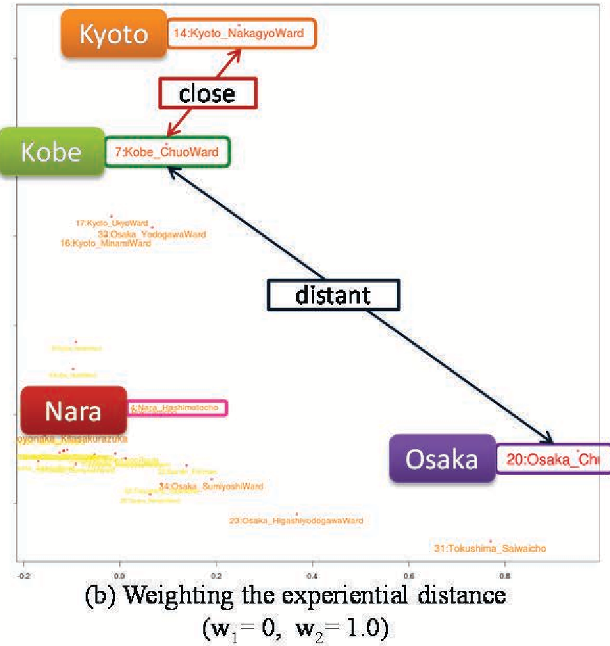 Figure: (a) Balanced physical/social weights vs. (b) Social-heavy weights. Note how the clusters shift.
Key Finding: Geographically, Kobe is closer to Osaka than it is to Kyoto. However, the movement data showed a higher socio-cognitive affinity between Kobe and Kyoto in certain contexts. The final generated map (below) provides a simplified, intuitive view where Chuo Ward (Osaka) and Nakagyo Ward (Kyoto) emerge as the dominant hubs of regional influence.
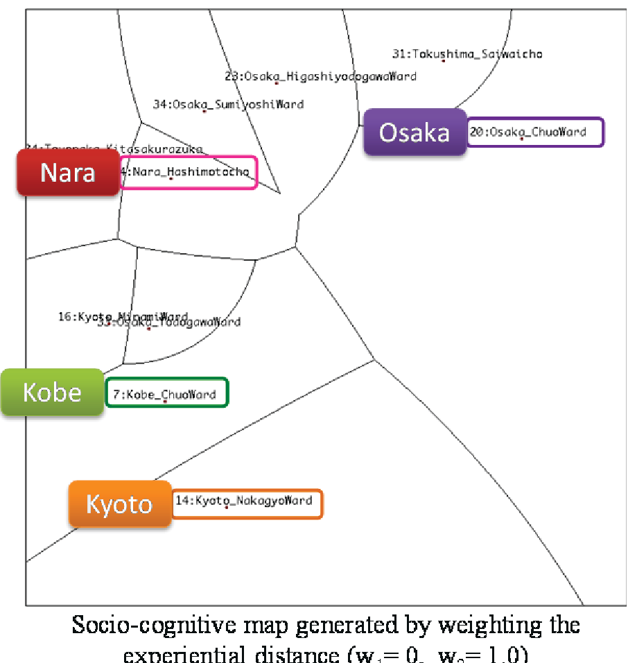 Figure: The final socio-cognitive cartogram partitioned by Weighted Voronoi cells.
Critical Insight & Conclusion
This work demonstrates that location-based social networks (LBSNs) are more than just communication tools; they are sensors for urban psychology. By redefining "distance" through movement, we can create maps that are more relevant for:
- Urban Planning: Identifying which areas are socially isolated despite physical proximity.
- Real Estate: Understanding the true "accessibility" and prestige of a neighborhood.
- Marketing: Targeting areas based on the flow of human traffic rather than static demographics.
Limitations: The study relies on Twitter users, who represent a specific demographic slice (likely younger and more tech-savvy). Future work should integrate more diverse data sources (e.g., transit cards, cellular handover data) to refine the "socio-cognitive" accuracy across all population segments.