
Cultural Interface Design: Beyond Aesthetics to Localized Trust
Cultural Interface Design: Global Colors Study
This paper presents a systematic study of "cultural markers" in web design, specifically focusing on global color preferences across fifteen countries using a custom Web Crawler (CWS). The authors identify both an "international color palette" (shared preferences) and country-specific nuances, proposing a localized approach to global interface design.
TL;DR
In the era of globalized digital services, a website's "look and feel" is more than just branding—it's a matter of "culturability." This research by the National Research Council Canada utilizes automated web crawling to decode the color DNA of 15 different nations. By identifying an International Color Palette alongside country-specific preferences, the authors provide a data-driven roadmap for designers to build interfaces that feel "native" anywhere in the world.
The "Culturability" Gap
Why do some global e-commerce sites fail in specific markets despite perfect translation? The answer lies in Cultural Markers. Existing design frameworks often treat usability as a universal constant, but the authors argue that trust and credibility are deeply tied to cultural expectations of visual layout and color. The challenge is that manually auditing thousands of local websites to find these patterns is impossible for human designers.
Methodology: The Hybrid Audit
The researchers developed a dual-tool approach to bridge the gap between "code" and "perception":
- HTML Color Analyzer: Scans the CSS and HTML code of top-ranked country-specific websites (e.g.,
.jpfor Japan,.frfor France) to count instances of color usage. - Image Color Analyzer: Takes snapshots of web pages and measures the actual surface area covered by specific colors. This accounts for the fact that a single background color code might have more visual impact than fifty small colored icons.
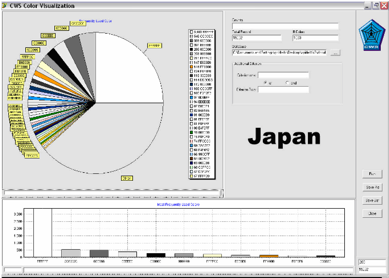 Fig 1: Initial visualization of RGB color data from Japanese websites.
The Artistic Calibration
Raw RGB data (16.7 million colors) is too granular for design insights. The team developed a proprietary algorithm to map these into an "Artistic Palette" of 51 intuitive categories (e.g., "Shaded Blue," "Light Yellow Orange"), making the data actionable for human creators.
Global Findings: Universal vs. Local
One of the most striking results is the identification of an International Color Palette. Regardless of the country, ten colors dominated the web:
- Neutrals: White, Black, and various shades of Grey.
- Trust Colors: Multiple shades of Blue.
- Accents: Light Yellow.
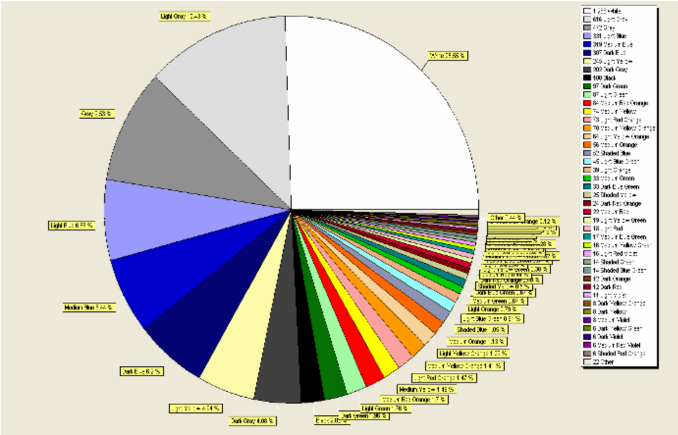 Fig 2: Background color distribution for Japan, highlighting the dominance of white and grey.
However, the "cultural soul" of the design emerges in the remaining palette. For instance, while Japan shares the international foundation, its specific use of greens and warm oranges differentiates its localized digital landscape from Saudi Arabia or Brazil.
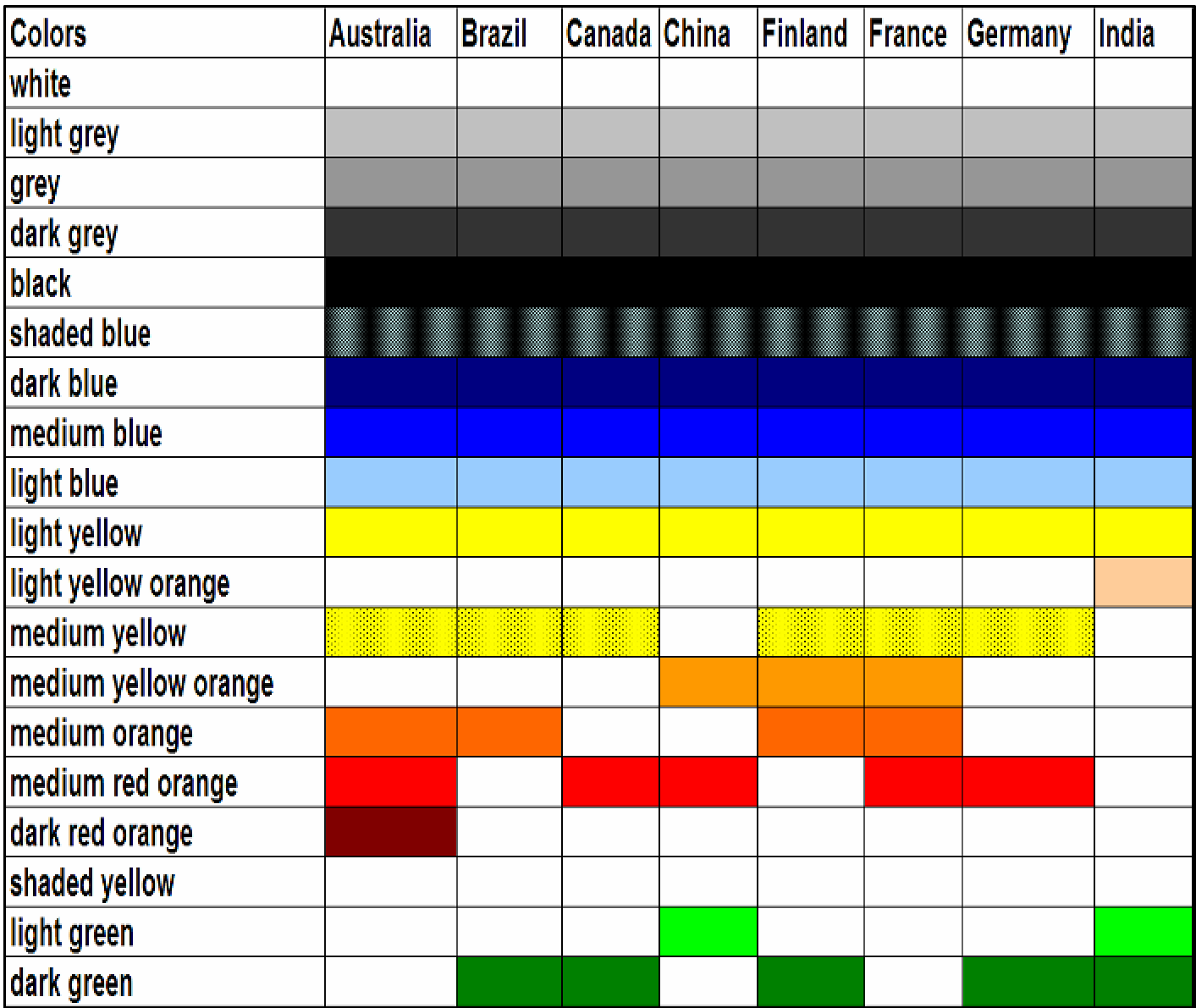 Table 1: Preferential color usage across different nations, showing the overlap in "international" hues.
Critical Insight: The Designer’s Advisor
The ultimate value of this work isn't just a list of colors; it's the shift toward Prototyping Tools. The authors propose a "Cultural Interface Design Advisor" that uses this databank to suggest a "first draft" of a UI based on the target locale.
Limitations
- Corporate Monoculture: Large multinational brands often enforce a strict global identity, which can skew the data by masking local preferences.
- Dynamic Content: As websites shift from static HTML to dynamic, image-heavy JavaScript apps, simple crawling becomes more difficult.
Conclusion
This study proves that "International Design" doesn't mean "Generic Design." By starting with the International Palette and layering on verifiable country-specific markers, developers can achieve a balance of global efficiency and local resonance. For future products, such automated "cultural audits" will be essential to maintaining a competitive edge in diverse global markets.