
Designing for Delight: Why Visualization is the Heart of Product Customization
Designing for Positive User Experience in Product Design: A Qualitative Analysis of Toolkit Design Elements and their Implications on Emotional Reactions and Perceptions
This paper explores the impact of toolkit design elements on user experience within mass customization, specifically for product design tasks. Using focus groups and an experiment involving car customization, the authors identify how "visualization" (hedonic) and "detailed information" (utilitarian) drive emotional reactions like enjoyment and perceptions such as realistic product understanding.
Executive Summary
TL;DR: In the age of "unique-for-me," companies like Nike and Dell use toolkits to let customers design their own products. However, design is hard work. This paper reveals that the secret to making this effort "fun" rather than "work" lies in the delicate balance of Hedonic (pleasure-oriented) and Utilitarian (goal-oriented) design elements. The core finding? Visualization isn't just "eye candy"—it's a critical cognitive tool that reduces uncertainty and sparks creativity.
Positioning: This work bridges the gap between Marketing (Customer Experience) and HCI (User Experience), providing a concrete roadmap for a field that has long relied on vague "one-size-fits-all" design advice.
The "Self-Design" Paradox
Why would a customer spend 30 minutes designing a car when they could buy one in 30 seconds? This is the Self-Design Paradox. The effort, time, and expertise required are "costs." To outweigh these costs, the software interface must provide a "process benefit"—essentially, the act of designing must be as rewarding as the product itself.
Existing research tells us we need a "trial-and-error" process, but it doesn't tell us how to visualize it. This paper argues that without the right digital touchpoints, users feel "lost in the solution space," leading to choice paralysis and frustration.
Methodology: The Three-Way Battle
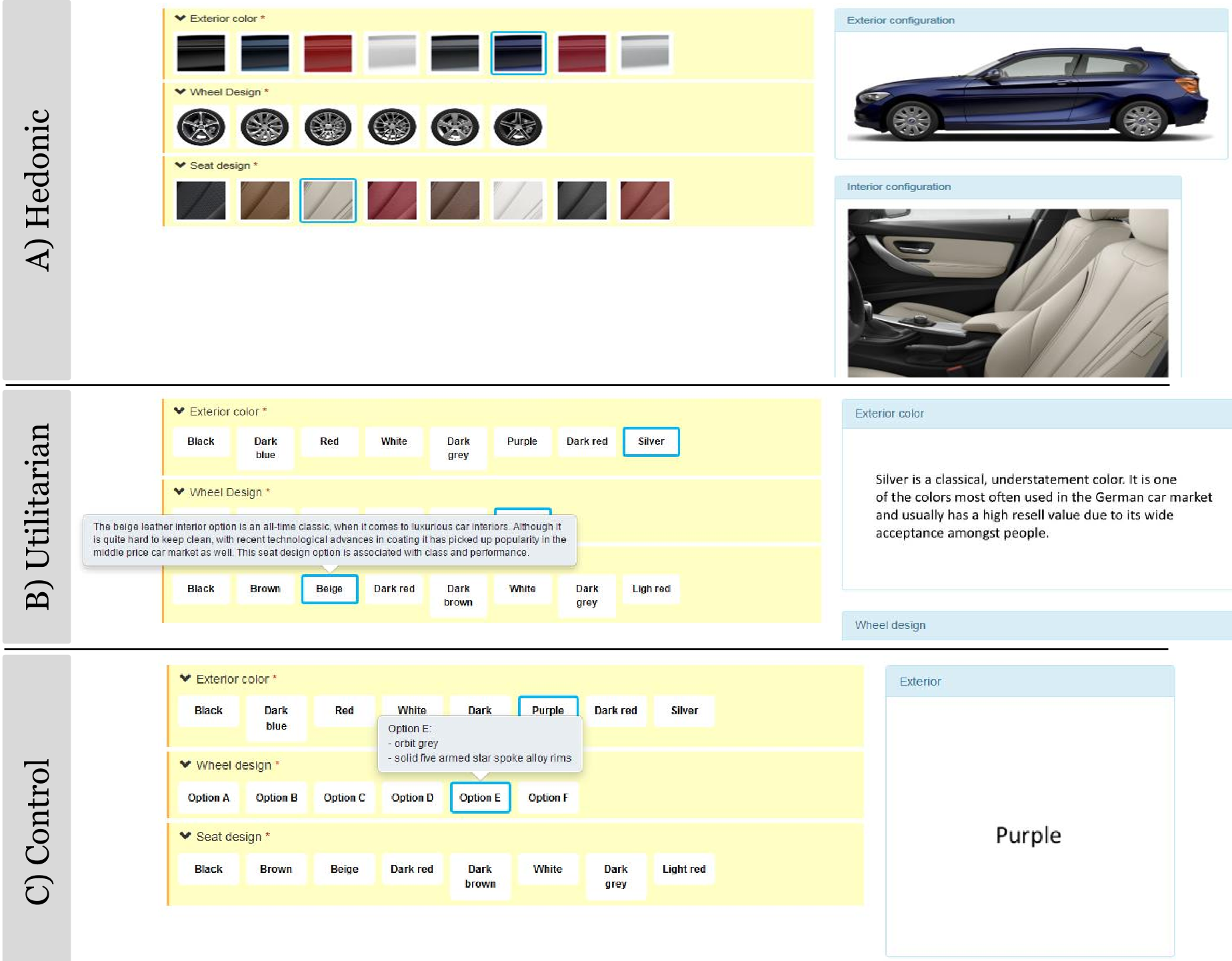
The researchers built three distinct car configurators to test their theories:
- The Hedonic Toolkit: Focused on "The Look." High-res pictures, instant visual feedback, and a focus on aesthetics.
- The Utilitarian Toolkit: Focused on "The Specs." Detailed text descriptions of engine performance, service contracts, and functional trade-offs.
- The Control Toolkit: A "worst-case" scenario. Text-only, minimal info, essentially a digital form.
Core Insight: Visualization is Functional
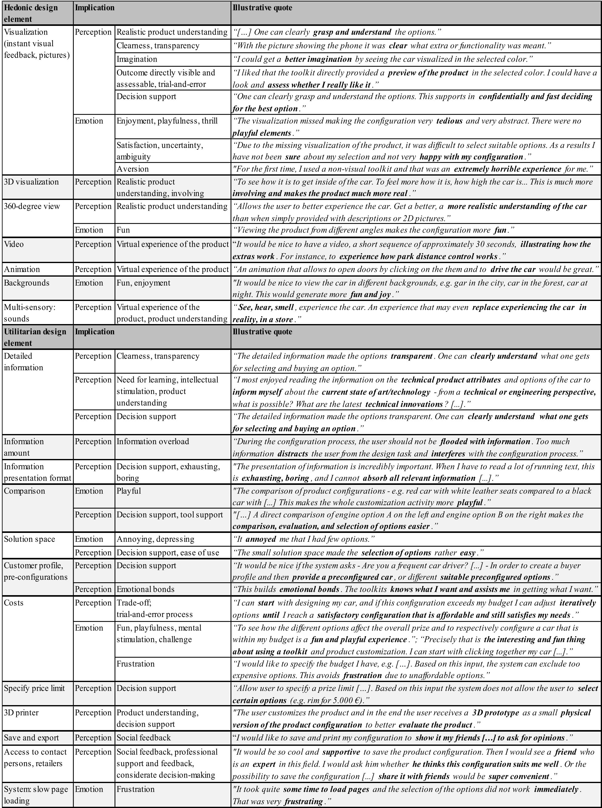
The most striking discovery from the focus groups was that visualization does double duty. While it is a "hedonic" element (it makes things fun), it also significantly aids "utilitarian" goals:
- Reality Check: Users who saw the car change color or seat style in real-time felt more confident in their choice.
- Emotional Safety: Without visuals, users reported feeling "horrible," "uncertain," and "unhappy with their configuration."
- Creative Spark: Visuals didn't just show the product; they allowed users to "play" with the price-to-aesthetic trade-off, turning a financial constraint into a game.
The Role of Detailed Information
While visuals win hearts, information wins minds. Users wanted technical specs (like engine innovations) to feel like they were "learning" something. The takeaway for designers? Use a drill-down structure: show the beautiful image first, and provide the deep technical specs only when the user clicks for more.
Deep Dive: Applying Garrett’s 5 Layers
The authors map their findings to Garrett’s famous "Elements of User Experience" framework:
- Strategy: Satisfy the user's need for "Information Acquisition" and "Mental Stimulation."
- Scope: Offer a "hierarchically structured solution space"—start with the basics, then offer deeper customization for "power users."
- Structure/Skeleton: Use Progress Bars. Interestingly, the "Control" group (no visuals) wanted progress bars the most—this suggests that when a task isn't fun, users focus purely on "when will it be over?"
- Surface: Use Real Photos, not computer imitations. Users are savvy; they want a "realistic product understanding."
Critical Analysis & Conclusion
This paper serves as a vital reminder that in Digital Product Design, Hedonic value is not a luxury—it's a usability requirement.
Takeaways for Designers:
- Visualize everything: Even functional parts (like an engine) benefit from a visual representation to reduce cognitive load.
- Gamify constraints: Transparency in pricing allows users to "play" with their budget, turning a negative (cost) into a playful challenge.
- Feedback Speed Matters: The study noted that slow page loading was a "joy killer," proving that technical performance is a prerequisite for a positive emotional state.
Limitations: The study was conducted on students for a high-ticket item (cars). Would the results hold for $20 t-shirts? Likely, though the need for "detailed information" might scale down with the price tag.
Future Outlook: As we move toward VR/AR, the definition of "visualization" will shift from 2D images to immersive "virtual ownership," likely magnifying the emotional bonds identified in this paper.