
Consubstantiality in Crisis: Rhetorical Barriers in Heart Health Advocacy
Dispelling myths, motivating action: rhetorical complexities and information challenges in the heart healthy advocacy website, go red for women
This paper provides a rhetorical and technical analysis of the "Go Red for Women" (GRFW) advocacy website, focusing on how information design influences health awareness. It evaluates the site’s effectiveness using Kenneth Burke’s concept of consubstantiality and the American Medical Association’s (AMA) guidelines for health information.
TL;DR
Despite the high-profile success of the "Red Dress" campaign, the Go Red for Women (GRFW) website faces critical challenges in information design. This paper argues that the site's heavy focus on fashion-based branding and "push" messaging creates a digital environment that alienates marginalized women, lacks essential accessibility tools, and fails to bridge the gap between awareness and health action.
Motivation: Beyond the "Hollywood Heart Attack"
For decades, cardiovascular disease (CVD) was misperceived as a "man's disease"—the so-called "Hollywood heart attack" featuring a middle-aged male clutching his chest. Organizations like the American Heart Association (AHA) launched the GRFW Movement to dispel this myth. However, as researcher Antoinette Larkin notes, the transition from high-fashion awareness events (the "push") to actionable website information (the "pull") is fraught with rhetorical and technical complexities.
The Core Concept: Burke’s Consubstantiality
The author leans on Kenneth Burke’s theory of "consubstantiality" (shared identification). For a health website to work, the user must see themselves reflected in the site’s ethos and content. If the branding—in this case, young, able-bodied women in runway-ready red dresses—doesn't match the reality of the diverse audience (including those with disabilities or low income), "alienation" occurs instead of "identification."
Methodology: Analyzing the Rhetorical Interface
The study evaluates the GRFW site through three lenses:
1. Navigation & Accessibility
The AMA suggests that health sites should include FAQs, site maps, and accessibility statements.
- The Reality: GRFW lacks a robust search engine (no autocorrect for "cardiovascular") and buries critical navigation in footers.
- The "Satisficing" Trap: Users often settle for "good enough" information (satisficing) rather than the best information due to seeker fatigue.
2. Visual Semiotics of Photography
Larkin analyzes the "Information Value" and "Modality" of the site's imagery.
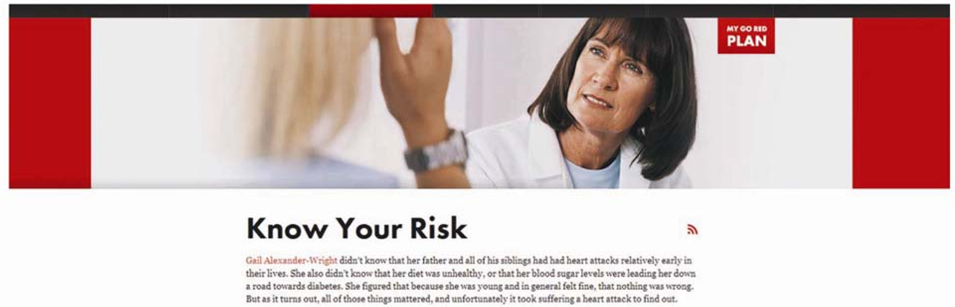 Figure: Analyzing the "Live Healthy" landing page interaction and visual vectors.
- Commodity Feminism: The "Red Dress" logo is highly sexualized and gender-normative, which might exclude women who don't identify with the "fashionista" persona.
- Low Modality: Many images are stock photos that lack cultural relevance or real-world "dirt" (e.g., surgical-clean kitchens), diminishing the site's ethos.
3. Readability and the Literacy Gap
Using the Flesch-Kincaid scale, the author found the site operates at a 9th-10th grade reading level. This creates a massive barrier for low-income and low-literacy populations, who typically require a 6th-grade level for health materials.
Critical Analysis: Branding vs. Utility
The study highlights a recurring tension: Branding Demands vs. User Needs.
- The Logo Conflict: The red dress logo, while iconic, implies health is achieved through "performance" and beauty.
- The Inclusion Void: There is a notable absence of women with conspicuous disabilities, despite CVD being a leading cause of disability.
 Figure: The "Ten Real Women" photograph intended to bridge the gap between fashion and reality.
Future Outlook & Takeaways
Larkin concludes that the GRFW site remains "stuck in a push phase." To move consumers into the "actor" phase, information designers must:
- Prioritize Utility: Move high-value health information above the fold.
- Broaden Imagery: Replace stock photos with culturally diverse, inclusive representations.
- Enhance Wayfinding: Adopt AMA guidelines for search functionality and accessibility.
Ultimately, while the movement has successfully debunked the myth of the "man's disease," its digital platform must evolve from a "market bazaar" of branding into an "everyday helper" for all women.