
From Data to Insight: Evaluating the ROI of Educational Dashboards
Educational Dashboards for Smart Learning: Review of Case Studies
This paper presents a systematic review and evaluation framework for educational dashboards designed for smart learning environments. By synthesizing Stephen Few’s information visualization principles with Kirkpatrick’s four-level evaluation model, the authors analyze 10 prominent case studies (e.g., Course Signal, SAM, SNAPP) to determine their pedagogical and visual effectiveness.
TL;DR
Educational dashboards are more than just fancy charts; they are clinical tools for "Smart Learning." This paper establishes a dual-perspective framework—visual and pedagogical—to evaluate 10 major dashboard projects. It finds that while we are great at visualizing "how many times a student logged in," we are still struggling to prove that these visualizations actually lead to better grades or smarter study habits.
The "Mud-Guard" Evolution: Why Design Matters
The term "dashboard" originally referred to a board on a horse carriage to block mud. Today, in the era of Big Data and LMS (Learning Management Systems), students and teachers are being "splashed" with messy log files. The challenge isn't just showing the data; it's showing the right data in a way that respects human cognitive limits.
Most current tools fail because they ignore Few's Principles. Humans can only process 3-4 chunks of visual information at once. If a dashboard requires scrolling or complex mental math to understand a student's status, it has already failed its primary mission: situational awareness.
Methodology: The Kirkpatrick Alignment
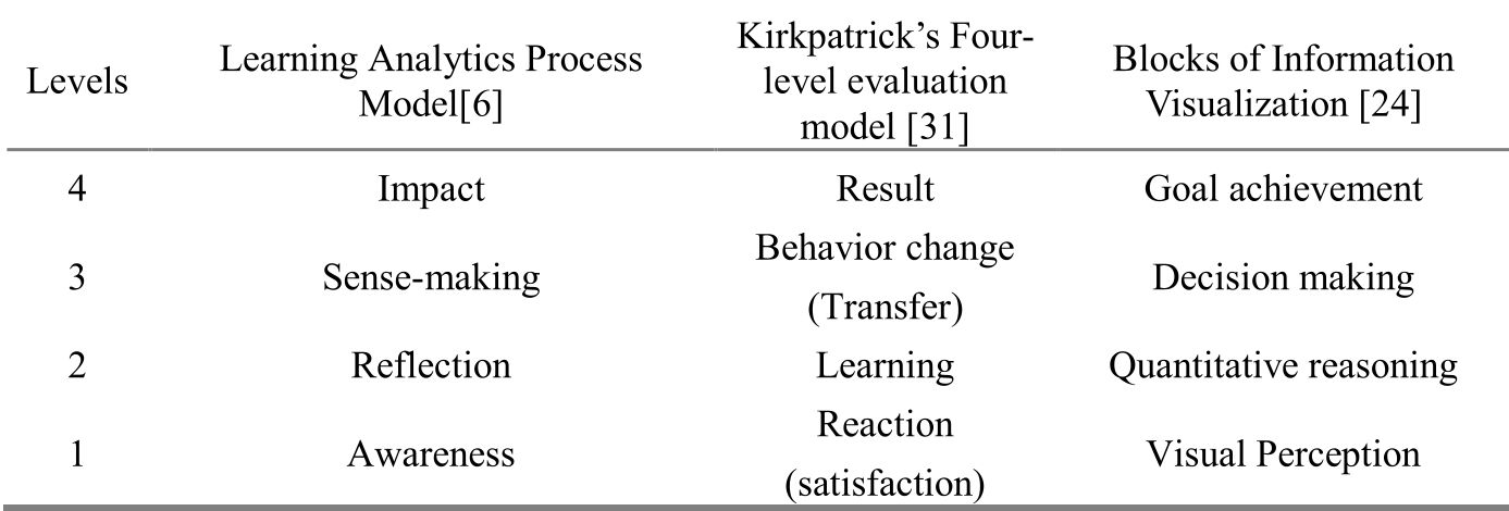
The core contribution of this work is the mapping of educational data mining to the Kirkpatrick Four-Level Evaluation Model. The authors argue that a dashboard's success should be measured through a hierarchy:
- Awareness (Reaction): Can the user perceive the data? (Visual perception).
- Reflection (Learning): Does the user understand the reasoning behind the data?
- Sense-making (Behavior): Does the user change their study/teaching habits?
- Impact (Result): Does the dashboard actually improve GPA or decrease dropout rates?
Benchmarking the State of the Art
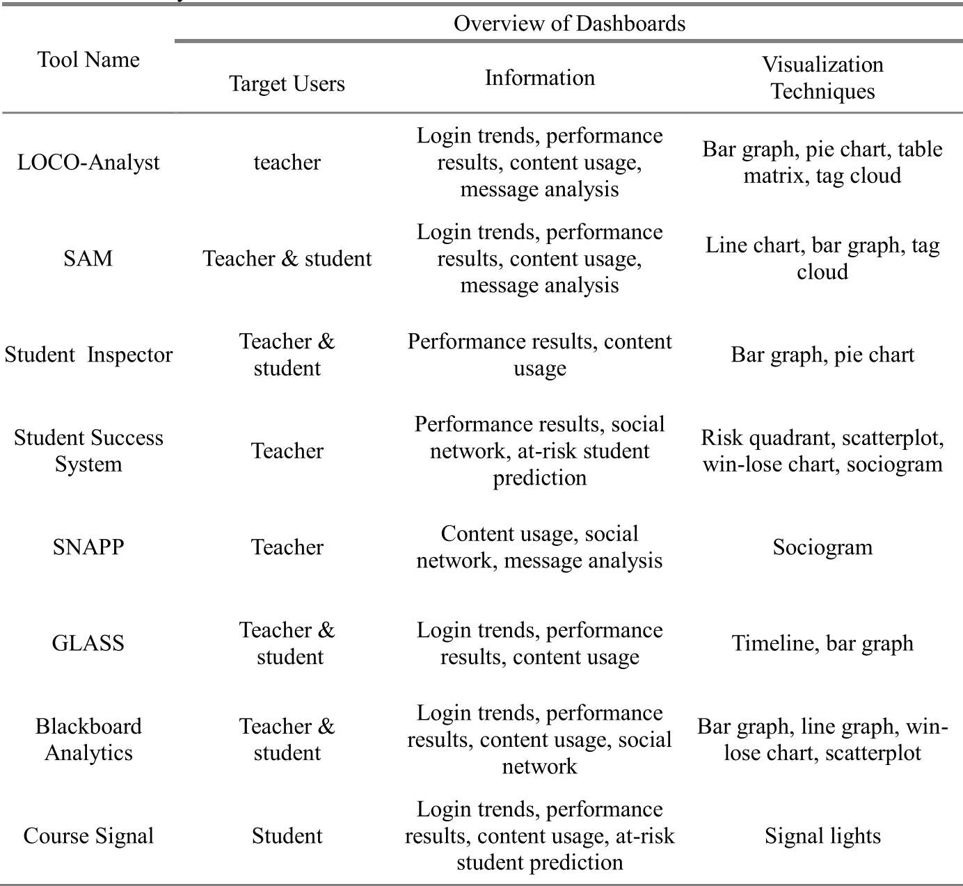
The authors reviewed 10 tools, including Course Signal, which uses a simple "traffic light" metaphor to indicate student risk, and SNAPP, which focuses on social network analysis within discussion forums.
Key Insights from the Comparison:
- The Visualization Gap: Most tools use standard bar graphs and pie charts. Only a few (like Narcissus) use more complex metaphors like "Wattle trees" to represent social interaction.
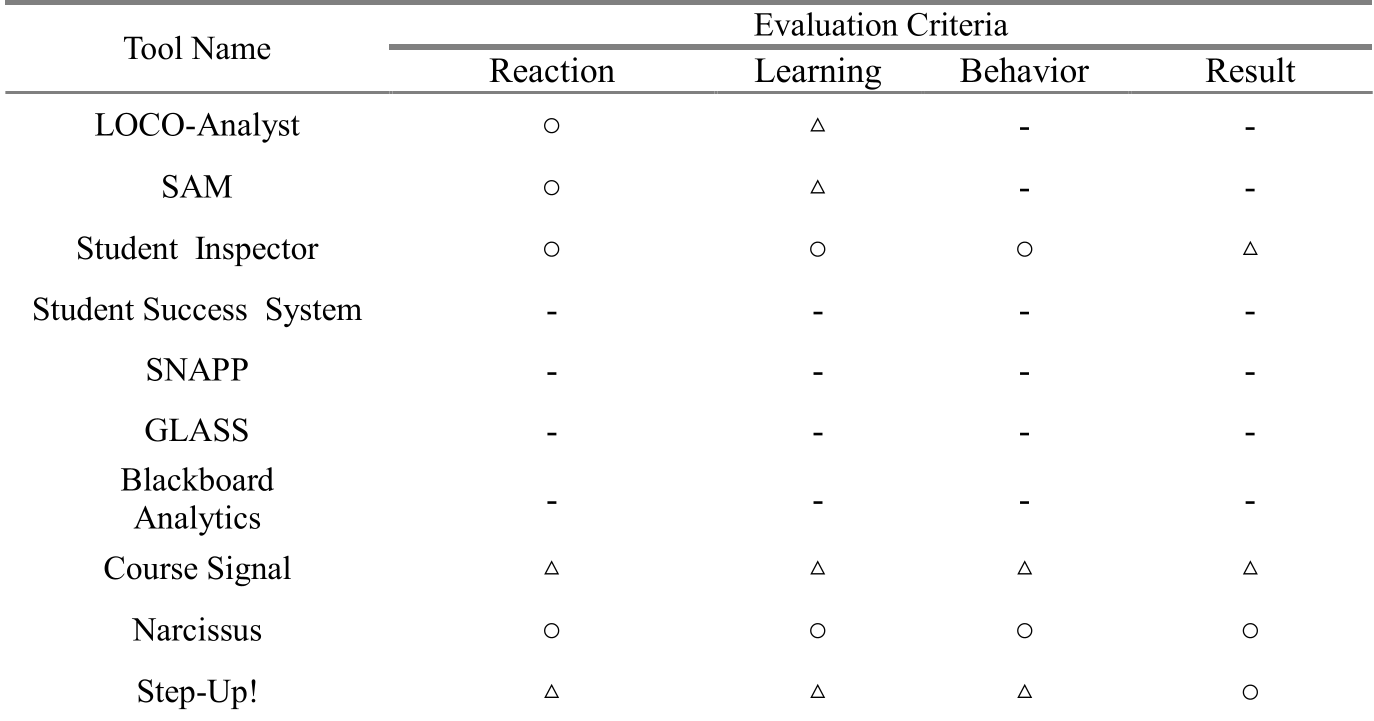
- The Level 4 Void: As shown in the evaluation table below, very few tools have been rigorously tested to see if they yield actual "Results" (Level 4). Most research stops at Level 1 (do students like the dashboard?).
Critical Analysis: Beyond the Screen
The paper effectively highlights a critical industry weakness: Pedagogical Affordance. We often build dashboards because the data exists, not because we have a clear theory of how seeing a "login trend" changes a student's motivation.
Limitations noted in the work:
- The review relies on existing literature, which may suffer from reporting bias.
- There is a lack of objective physiological data (like eye-tracking) to verify if "at-a-glance" designs are actually interpreted correctly by stressed students.
Conclusion & Future Outlook
This research provides a much-needed evaluative lens for the next generation of AI-driven education. Future dashboards should not just report the past; they must act as predictive intervention tools.
The Takeaway? If you are designing an educational tool, your "North Star" metric shouldn't be user clicks—it should be the measurable behavioral change that occurs after the user closes the dashboard.