
EduVis: Unlocking the Hidden Logic of Academic Success through Coordinated Visualization
EduVis: Visualizing Educational Information
EduVis is a coordinated visualization framework designed to decode complex interdependencies between university courses. By integrating a multi-layered view with a multi-matrix representation, it transforms symbolic Educational Data Mining (EDM) patterns into intuitive visual insights regarding student success and failure trends.
TL;DR
Educational Data Mining (EDM) often produces "data graveyards"—mountains of textual patterns that are theoretically useful but practically unreadable. EduVis changes the game by introducing a coordinated visualization system that maps out how passing (or failing) one course impacts a student's entire academic trajectory. Using a mix of layered flow diagrams and matrix heat maps, it makes "hidden" educational patterns visible to the human eye.
The Problem: The "Symbolic Pattern" Trap
In modern universities and MOOCs, we have access to years of student performance data. However, the existing tools (like CourseVis or GISMO) often focus on individual student progress or forum activity. When it comes to understanding the relationship between courses—for instance, "Does failing Calculus I in Semester 1 guarantee failure in Physics II in Semester 2?"—the results are usually spat out as complex logical formulas:
To an administrator or teacher, these text strings are indecipherable at scale. There is a massive "impedance mismatch" between raw data mining and actionable academic insight.
Methodology: The EduVis Dual-Engine Approach
The core innovation of EduVis lies in its coordinated interaction. Instead of one static chart, it uses two complementary views to represent nine years of computer science program data.
1. The Multi-Layer Visualization (Flow Perception)
This view organizes courses by semester layers.
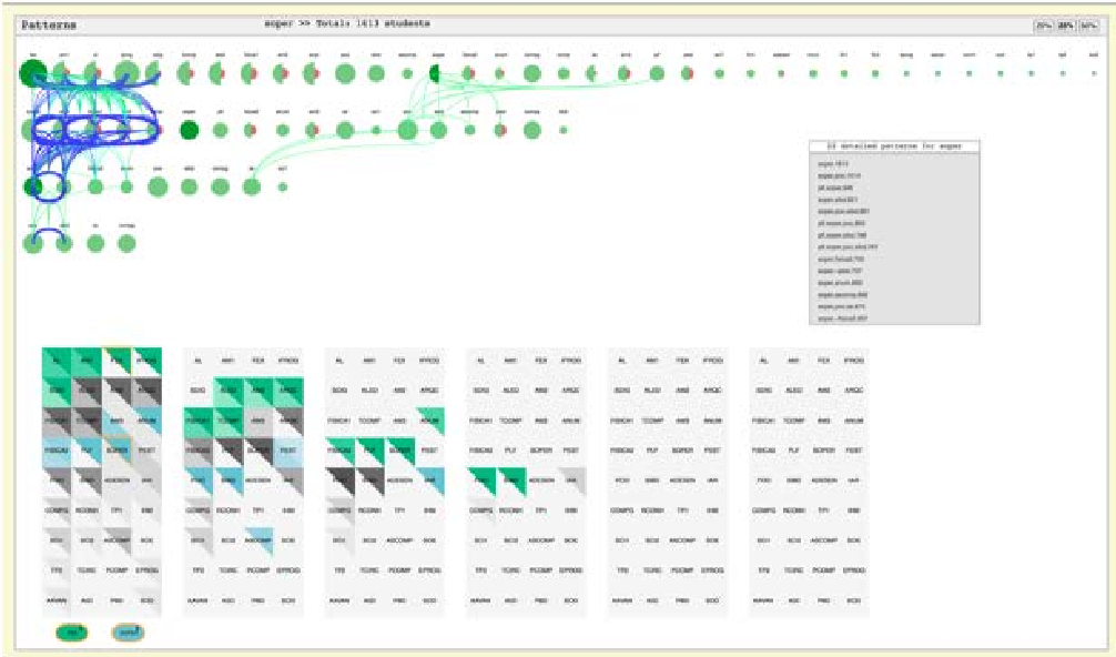
- Success/Failure Semicircles: Each course is a circle split into two. Green (left) indicates passing students; Red (right) indicates failures.
- Visual Connectors: Dynamic cubic Bézier curves link courses. If a student's success in Course A is statistically linked to Course B, a curve appears.
- Visual Encoding: Curve thickness represents the number of students, while color scales (Blue-to-Green for success, Yellow-to-Red for failure) indicate the "health" of that specific academic path.

2. The Multi-Matrix Visualization (Deep Exploration)
While the layered view shows flow, the Matrix view shows density.
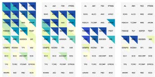
- Triangle Subdivision: Each square in the matrix is split into success (upper) and failure (lower) triangles.
- Heat Mapping: Brightness indicates the volume of patterns a course is involved in. Darker shades signify "hub" courses that have the most significant impact on other subjects.
Interaction: Beyond Static Dashboards
The true power of EduVis is revealed during interaction. When a user hovers over a course in the Matrix, the Layered view instantly lights up with all correlated dependencies.
- Filtering: Users can "lock" a course and then select another to see the intersection of patterns affecting both—making it possible to diagnose exactly why certain student cohorts struggle across specific departmental boundaries.
Experimental Insights & Results
By testing the system on nearly a decade of Computer Science student data, the researchers found that:
- Immediate Perceivability: Users could identify "bottleneck" courses (those with thick red output lines) significantly faster than reading data reports.
- Comparison Latency: The "locking" mechanism allowed for side-by-side comparison of different academic years, revealing how curriculum changes impacted student success over time.
- Color Intuition: Using western color conventions (Red/Green) significantly lowered the learning curve for non-technical academic staff.
Critical Analysis & Future Outlook
EduVis succeeds in bridging the gap between Data Mining and Human-Computer Interaction (HCI). However, as a 2014-era tool, it faces a few limitations:
- Scalability: While 9 years of data were handled, a curriculum with hundreds of elective courses might lead to "spaghetti" diagrams in the layered view.
- Aesthetic Consistency: As the authors noted, future work requires refining the color consistency between the Matrix and Layered views to prevent user confusion.
The Takeaway: EduVis proves that educational data is inherently relational. The future of academic management isn't just about collecting "grades"; it's about visualizing the connections between those grades to build more resilient learning pathways.