
Emotion-Weather Maps: Visualizing the Atmosphere of Human Feelings
7606_Development of Emotion-weather Maps.
The paper introduces "Emotion-Weather Maps," a thematic visualization system designed to represent the spatio-temporal distribution of eight primary emotions extracted from social media. By applying data normalization and metaball-based rendering, it successfully visualizes complex emotional shifts across geographical regions, such as reactions to an earthquake.
TL;DR
Researchers have developed a way to map communal emotions just like we map the weather. By extracting data from Twitter and applying sophisticated normalization to remove "noise" and "bias," Emotion-Weather Maps allow us to see how emotions like fear, surprise, and joy travel across a country in real-time, providing a "meteorology of the mind."
Strategic Position: This work moves beyond simple "thumbs up/down" sentiment analysis, positioning itself as a pioneer in multi-dimensional, spatio-temporal emotional visualization.
The Problem: The Bias of the "Loud"
If you look at raw Twitter data, it seems like everyone is happy, everyone lives in Tokyo (or NYC), and no one says anything at 4 AM. This creates three critical failures in traditional sentiment maps:
- Spatial Bias: Large cities drown out the emotions of rural areas.
- Temporal Bias: High-activity hours mask the sentiment of the morning.
- Category Bias: "Joy" and "Trust" are social media defaults, hiding "Fear" or "Sadness" until they reach extreme levels.
The authors argue that without Normalization, we aren't seeing the people's feelings; we are just seeing where the population density is highest.
Methodology: From Grids to Metaballs
The researchers transitioned from a simple colored grid to a more fluid, intuitive visualization.
1. Data Normalization
To reveal the "minor features," the authors calculate a correction value based on the maximum number of tweets in any unit. This ensures that a single cry of "fear" in a quiet village is given the same visual weight as a thousand cries in a busy city, provided they meet a 1% threshold.
2. The Color Science of Emotion
Unlike previous attempts that used random colors, this study utilizes the Lab color space*. By mapping Plutchik's eight primary emotions (Joy, Trust, Fear, Surprise, Sadness, Disgust, Anger, Anticipation) to specific coordinates in this space, they ensure that:
- Similar emotions have similar hues.
- Opposite emotions are visually distinct.
- Uniform Brightness: No single emotion distracts the viewer simply because its color is "brighter."
3. Visual Continuity with Metaballs
Instead of jagged blocks, the authors use metaballs. These create smooth, organic shapes that resemble high-pressure or low-pressure zones on a weather map, allowing the human eye to perceive the "spread" and "concentration" of an emotion naturally.
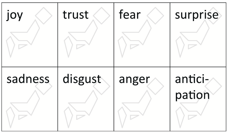 Figure: The 2x4 layout designed for widescreen displays, placing similar emotions adjacent to one another.
Real-World Case Study: The Miyagi Earthquake
On August 4, 2013, a significant earthquake hit Japan. The Emotion-Weather Maps captured a fascinating phenomenon:
- 12:00 - 13:00: Huge "clouds" of Surprise and Fear appeared over the Tohoku region.
- 13:00 - 14:00: While the "Surprise" cloud vanished almost instantly, the Fear cloud lingered and even intensified as the word "Tsunami" began to trend.
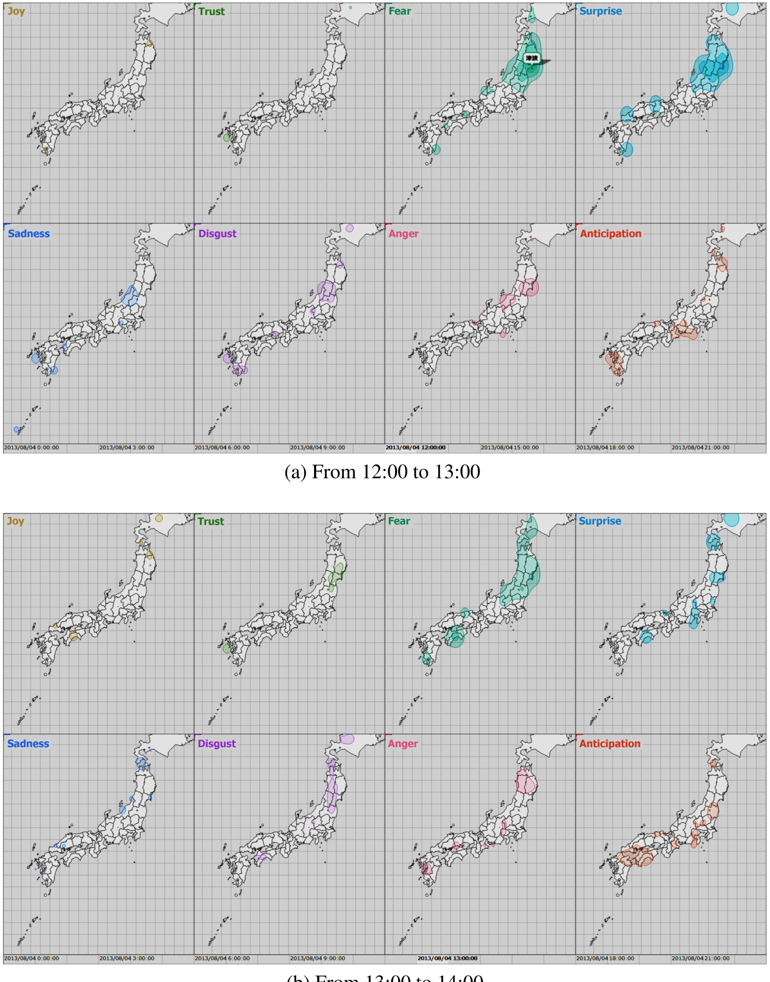 Figure: Emotion-Weather Maps showing the regional emotional shift during the earthquake.
Critical Insight & Conclusion
The true value of this work lies in its Inductive Bias toward human perception. By designing maps that look like weather reports, the authors bridge the gap between complex NLP data and human intuition.
Limitations: The paper relies on a relatively simple keyword-based dictionary for emotion extraction. In the era of LLMs, the "How" of extraction could be significantly improved to detect sarcasm or nuance.
Future Outlook: These maps aren't just for researchers; they are for governance. Imagine a city council seeing a "cloud of frustration" forming over a specific district—this could allow for proactive social intervention before local issues escalate.