
Hybrid Visualization: Bridging Matrix and Node-Link Diagrams for Dynamic Social Networks
Evaluation of a novel visualization for dynamic social networks
This paper introduces a novel timeline-based visualization for dynamic social networks that hybridizes characteristics of node-link diagrams and adjacency matrices. Developed using Tableau, the method focuses on representing temporal communication patterns (e.g., phone calls) through a juxtaposed, coordinate-like system to improve readability of individual connections over time.
TL;DR
Understanding how social relationships evolve over time is notoriously difficult because networks are rarely static. This paper presents a novel visualization approach that maps time to space using a "spine-like" structure. While it excels at identifying influential actors and specific interaction details, the study uncovers an inherent "path-finding" bottleneck similar to traditional adjacency matrices.
Context: The Dynamic Network Dilemma
In the world of Social Network Analysis (SNA), experts usually choose between two evils:
- Node-Link Diagrams: Great for seeing the "big picture" but become a chaotic "hairball" as edges increase.
- Adjacency Matrices: Excellent for dense data and avoiding edge crossings, but terrible for following paths or social "flow."
When you add the dimension of time, the problem multiplies. Animations force users to remember previous states (high cognitive load), while small multiples take up too much screen real estate.
The "Timeline-Link" Approach
The authors propose a design that blends the best of both worlds. Imagine a coordinate system where:
- Y-Axis: Lists all actors (individuals) in the network.
- X-Axis: Represents time, but specifically discrete communication events (IDs).
- Visual Logic: A phone call is a vertical blue line connecting two dots on the horizontal tracks of the participants.
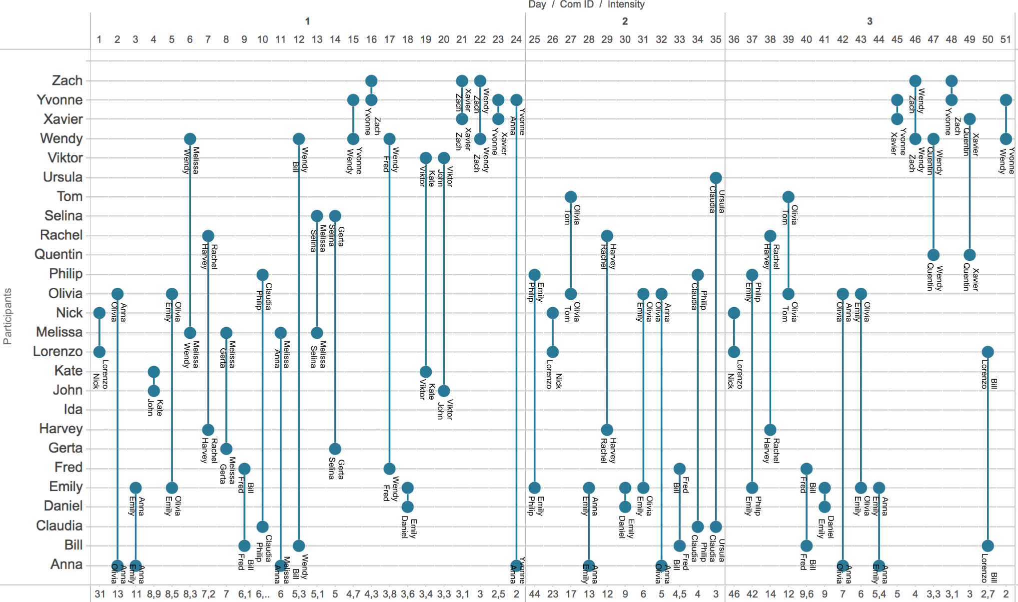
Figure 1: The proposed visualization showing phone call IDs on the x-axis and participants on the y-axis. Notice the "intensity" (call duration) represented at the bottom.
By juxtaposing events side-by-side, users can scan a single horizontal line to see the "biography" of an actor's interactions without the visual noise of intersecting lines found in traditional diagrams.
Performance: Where It Shines and Where It Struggles
The researchers conducted a qualitative study using a dataset of 98 phone calls. The results were polarizing based on the task type:
The Wins:
- Node/Edge Counting: Users found it trivial to count participants and total interactions.
- Identifying Influencers: Finding the "most connected" person was intuitive—users simply looked for the horizontal line with the most dots.
- Temporal Precision: High confidence in identifying when a specific relationship was most intense.
The Challenges:
- Path-Finding: This is the "Achilles' heel." If you need to find a connection from Person A to Person D via B and C, the error rate jumped to 67%.
- Memory Load: Because the visualization spreads events horizontally, users had to "scroll and remember" connections, which became "exhausting" for multi-step paths.
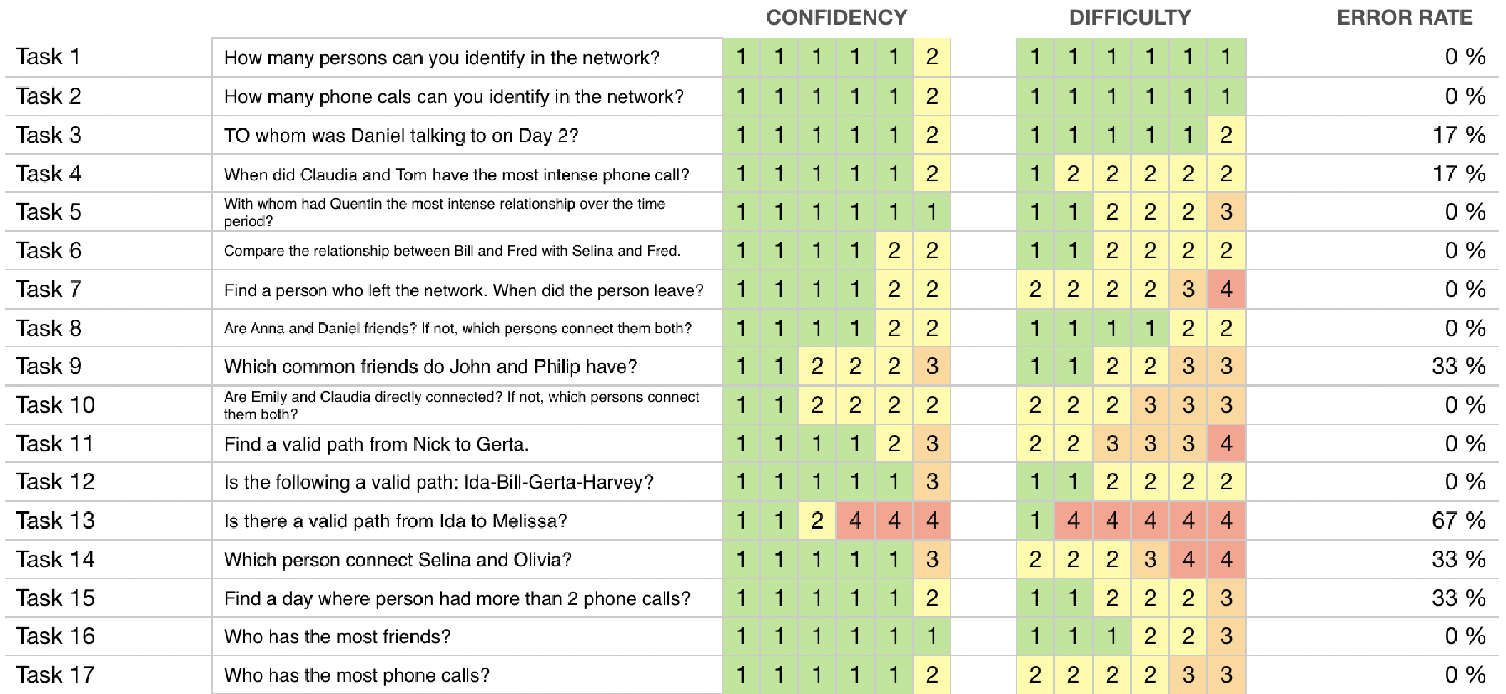
Table 1: User performance metrics. Note the sharp drop in confidence and accuracy for Task 13 (Path Finding).
Design Implications & Future Directions
The study highlights that no single visualization is a silver bullet. For dynamic networks, the authors suggest:
- Interaction is Mandatory: Static views aren't enough. Users requested filtering (e.g., "Show only Kate's calls") to manage complexity.
- Coordinated Views: Using this timeline view alongside a traditional node-link diagram could allow users to switch context between "Detail" and "Topology."
- Labeling Matters: Small details, like rotating text from vertical to horizontal, significantly impact the speed of analysis.
Critical Analysis
As a Senior Tech Editor, I find the "Time-to-Space" mapping compelling for audit-style tasks (e.g., "Whom did the suspect call on Tuesday?"). However, the failure in path-finding suggests that this method lacks topological transparency. It treats relationships as isolated events rather than a unified structure. Future iterations should focus on "Highlighter" features where clicking a node illuminates its neighbors across the entire timeline to mitigate the memory load.
Takeaway
This work successfully domesticates the "hairball" problem for dynamic networks by borrowing from matrix logic, making it a powerful tool for forensic-style social analysis, even if it sacrifices some architectural "flow."