
Eye-Tracking the UI: Decoding Player Intuition in Managerial Racing Games
Eye-Tracking to Enhance Usability: A Race Game
This study applies eye-tracking technology to evaluate the usability and playability of a social-managerial racing game. By recording gaze patterns and heat maps of 10 participants, the research identifies critical UI/UX flaws and provides actionable design improvements for game elements.
TL;DR
In the world of game design, what a player says they did is often at odds with what they actually saw. This paper leverages eye-tracking technology to bridge this gap, using a mid-core managerial racing game as a case study. By analyzing gaze heat maps, the research uncovers how poorly designed HUDs (Heads-Up Displays) and ambiguous feedback messages can break immersion and frustrate players, ultimately offering a blueprint for data-driven UI redesigns.
Background: The Usability-Playability Nexus
In Human-Computer Interaction (HCI), "Usability" (how easily a task is accomplished) and "Playability" (the quality of the gaming experience) are two sides of the same coin. For a managerial game—where the player isn't just driving but making high-stakes tactical decisions—the interface is the game. If the "Pit Stop" button is invisible or the "Tavern" menu is confusing, the game fails regardless of how good the underlying physics engine might be.
The "Invisible" Friction: Why Traditional Testing Isn't Enough
As the author notes, users often forget or ignore up to 47% of where they looked immediately after a task. In a fast-paced racing game, these split-second visual fixations are the difference between a satisfied player and a churned one. The research identifies that while players have "driving habits," they also have "looking habits" that designers often ignore.
Methodology: Seeing Through the Player's Eyes
The study conducted tests at the METU Human-Computer Interaction Research Laboratory using the Tobii 1750 eye tracker.
- The Subjects: 10 experienced gamers (the "mid-core" target demographic).
- The Tasks: Players were given freedom to manage their team across four hubs: The Race, The Garage, The Academy, and The Tavern.
- The Data: The system tracked location, duration, and the "path" of eye movements to create Heat Maps.

Key Insights & Visual Evidence
The most striking findings came from comparing where designers thought players would look versus where they actually looked.
1. The "Tactic" Distraction
In the Race Screen, eye-tracking revealed that tactical buttons on the lower left were so "loud" visually that they distracted players from watching their car on the track. Instead of a seamless managerial flow, players were physically struggling to balance their attention between the car's position and the GUI.
2. The Feedback Gap in the Academy
The heat maps for the "Academy" screen (where players train pilots) showed intense focus on the action panels. However, a staggering 77% of players failed to realize that classes followed a schedule. The visual data showed they were looking for a "Start" button that didn't exist, highlighting a failure in passive feedback.
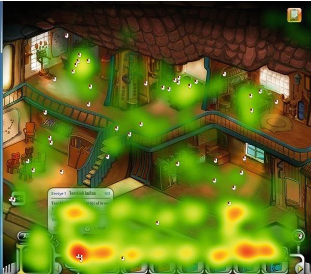 Above: The heat map shows concentrated gaze on the lower action panel, yet players remained confused about the underlying mechanic.
3. Ambiguous Icons: The "P" Problem
A classic usability pitfall was found in the "Pit Stop" button. Labeled simply with "P," many players—unfamiliar with specific racing terminology—didn't realize its function until it was too late. Eye-tracking showed players scanning the screen for help during critical car failures but missing the "P" button entirely because it didn't align with their mental model.
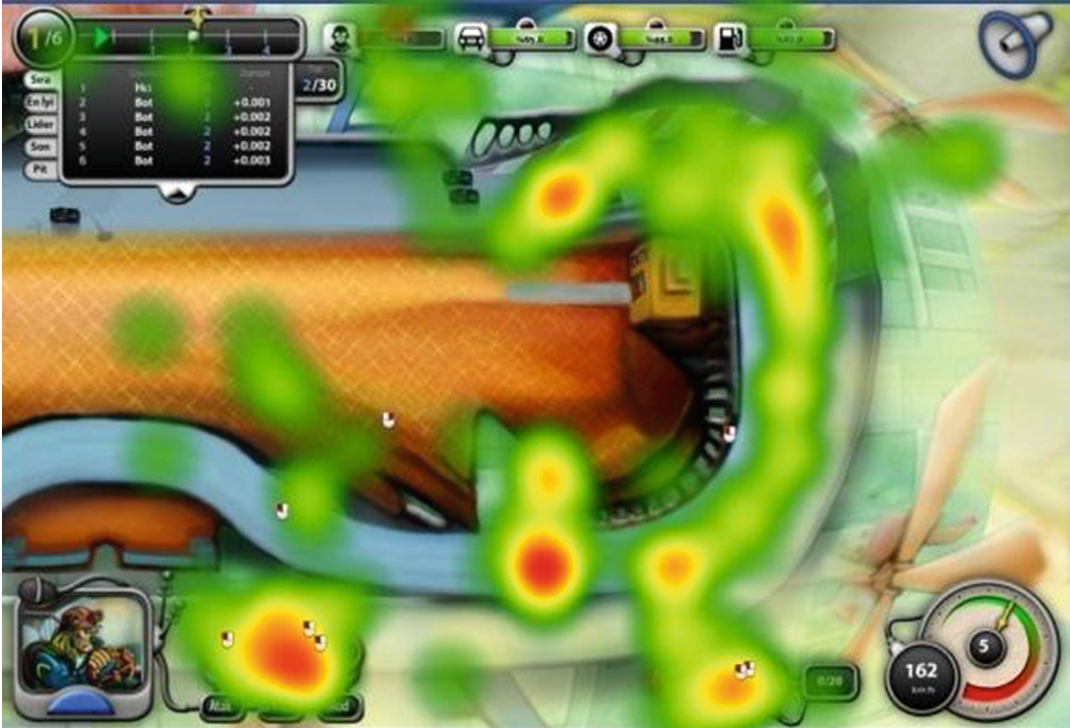 Visualizing the Race GUI: The study suggested moving controls closer to the center of action to reduce "gaze travel time."
Critical Analysis: Is More Data Always Better?
While the study provides a surgical look at UI failures, it also highlights the limitations of the "Mid-core" genre. Players in this study expressed a desire for more "active driving" rather than just managerial oversight. This suggests that Usability data can sometimes reveal a more fundamental Game Design conflict: the players may have been looking for controls that weren't meant to be there in a simulation-style game.
Takeaways for Modern Devs:
- Close the Feedback Loop: Instant visual confirmation is required for background processes (like the Academy classes).
- Minimize Gaze Travel: Essential buttons (like Pit Stops) must be within the peripheral vision range of the main action area.
- Kill the Jargon: Unless your game is a hardcore simulator, use descriptive icons instead of single-letter abbreviations.
Conclusion
This research demonstrates that eye-tracking is no longer a luxury for academic labs but a vital tool for game studios. By identifying "unobtrusive images" and "crowded screen elements" before release, developers can ensure that the primary challenge of the game is the strategy itself, not the interface used to execute it.