
LinkedUI: Solving Social Media Fragmentation through Deep Integration and Recommendation
Facilitating consumption of online social networking services on mobile devices
This paper introduces LinkedUI, an innovative mobile social network aggregator that integrates multiple SNS streams into a unified handset interface using hypertext navigation and personalized recommendations. It addresses the overhead of switching between apps and the "information overload" of social awareness streams on mobile devices.
TL;DR
Long before the "super-app" era, users struggled with jumping between Facebook, Twitter, and Flickr on tiny screens. LinkedUI was a pioneering research platform from Nokia that merged these feeds directly into the mobile OS. By using hypertext navigation and smart recommendations, it transitioned mobile interaction from "managing apps" to "consuming content."
Background Positioning
Published in 2011, this work sits at the intersection of Ubiquitous Computing and Mobile HCI. It reflects a pivotal moment when mobile manufacturers (like Nokia, Motorola, and Microsoft) were trying to reclaim the user experience from third-party apps by building social functionality directly into the "Phonebook" and "Home Screen" layers.
Problem & Motivation: The Tax of Fragmented Social Streams
In 2011, 25% of social awareness streams originated from mobile. However, the UI was punishing:
- Interaction Fragmentation: Users had to open separate apps for every service, leading to high cognitive load.
- Micro-level Friction: Constant window switching prevented users from focusing on actual content objects.
- Information Overload: Real-time fetching meant too much to read, yet no way to filter for quality.
The author’s insight was that social consumption (reading/glancing) is the most frequent activity but the least optimized. They hypothesized that moving to a content-centered design—where the UI is built around the "who" and "where" rather than the "which app"—would solve these pains.
Methodology: LinkedUI and Hypertext Navigation
LinkedUI wasn't just another app; it was a fundamental rethink of the mobile UI.
1. Unified Aggregation
Instead of a "Universal Inbox" (which just lists items), LinkedUI used hypertext transitions. If you saw a post from a friend, you could click their identity to see all their content across all services, or click a geo-tag to see posts from that location nearby.
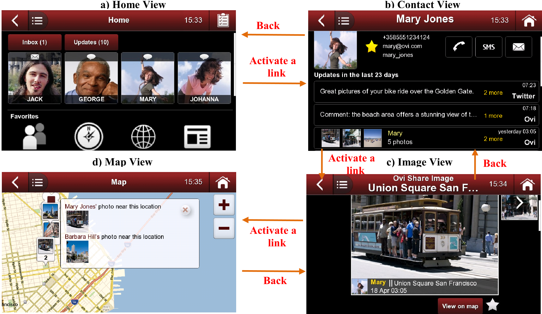 Figure 1: Hypertext navigation between key LinkedUI views. Note how identity and location serve as the connective tissue between disparate services.
2. Contextual Recommendation
The system prioritized feeds based on:
- Familiarity: How often the user interacted with a specific contact.
- Recency (Age): Prioritizing "fresh" content.
- User History: Learning preferences over time to highlight what is "likely to be interesting."
Experiments & Results: Serendipity over Accuracy
The research involved three published stages, moving from web-usage analysis to laboratory tests and finally field trials.
Key Findings:
- Content-Centeredness: Users preferred focus on objects (people, photos) rather than UI elements (buttons, menus).
- The "Glance" Practice: Field trials showed users don't read everything instantly. They glance at intervals. LinkedUI's real-time notifications supported this rhythmic checking.
- Serendipity: Because social content was integrated into logical views (like the phonebook), users "stumbled upon" interesting updates while performing unrelated tasks.
Quantitative Insight:
The recommendation system achieved "reasonable accuracy." While it did not drastically spike traditional "User Experience" metrics in the short term, the fact that most users chose to keep the feature active after three weeks suggests a high "latent value" in noise reduction.
Critical Analysis & Conclusion
Takeaway
LinkedUI proved that the mobile OS should be more than a grid of icons; it should be an integrated portal. Its use of hypertext navigation was a sophisticated way to handle many-to-many relationships in social data.
Limitations
- Ecosystem Lock-in: Deep integration makes it hard to ship as a simple "app," requiring deep OS hooks.
- Predictability: As with many intelligent systems, users sometimes felt a lack of control or "breadth of experience" when the algorithm hid certain content.
Future Outlook
Today, we see the remnants of LinkedUI’s philosophy in the "Widgets" of iOS and Android and the algorithmic "For You" feeds of social giants. The core lesson remains: in a world of infinite content, the UI's job is to act as a context-aware filter, not just a container.