
Decoding the Mobile Screen: Why Gender and Culture Shape Icon Recognition
The Effects of Gender Culture on Mobile Phone Icon Recognition
This study investigates how gender and icon types (concrete, abstract, arbitrary) influence mobile phone icon recognition and preference among Taiwanese teenagers. Utilizing a mixed-methods approach with content analysis and questionnaires, it identifies that while concrete icons are most preferred, abstract icons often yield higher recognition rates, particularly among females.
TL;DR
In the hyper-competitive mobile market of Taiwan, the "language" of icons is the gatekeeper of user experience. This study reveals a fascinating cognitive split: while Taiwanese teenagers—especially males—prefer concrete icons for their ease of learning, abstract icons actually lead to higher recognition accuracy, with females demonstrating a superior ability to decode conceptual visual metaphors like "Call Records."
The Visual Language Gap
The proverb "a picture is worth a thousand words" is the bedrock of UI design, yet not all pictures are created equal. In the small-screen environment of a mobile phone, icons must bridge the gap between abstract software functions and human intuition.
The researchers identified a critical tension:
- Concrete Icons: Direct replications of reality (e.g., a physical book for a phonebook).
- Abstract Icons: Visualizations of concepts (e.g., arrows for call records).
- Arbitrary Icons: Learned symbols with no inherent link to the object (e.g., specialized brand logos).
While we assume "realism" is always better, the study suggests that the Inductive Bias of the user—shaped by gender and culture—dictates how effectively these symbols are processed.
Methodology: Testing the Teenage Mind
The study sampled 60 students from top Taiwanese universities, using icons from best-selling mobile brands of the mid-2000s. Participants were subjected to two tests:
- The Recognition Test: Can you identify the function of this icon?
- The Preference Test: Which icon do you actually like using?
 Figure 1: Examples of the 15 icons tested, spanning from concrete representations to abstract concepts.
Key Findings: The Abstract Advantage
The data yielded two major surprises that challenge standard design conventions:
1. Accuracy vs. Affection
Surprisingly, Abstract Icons yielded the highest recognition scores (avg. 4.3 for males, 4.6 for females). However, when asked what they preferred, both genders overwhelmingly chose Concrete Icons. This suggests a "comfort vs. performance" trade-off: users feel safer with realistic icons, but conceptual icons might actually be more distinct and memorable once the initial learning curve is over.
2. The Female Edge in Abstract Reasoning
The study found that females outperformed males in recognizing abstract icons. Specifically, for the "Call Records" function, the gender difference was statistically significant (p=0.019). The researchers hypothesize that females perceive more "visual stimulation" in their environment, allowing them to subconsciously memorize and decode complex conceptual symbols more effectively than their male counterparts.
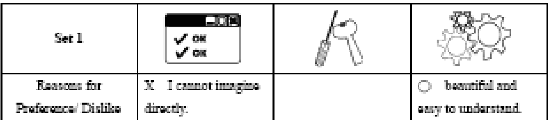 Figure 2: Preference vs. Recognition ratings across the different icon sets.
Deep Insight: Beyond Just Pictures
Why do these differences exist? The study points toward Gender Culture. Male participants often cited "ease of learning" as the reason for preferring concrete icons—a utilitarian approach. Female participants, however, favored the "richer concepts" provided by abstract icons.
This suggests that for a product to succeed in a diverse market like Taiwan, designers should not rely solely on "Arbitrary" symbols that require repeated rote learning. Instead, they should leverage Concrete icons for initial adoption and Abstract metaphors for long-term functional efficiency.
Conclusion & Legacy
This research highlights that UI is never "gender-neutral." As we move into an era of increasingly minimalist and flat design, the ability of users to recognize abstract symbols becomes even more vital.
Limitations: The study's sample was limited to university-aged teenagers in 2005. In a modern context, "Arbitrary" icons (like the 'Save' floppy disk or the 'Hamburger' menu) have become "Concrete" in the minds of digital natives through sheer exposure.
Takeaway: Designers should balance the "Conceptual Richness" preferred by female users with the "Tangible Clarity" demanded by males to create a truly universal interface.