
Beyond the Small Screen: Reimagining User Experience in Mobile Social Networks
How to Improve User Experience in Mobile Social Networking: A User-Centered Study with Turkish Mobile Social Network Site Users
This study investigates the user experience (UX) of mobile social networking sites (MSNS) through a multi-method qualitative usability test on Facebook using iPhone and BlackBerry devices. It identifies critical usability gaps and proposes a set of design guidelines tailored for mobile platforms.
TL;DR
Social media didn't just move to mobile; it underwent a traumatic migration. This study reveals that the early mobile Facebook experience was plagued by "hidden" functions, confusing translations, and a failure to respect the physical constraints of hardware. By tracking Turkish students across iPhone and BlackBerry devices, the authors define why our favorite apps originally felt so broken and how design principles—not just better code—fixed them.
Contextualizing the Friction
In the early 2010s, mobile social networking was the "Wild West." Developers were caught between two worlds: the established, comfortable logic of the desktop browser and the emerging, chaotic world of touchscreens and physical QWERTY keyboards. This paper identifies a core tension—users expected their mobile apps to behave like their PCs, but the hardware limitations made this impossible.
Methodology: Seeing Through the User's Eyes
To move beyond subjective opinions, the researchers utilized a laboratory environment equipped with eye-tracking and video recording.
- Demographic: 25 experienced Turkish social media users.
- Devices: iPhone (Touch-centric) vs. BlackBerry (Trackball/Keyboard-centric).
- Tasks: Status updates, photo tagging, and the surprisingly difficult task of "logging out."
The Core Friction Points (The "Why" it Failed)
1. The Visibility Trap
On BlackBerry, "Log Out" was buried deep within "Options," which was itself hidden behind a "Menu" button. Users, conditioned by desktop browsers to look at the top-right or scroll to the bottom, were left stranded. The study found that 83% of BlackBerry users failed to log out because the action lacked a "signifier."
2. The "Lost in Translation" Paradox
Localization is more than translation. The study found that the Turkish phrase for "Status Update" (Durum güncelleme) was technically correct but practically confusing. Users associated "Update" with "Refresh." When interviewed, users preferred terms like "What are you thinking?" or "Share on the wall"—terms that matched their social intent rather than the technical action.
3. Gestural Missteps
iPhone users struggled with "fat finger" syndrome. While the larger screen offered visibility, small touch targets led to accidental activations. Furthermore, the eye-tracking data revealed a fascinating insight: users ignored the "tagging" icon because its design too closely resembled the system-standard "share" icon, leading to significant cognitive load.
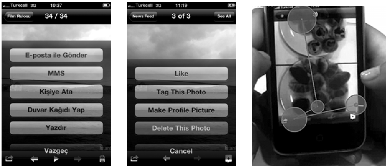 Figure 1: Comparison of icons where users struggled with discoverability due to visual similarity.
Why This Matters: The Architecture of Intimacy
The study highlights that mobile isn't just a "smaller browser." It is a context-dependent tool.
- Bandwidth Sensitivity: Users chose the "shortest path" for messaging (replying directly from a feed) because they didn't trust the app to load a full contact list quickly.
- Social Strategy: Turkish users utilized MSNS pragmatically—when they lacked credit for a phone call, they used SNS messages via Wi-Fi as a cost-saving tool.
Final Insights & Design Guidelines
The paper concludes with a manifesto for mobile UX:
- Value Visibility: Don't hide core tasks for the sake of a "clean" UI.
- Predictable Discovery: Use clear labels; icons alone are rarely enough.
- Cultural Nuance: Speak the user's language, not the developer's dictionary.
- Hardware Awareness: Design for the thumb, not the mouse cursor.
Conclusion
This research serves as a vital reminder that usability is not a feature—it is the foundation. By bridging the gap between desktop expectations and mobile reality, designers can transition from making apps that work to making apps that feel "natural."