
Beyond Color Theory: Mapping the Emotional DNA of Web Design with Bayesian Networks
Inferring Relations Between Color and Emotional Dimensions of a Web Site Using Bayesian Networks
This paper presents a novel methodology for selecting website color schemes by mapping physical color attributes to user emotional responses using Bayesian Belief Networks (BBN). By training a machine learning model on empirical data from a case study involving 46 participants, the authors established a probabilistic framework to predict and guide emotionally-driven web design.
TL;DR
Choosing the right color scheme for a website is often treated as an art, but this paper argues it is a science of probability. By employing Bayesian Belief Networks (BBN), the researchers have created a framework that predicts how specific color attributes (like brightness and saturation) trigger emotional responses such as "Reliability" or "Professionalism." The study reveals that technical properties—specifically dominant color brightness—hold more sway over user emotion than the actual choice of hue.
The "Subjectivity" Trap in Web Design
Most web designers rely on experiential guidelines that are frequently non-representative or contradictory. While we know aesthetics are a strong determinant of satisfaction, bridge the gap between "I want this site to feel professional" and "What specific Hex code should I use?" remains a significant challenge. Traditional surveys fail because direct evaluation of colors is highly subjective; asking someone "Do you like blue?" provides little utility for complex UI layouts.
Methodology: Engineering Emotion
The authors propose an indirect approach. Instead of asking for preferences, they collected 4,416 evaluations where users rated various color schemes against 12 emotional descriptors.
The Bayesian Approach
The heart of this research is the Bayesian Belief Network. Unlike linear models, a BBN can handle uncertainty and illustrate complex dependencies. It treats design attributes (number of colors, contrast, brightness) and emotional values as nodes in a graph.
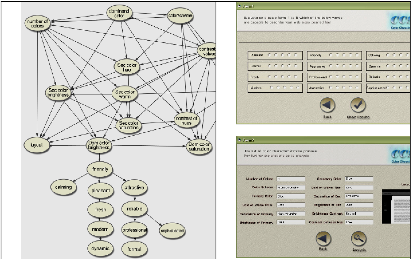
Figure 1: The BBN structure showing the hierarchical influence of design variables on emotional dimensions.
Key Insights: What Actually Drives Perception?
The study categorized the influence of color factors into four levels of importance, revealing surprising results that challenge common design intuition:
- Brightness is King: The brightness of the dominant color has a significantly stronger emotional effect than its hue (the actual color identity).
- Saturation Contrast: The most effective combination for positive emotional reception is a high-saturation dominant color paired with a low-saturation secondary color.
- The "Cold" Advantage: Cold colors (blues, greens) were consistently perceived as more suitable for web environments than warm colors (reds, yellows).
- Complexity Matters: Interestingly, the study suggested that using more than four colors or adopting monochromatic/analogous schemes with low contrast levels led to better emotional outcomes.
Critical Analysis & Future Outlook
This work marks a transition from Aesthetic Usability as a vague concept to a computable feature. By mapping these relationships, the authors have paved the way for automated design assistants that can "reverse-engineer" a palette from a set of desired brand values (e.g., "Give me a palette that scores 90% in Reliability").
Limitations
- Demographic Bias: The study primarily involved students aged 21-31, which may not represent the global or aging population’s emotional response to color.
- Static vs. Dynamic: The research treats color as a static element, whereas modern web design involves motion, transparency, and dark/light mode transitions.
Conclusion
The integration of machine learning into the creative process doesn't replace the designer; rather, it provides a "probabilistic compass." As we move toward more personalized web experiences, frameworks like this will be essential for creating interfaces that don't just work well, but feel right.