
Oracle Bone Icons: Bridging 3,500 Years of Wisdom for Modern Social Networks
Designing infographics/visual icons of social network by referencing to the design concept of ancient Oracle Bone characters
This paper explores a novel design framework for modern social network infographics and icons by referencing the concept of ancient Chinese Oracle Bone characters. The authors propose the "Oracle Bone Styled Icons" methodology to create "sensory symbols" that facilitate pre-attentive processing in human-computer interaction.
TL;DR
Is the future of UI design hidden in the 3,500-year-old carvings of the Shang Dynasty? This paper proposes that ancient Oracle Bone characters—the earliest form of Chinese writing—hold the key to creating "sensory symbols" that the human brain can process in under 250ms. By redesigning WeChat's interface using these ancient principles, researchers aim to eliminate the "learning curve" associated with modern digital icons.
The Cognitive Bottleneck: Why Your Icons Are Failing
In modern UX design, we often settle for Arbitrary Symbols. Think of the word "DOG"—it looks nothing like a dog; you had to learn the alphabet and the vocabulary to understand it. In contrast, Sensory Symbols leverage our primary visual cortex to identify objects almost instantly, without prior study.
The authors point out that current social network icons are often inconsistent and visually complex, forcing users to "think" before they "click." This breaks the "pre-attentive" processing flow—the initial 200ms where our brains scan visual fields before our eyes even move.
Methodology: The Ancestral Design Logic
The researchers argue that our ancestors, who carved characters into turtle shells and ox bones with sharp stones, were the original "minimalist" designers. They followed two core constraints that are remarkably relevant to modern mobile screens:
- Complexity Minimization: Hard surfaces meant fewer strokes were better.
- Maximized Similarity: To be understood, symbols had to mirror the physical contour of the objects they represented.
The Neurological Bridge
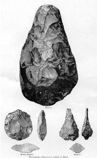 Fig 1: The paper emphasizes that while technology changes, the human visual cortex remains identical to that of our ancestors.
Case Study: Redesigning WeChat
The authors applied these principles to WeChat, one of the world's most popular social networks. They deconstructed modern menu items and rebuilt them using Oracle Bone radicals.
1. The "Search" Icon
Instead of a generic magnifying glass, the authors looked at the Oracle Bone character for "Search," which depicts a hand holding a torch to light up a house.
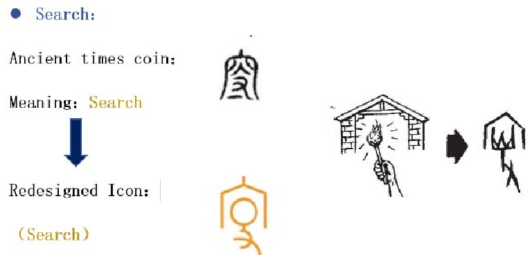 Fig 2: Evolution of the 'Search' icon from ancient pictograph to modern infographic.
2. The "Moments" Icon
For "Moments" (social feed), they utilized the ancient symbol for "friends"—originally depicted as two hands holding each other. This captures the essence of the action (social connection) rather than a literal representation of a camera or a clock.
3. Integrated Interface
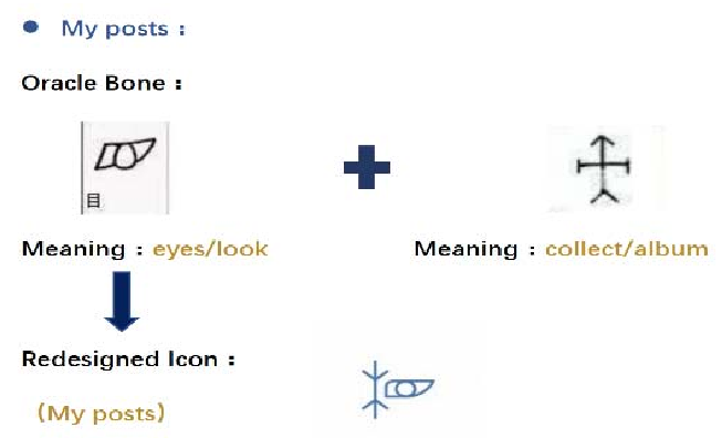 Fig 3: The original WeChat "Me" interface compared to the proposed Oracle Bone-inspired design.
Experimental Insight & Future Work
The core "win" of this method is the transformation of abstract digital functions into Logographic Scripts. By reducing the "strokes" of an icon and focusing on "continuous contours," we align with how the brain naturally seeks patterns.
While the paper is currently in its preliminary stage, the researchers plan to conduct rigorous usability tests to measure:
- Pre-attentive perception: Do users identify these icons faster than standard ones?
- Cognitive Cost: Do users feel less "mental fatigue" when navigating the interface?
Conclusion: A Return to Roots
This study proves that "new" is not always "better." By looking back 3,500 years, designers can find a blueprint for Universal Design—a visual language that bypasses cultural and linguistic barriers to speak directly to the human visual system.
Takeaway: For the next generation of MR/AR or high-density data dashboards, the secret to speed might just be carved in bone.