
Harmonizing the Digital Noise: Audio-Visual Renderings for Social Media Analytics
Information visualisation for social media analytics
This paper introduces a multimodal framework for the geospatial and temporal visualization of social media data (Twitter, Instagram, Viddy). By utilizing Kernel Density Estimation (KDE) and the Stanford CoreNLP library, the authors develop an interactive audio-visual sentiment map that encodes text-based emotions into color and sound.
TL;DR
The paper presents a novel approach to navigating the "data shadows" of our digital lives. By combining Kernel Density Estimation (KDE) with Deep Learning sentiment analysis, the researchers from Trinity College Dublin transformed noisy social media feeds into an interactive, animated audio-visual map. This allows users to not only see where people are tweeting but to hear the collective emotional pulse of a city in real-time.
Background: Beyond the 2D Map
Social media data—comprising GPS coordinates, timestamps, and unstructured text—is a goldmine for urban sociology and event management. However, the sheer volume and "noise" of this data often lead to information overload. The authors identify a critical gap: traditional 2D static maps struggle to represent the fourth dimension (time) and the qualitative dimension (sentiment) without becoming unreadable.
Methodology: The Math and the Senses
The core of the system relies on a rigorous mathematical foundation to smooth out raw data points into continuous "probability surfaces."
1. Kernel Density Estimation (KDE)
Instead of just plotting dots on a map, the authors use KDE to estimate the density of activity. The formula for the spatial-temporal density is:
This allows the visualization to show "hotspots" of activity (saliency maps) rather than individual, cluttered data points.
2. Deep Sentiment Analysis
Using the Stanford CoreNLP library, the system extracts sentiment scores from tweet text. This isn't just a keyword search; it uses a dedicated deep architecture to understand the linguistic structure and emotional weight of the posts.
3. Audio-Visual Rendering
This is where the paper's unique contribution lies. To solve the problem of visualizing a 4D space (), the authors use:
- Animation: To handle the temporal domain ().
- Color Encoding: Bubbles on the map change color based on sentiment (e.g., Green for positive, Red for negative).
- Sonification: Sentiment is mapped to sound (high pitch for happiness, low pitch for sadness), creating a "sentiment rain" effect.
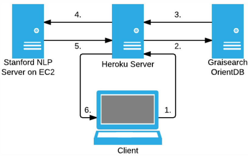 Fig 1: The architecture used for the web-based demonstrator, integrating OrientDB and external APIs.
Experimental Insights: The Dublin Marathon case
The authors tested their framework on two datasets: "Dublin Marathon 2014" and "Trinity College."
In the Trinity dataset, the KDE visualization (Fig 2) clearly highlighted hotspots around tourist attractions like the Campanile and the Book of Kells, proving that geolocated social data accurately reflects physical foot traffic and points of interest.
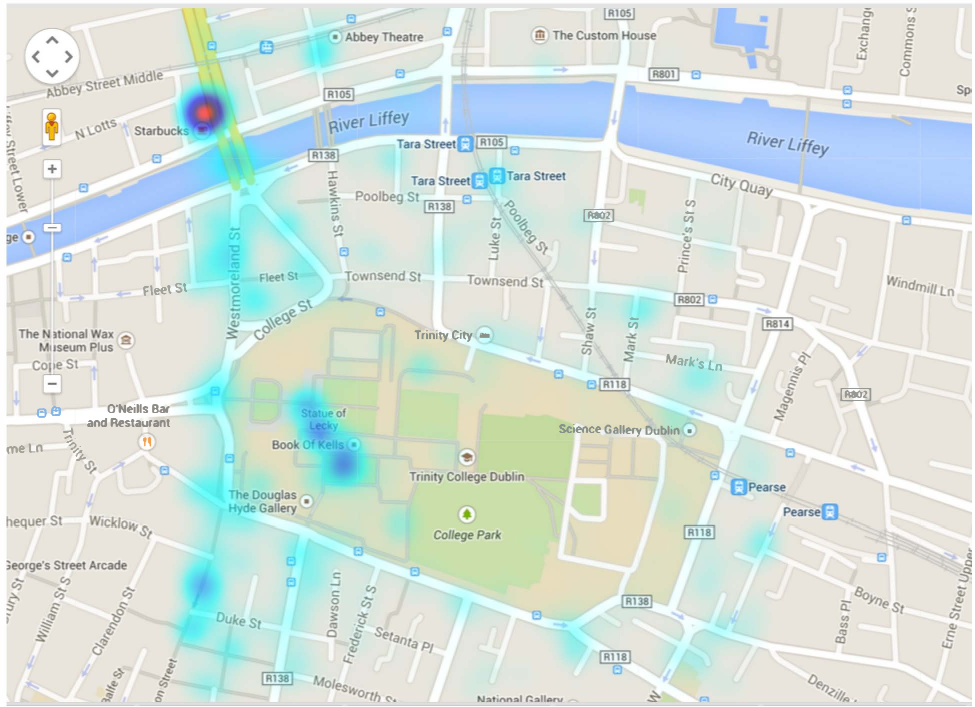 Fig 2: Saliency map showing high-density tweet activity over Trinity College Dublin.
For the Marathon dataset, the interactive map allowed researchers to track the "mood" of the city as the race progressed. By clicking on specific "bubbles," users could drill down into the raw JSON data to verify why a specific area was flashing red (negative sentiment) or green (positive sentiment).
Critical Analysis & Conclusion
Takeaway
This work demonstrates that multimodal visualization—specifically the inclusion of audio—reduces the cognitive load on the analyst. It shifts the paradigm from "searching for data" to "experiencing the data environment."
Limitations & Future Work
While the sentiment extraction uses SOTA deep learning for the time, the authors acknowledge that geolocated tweets are a "data shadow" and may not represent the entire population (selection bias). Future work aims to incorporate Information Theory to compare different KDEs mathematically, potentially automating the detection of "anomalous" emotional events in a city.
By bridging the gap between raw JSON packets and human sensory perception, this framework provides a powerful tool for anyone needing to understand the "heartbeat" of a modern city.