
Interactive Visual Classification: Precision Retrieval for Environmental Data
An environmental search engine based on interactive visual classification
The paper introduces an environmental domain-specific search engine that leverages interactive visual classification. Built atop a general-purpose search engine (Yahoo! BOSS), the system employs a Support Vector Machine (SVM) and a sophisticated visualization interface to filter and refine results for retrieving environmental nodes like weather, air quality, and pollen data.
TL;DR
This research presents a novel environmental search engine that empowers expert users to act as "live trainers" for machine learning models. By visualizing the "uncertainty space" of an SVM classifier, users can manually correct misclassified websites, resulting in a significantly more accurate and domain-specific search experience than standard query engines.
Background: The Noise in General Search
When searching for specific environmental "nodes"—websites providing real-time measurements for air quality, pollen, or weather—standard search engines (like Yahoo! or Google) often return a mixed bag of news articles, generic blogs, and irrelevant portals. The core challenge is that "relevance" in a highly specialized field is often nuanced, requiring a level of domain expertise that static algorithms struggle to capture.
The Core Innovation: Closing the Loop
The authors argue that the solution isn't just a better algorithm, but a better interface between human and machine. They developed a system that uses an SVM (Support Vector Machine) with a Radial Basis Function (RBF) kernel to classify search results into "Relevant" or "Irrelevant."
The breakthrough is the Interactive Classification Layer. Instead of accepting the SVM's output, users see a visual representation of how the model "thinks."
Methodology & Architecture
The framework consists of two phases:
- Web Search: A query is generated using combinations of environmental terms and geography (e.g., "weather+Helsinki") via an API.
- Visual Interaction: The resulting websites are mapped onto a 2D plane.

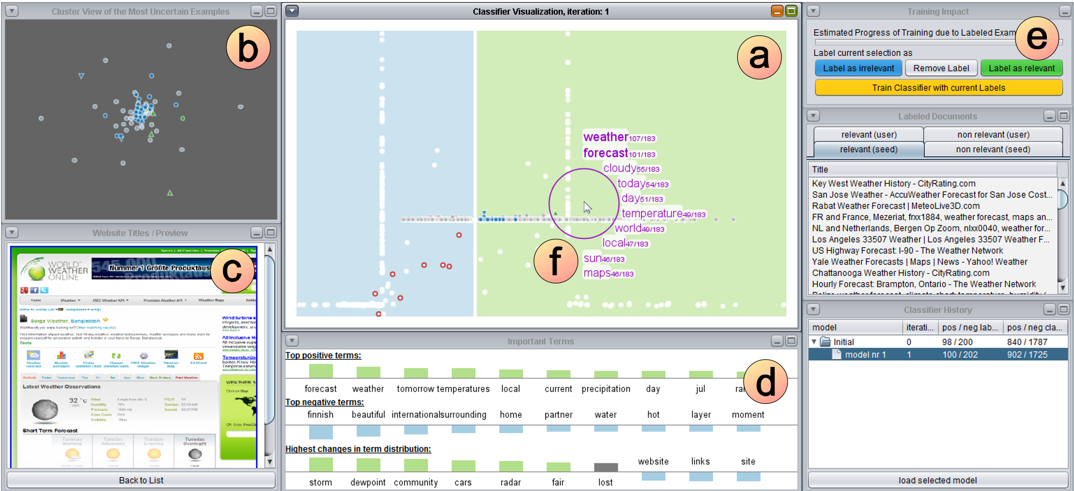
The Visualization Tool (Figure 2) includes:
- The Main View: A vertical white "decision boundary" separates classes. Dots closer to the boundary represent low-confidence classifications, visually signaling to the user where their input is needed most (Active Learning).
- Cluster View: Uses the Bisecting K-Means algorithm and Least Square Projection (LSP) to group similar websites together, helping users label entire groups at once.
- Important Terms View: Displays the features (keywords) that the SVM is using to make decisions, providing a level of "explainability" to the model.
Experimental Results: Tuning the Machine
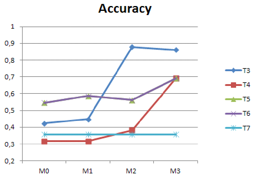
The research team tested the system with six experts over eight different query test sets. They used a cross-validation approach where models were iteratively updated (M0 to M3).
Key Findings:
- Accuracy Improvement: In almost every test set (T3 to T6), the accuracy increased as users provided more feedback.
- Stability Preview: The system highlights (in blue) which results would change before the user commits to retraining, allowing for safe and predictable model steering.
Critical Insight & Conclusion
This paper, while published in 2012, anticipates the modern surge in Interpretable AI. It demonstrates that for niche domains like environmental science, the goal is not to automate the expert out of the loop, but to provide the expert with more powerful tools to "sculpt" the data.
Limitations: The reliance on manual labeling (even if visual) is time-consuming. While 15 minutes per user is manageable for experts, scaling this to broader domains would require more automated "seed" labels.
The Takeaway? Visualization is not just for viewing results; it is a critical interface for training models. By making the "decision boundary" tangible, the system transforms a complex mathematical concept into an intuitive sorting task.