
Beyond Citations: Mapping the Future of Research Collaboration with PCI
Recommending intra-institutional scientific collaboration through coauthorship network visualization
This paper introduces a visual recommendation system for intra-institutional scientific collaboration using a novel Potential Collaboration Index (PCI). The method combines Social Network Analysis (SNA) with bibliographic metrics to identify compatible researchers, achieving a high relevance rate where 70% of participants found the tool useful for expanding their research networks.
TL;DR
Scholarship is no longer a solo endeavor, yet finding the right collaborator within a large university remains surprisingly difficult. This paper presents a "Potential Collaboration Index" (PCI) and a force-directed visualization tool that identifies high-value partners by balancing expertise, social network position, and organizational closeness.
Background: The Limits of Individual Metrics
For decades, we have measured researchers using the H-index or simple publication counts. However, as the authors point out, these metrics reward individual output but ignore the "collaborative advantage"—the fact that collaborative papers are cited more frequently and drive higher productivity. The challenge isn't just finding a "famous" researcher; it's finding the right one who is reachable, similar in interest, and organizationally close enough to work with.
The "Potential Collaboration Index" (PCI)
The core innovation is the PCI formula. It moves away from "impact-only" metrics to a holistic compatibility score.
The Formula
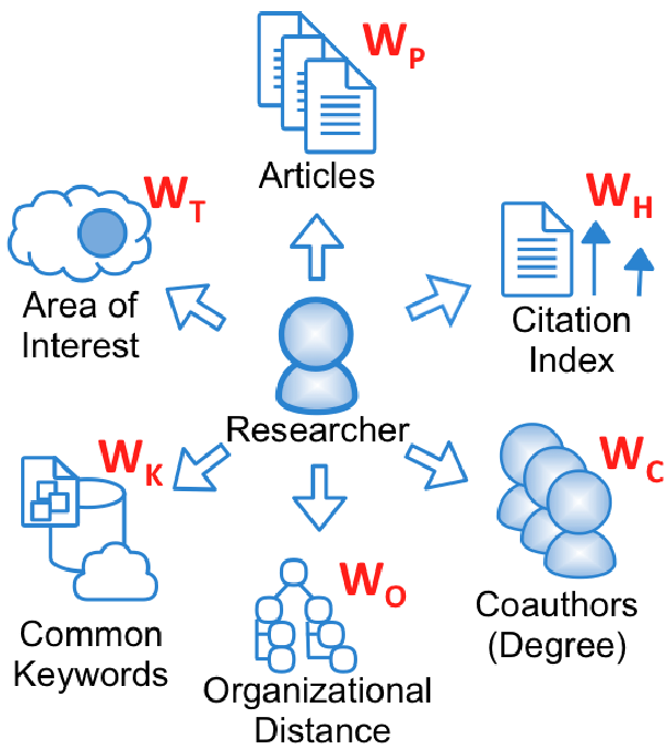
The PCI is calculated as a weighted sum of five factors, further modulated by topic similarity ():
- (Popularity): Number of coauthors (centrality).
- (Productivity): Total number of publications.
- (Prestige): The normalized H-index.
- (Keywords): Semantic overlap in research interests.
- (Organization): Geographical and departmental proximity.
By including Organizational Distance, the system acknowledges that a researcher in the same building is more likely to collaborate than one across the country, even if their research topics are identical.
Visualization: The "Pivot" Perspective
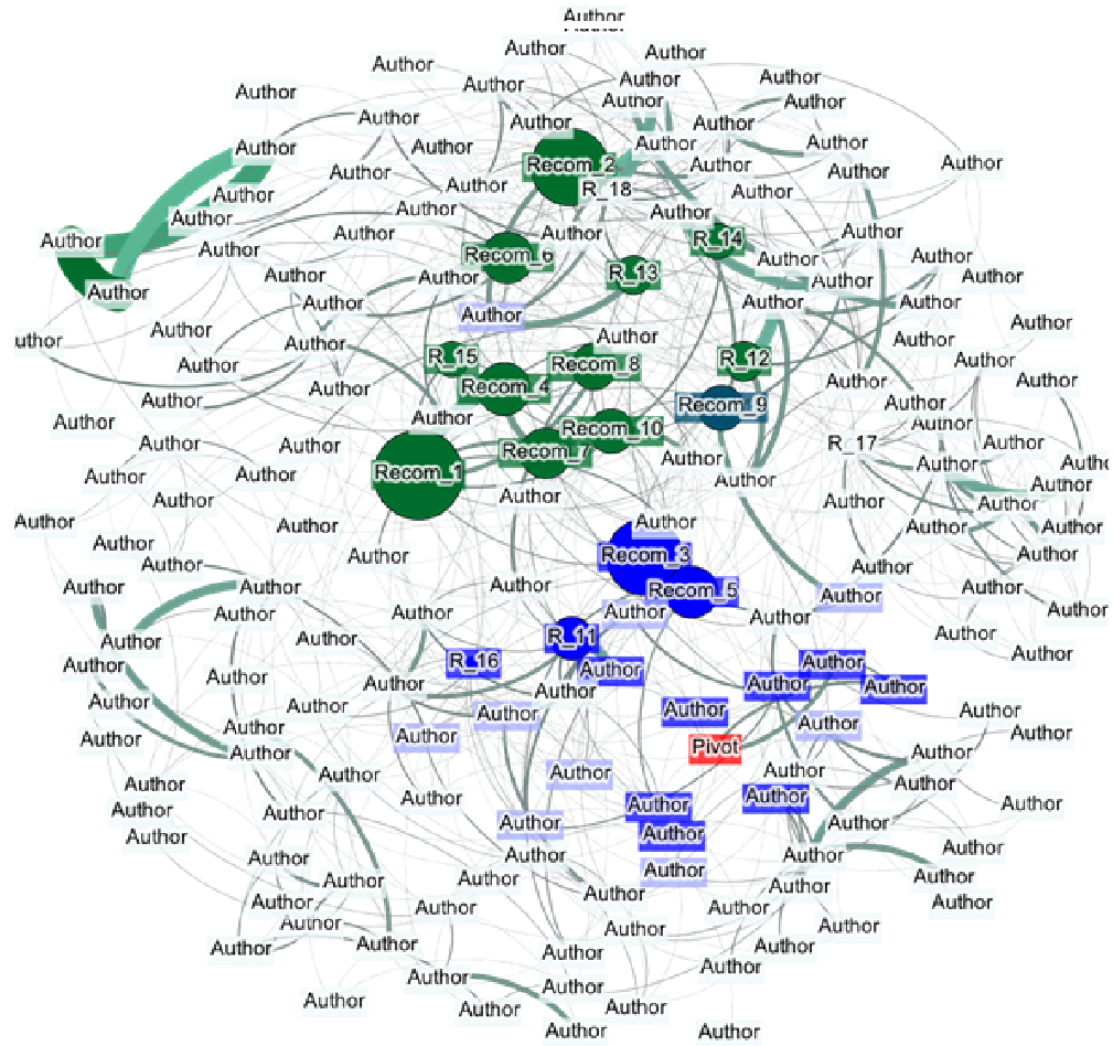
The authors argue that a list of names is insufficient. To provide "contextual awareness," they developed a visualization based on the Fruchterman Reingold layout.
- The Pivot (Red): The researcher seeking recommendations.
- The Network (Blue/Gray): Existing coauthors and the broader community.
- The Targets (Green): Recommended collaborators, where node size reflects the PCI score.
This allows a researcher to see not just who is recommended, but how that person connects to their existing circle—leveraging the Triangle-Closing Model (if my friend works with them, I am more likely to).
Does it Work? (Experimental Results)
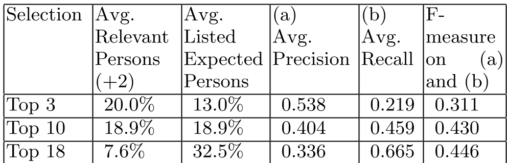
The study was conducted at a multi-campus university with 926 authors. The results were categorized by researchers who participated in interviews.
- Precision and Recall: The "Top 10" recommendations proved to be the "sweet spot" with an F-measure of 0.430.
- User Validation: Over 63% of recommendations were rated as "good" (either expected or valuable unexpected partners).
- The "Structural Hole" Effect: Participants noted that the map helped them identify "brokerage" positions—areas where they could bridge two research groups that weren't talking to each other.
Critical Insight: Complexity and Human Factors
The most fascinating finding was that 18.3% of recommendations were unknown to the participants. While some see this as "inaccuracy," in the world of recommendation, this is often "serendipity." The challenge for future versions (as suggested by the authors) is to include PhD students and external authors, as they are often the primary drivers of actual lab work.
Conclusion
This paper shifts the focus of academic analytics from evaluating scientists to connecting them. By quantifying social "closeness" and visual "reachability," the PCI tool serves as more than just a search engine; it is a roadmap for institutional innovation.
Future Work: The next step is making this interactive, allowing users to dynamiclly adjust weights (e.g., "I want to prioritize someone with a high H-index over someone in my department").