
Knot: Redefining Network Visualization for the Humanistic Inquiry
Knot: an interface for the study of social networks in the humanities
Knot is a specialized digital tool designed for exploring historical social networks in the humanities. Developed through a cross-disciplinary collaboration between Stanford University and Politecnico di Milano, it shifts the focus from static graph observation to an interactive "construction" process that respects the interpretative nature of historical inquiry.
TL;DR
Knot is not just another graph renderer; it is a specialized interface designed for historians. Developed by a multidisciplinary team from institutions like Stanford and Politecnico di Milano, it addresses the fundamental mismatch between traditional quantitative network analysis and the qualitative, interpretative needs of humanities scholars. By treating the visualization space as a dynamic "canvas" rather than a static chart, Knot allows researchers to build, enrich, and manipulate social networks in real-time.
The "Scientific Mismatch": Why Traditional Tools Fail Historians
For years, the Digital Humanities (DH) have borrowed tools from the natural and social sciences. Software like Gephi or Cytoscape are powerful for identifying clusters in biological networks or Measuring "closeness centrality" in massive social datasets. However, these tools assume that:
- The dataset is complete and well-structured before visualization begins.
- The primary goal is to find macro-patterns (The "Global Overview").
Historians, however, often start with a single person or a letter and work outwards. Their data is notoriously messy, filled with uncertainties, and "lost" records. A static "overview" of 10,000 nodes often obscures the very nuances—like the specific influence of a single philosopher's correspondence—that a scholar cares about.
Methodology: The Canvas as a Heuristic Tool
Knot flips the traditional "Overview First" mantra on its head. Instead, it follows a "Search, Contextualize, and Expand" logic.
1. The Local Starting Point
Scholars begin with a blank canvas. By using a specialized search box, they select "seed nodes"—specific historical figures or events—and manually bring them into the workspace. This prevents the "hairball" effect common in large graph visualizations.
2. Multi-Dimensional Layouts
The tool recognizes that historical relations aren't just abstract links; they are grounded in time and space. Knowledge can be re-oriented through three primary views:
- Force-Directed: For structural relationship discovery.
- Geographical: Mapping nodes to birthplaces or travel destinations.
- Attribute-Based: Clustering nodes by occupation, institution, or religion.
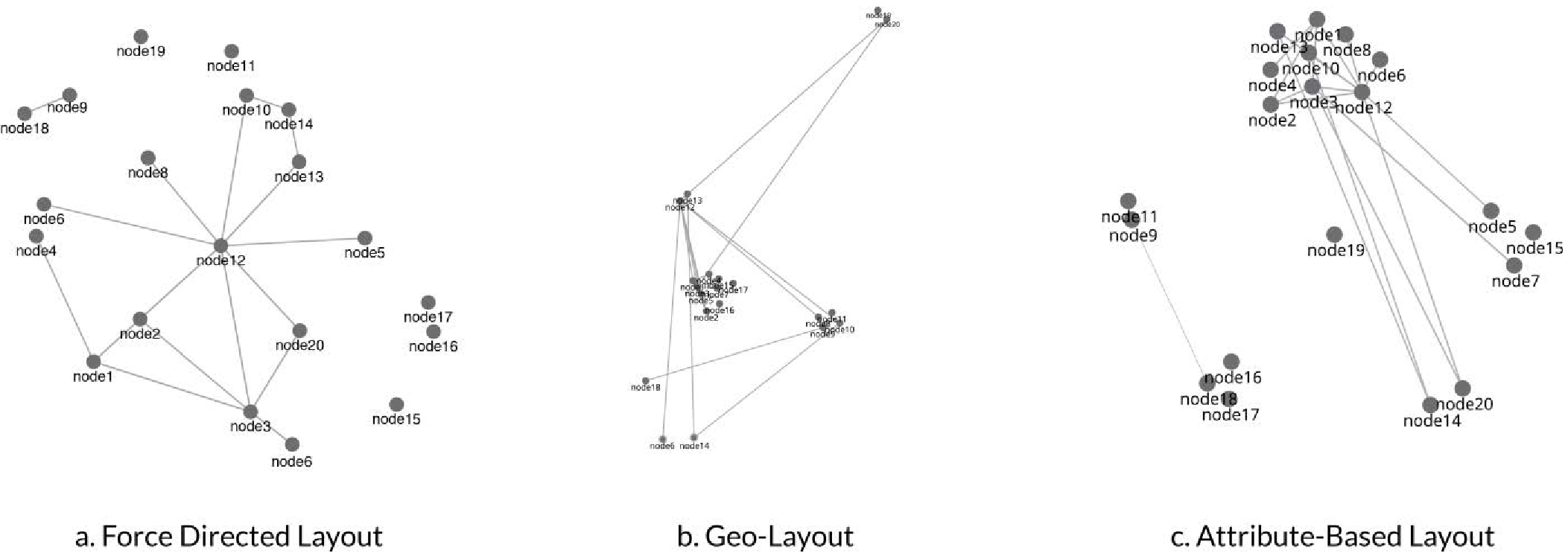 Figure 1: The spatial layouts transition the network from abstract nodes to georeferenced and category-based clusters.
3. Interface as Data Entry
Perhaps the most radical feature of Knot is that it allows researchers to create data within the visualization. If a scholar discovers a previously unrecorded relationship while exploring, they can draw a link or "group" nodes by dragging them together. This action generates new metadata that can be fed back into the primary archive.
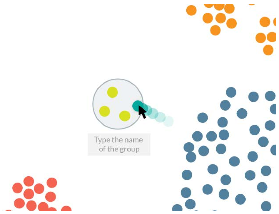 Figure 2: The grouping feature allows scholars to encode their interpretations directly into the visual structure.
Experiments and Collaborative Insight
The design of Knot was incubated during a two-week workshop at Stanford’s Center for Spatial and Textual Analysis (CESTA). By observing historians interacting with "Mapping the Republic of Letters" data, the team discovered that:
- Transparency is Key: Scholars need to see the "source" of every node. Knot includes facets that drill down into the original letters.
- Interaction > Algorithms: While automatic layouts are useful, the ability to manually "drag and drop" nodes to reflect a scholar's mental model was highly valued.
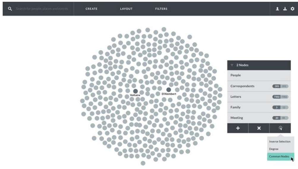 Figure 3: The Knot Interface combining the main canvas, faceted filters, and temporal sliders.
Critical Analysis & Conclusion
Knot is a landmark project because it acknowledges that in the humanities, the interface IS the research method. It successfully moves away from "data representation" toward "knowledge construction."
Takeaway: Future AI and data tools for the humanities shouldn't just strive for more powerful algorithms; they need to focus on "Intermediate Automation"—where the human expert remains the primary pilot of the discovery process.
Limitations: While Knot is excellent for small-to-medium datasets (like specific correspondence circles), its "local-first" approach might still struggle with the initial discovery of massive, unexpected trends that only a global layout can reveal. Finding the perfect balance between "Scholar-driven" and "Algorithm-driven" discovery remains the next frontier.