
Beyond Aesthetics: How Layout Conventions Shape Our Perception of Social Networks
Layout Effects on Sociogram Perception
This paper presents a within-subjects experimental study evaluating five sociogram drawing conventions (Circular, Hierarchical, Radial, Group, and Free) to determine their effectiveness in communicating network properties. The study specifically analyzes how spatial layout and edge crossings impact user performance and preference in identifying actor status and social groups.
TL;DR
Is a "pretty" graph always a "useful" graph? This study dives into the psychology of sociogram perception, revealing that while users hate edge crossings, their ability to understand actor status is actually more dependent on node positioning and angular resolution than on "clean" layouts. For group identification, however, specialized Group layouts remain the undisputed champions of efficiency.
The Conflict: Aesthetics vs. Communication
In the world of Graph Drawing, minimizing edge crossings has long been the "Golden Rule." The logic is simple: fewer crossings mean less visual clutter, which should lead to better understanding.
However, social networks aren't just abstract dots and lines; they represent power dynamics, clusters, and communities. The authors of this paper argue that domain-independent aesthetics might not be enough. They ask a critical question: Does a layout designed to look good actually help a user identify the "CEO" of a network or a "hidden clique"?
The Evaluated Layout Conventions
The researchers tested five distinct ways of arranging the same network data:
- Circular: All nodes on a single ring.
- Hierarchical: Nodes mapped vertically based on their status scores.
- Radial: Distance from the center reflects centrality/importance.
- Group: Collaborative nodes are clustered together.
- Free: A control layout with no specific structural goal.
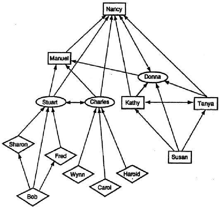 Figure 1: An example of a sociogram representing a social network.
Methodology: Testing the Human Element
The study involved 23 participants performing two main tasks:
- Importance Task: Identify the three most influential actors.
- Group Task: Identify the number of distinct communities and assign members to them.
By using both "Minimum-crossing" and "Many-crossing" versions of each layout, the researchers could isolate whether the convention (the way nodes are arranged) or the noise (the edge crossings) mattered more.
Key Findings: The "Usability-Performance Gap"
The results revealed a surprising disconnect between what users "liked" and how they actually "performed."
1. The Group Identification "Slam Dunk"
For finding groups, the Group Layout was the clear winner. It significantly reduced response time and increased accuracy (reaching a 76.5% correctness rate). Surprisingly, for this specific task, if you use a group layout, having more edge crossings didn't hurt performance as much as it did in other layouts.
2. The Illusion of Hierarchy
In the "Importance" task, users overwhelmingly preferred the Hierarchical Layout. They felt it was easier to use because they instinctively associate "top-of-the-page" with "important." However, the data showed that the Free Layout actually yielded higher accuracy for identifying status.
Why? The authors discovered that the Hierarchical layout often forced edges to be crowded on one side of a node, ruining the angular resolution (the space between edges). This made it harder to see where arrows were pointing, proving that perception is a delicate balance of node position and edge clarity.
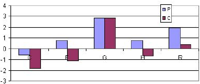 Figure 2: Users consistently rated Hierarchical and Radial layouts higher for importance tasks, despite performance variations.
Critical Insight: Why Does This Matter?
This paper challenges the "one-size-fits-all" approach to data visualization.
- For Group Dynamics: Semantic proximity (placing nodes in the same group close together) is more powerful than edge-crossing reduction.
- For Actor Status: The physical placement of nodes (top vs. bottom) and ensuring that edges don't overlap with node labels (angular resolution) are the primary drivers of perception.
Conclusion & Future Outlook
The study concludes with a powerful reminder for UI/UX designers and data scientists: User preference is a lie—or at least, an incomplete truth. Users will tell you they prefer a layout because it "looks organized," even if they are statistically more likely to make mistakes using it.
In the future, automated visualization tools should perhaps prioritize Task-Specific Layouts rather than general aesthetic optimizations. If the goal is community detection, force a Group layout; if the goal is hierarchy, prioritize angular resolution over crossing minimization.
Future Research Directions
- How do these findings scale to networks with thousands of nodes where edge crossings are inevitable?
- Can interactive layouts (allowing users to move nodes) mitigate the negative effects of poor angular resolution?