
Mapping the Invocation Structure: How 2016 Rewrote the Rules of Online Political Combat
Mapping the Invocation Structure of Online Political Interaction
The paper introduces "invocation graphs" to map online political interactions by analyzing how users share content from different Web domains in replies to one another. Using large-scale Twitter and Reddit data from the 2016 US Election, it demonstrates that political interaction becomes increasingly cross-cutting across ideological lines as an election approaches.
TL;DR
Researchers from Cornell and the University of Toronto have uncovered a dynamic shift in how we argue online. By creating "Invocation Graphs"—networks where news domains are linked when users use one to reply to another—they found that as the 2016 US Election neared, the "filter bubble" didn't just expand; it burst into a cross-spectrum battlefield. Paradoxically, the closer we got to the election, the more users engaged with their ideological opposites, albeit frequently in an adversarial manner.
The Problem: Beyond Hyperlinks and Echo Chambers
For a decade, the academic consensus on online politics was dominated by two models:
- Page-to-Page: Links created by authors (e.g., a New York Times article linking to a government report).
- User-to-User: Conversations between individuals (e.g., two people arguing in a Twitter thread).
The authors argue these views are incomplete. They ignore the Invocation: when a user "weaponizes" a specific domain (like Breitbart or The Guardian) to challenge or support a post. This isn't just a link; it's a "revealed interpretation" of a domain’s role in the social ecosystem.
Methodology: Building the Invocation Graph
The researchers tracked Twitter data throughout 2016. They filtered domains based on "political engagement"—how often a domain was shared by users who also retweeted Donald Trump or Hillary Clinton.
The Political Spectrum Embedding
Each domain was assigned a score from 0 (Left/Clinton) to 1 (Right/Trump). This allowed them to treat the invocation graph as an embedded network in a 1D space.
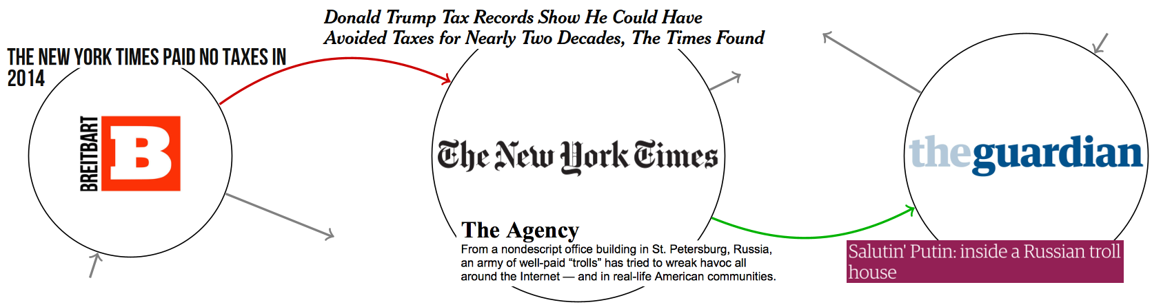 In the figure above, we see how users deploy the New York Times to support a Guardian article, or Breitbart to counter a Times investigation.
The Core Finding: The "Crossing" Phenomenon
One might assume that as polarization increases, people retreat into echo chambers (short edges in the graph). The data proves the opposite.
From January to October 2016, the edge length in the invocation graph grew significantly. By October, the correlation between the source domain's politics and the target domain's politics actually turned negative. This means users were increasingly "crossing the aisle" to drop links in the replies of opposing viewpoints.
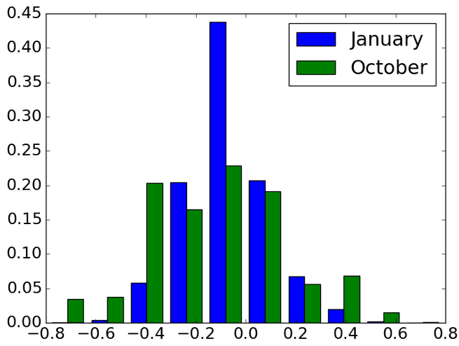 The shift from January (predominantly short, local links) to October (a surge in long-range, cross-spectrum links) is the defining characteristic of the 2016 election cycle.
Asymmetry: Who Initiates the Conflict?
The study discovered a fascinating structural asymmetry. In the invocation graph:
- Right-leaning domains (Trump-end of the spectrum) had a disproportionately high out-degree. They were frequently used as "weapons" to reply to others.
- Left-leaning domains (Clinton-end) had a higher in-degree. They were more often the "targets" of these replies.
This right-to-left flow suggests that the conservative media ecosystem during 2016 was characterized by a more aggressive "outward-facing" invocation strategy compared to the liberal ecosystem.
Cross-Platform Validation: Twitter vs. Reddit
To ensure this wasn't just a Twitter quirk, the authors applied similar logic to Reddit's /r/politics. By tracking users who frequented /r/The_Donald vs. /r/hillaryclinton, they found the exact same trend: a steady rise in cross-cutting comments (replies between opposing camps) that peaked on Election Day.
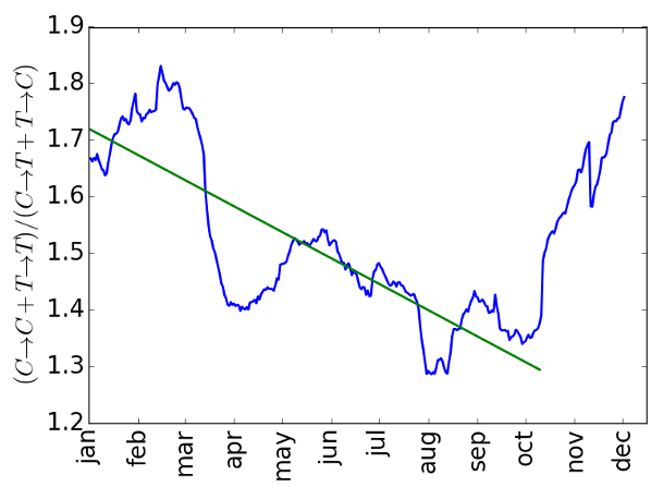 Reddit data confirms the Twitter trend: the "ratio of across" replies steadily increased throughout the year.
Conclusion: The Functional Role of Media
This paper changes our understanding of "filter bubbles." While users may consume information in bubbles, they deliberate (and argue) in a highly interconnected, adversarial space.
The Invocation Graph provides a roadmap for future researchers to understand not just what people are reading, but how they are using that information to engage—or clash—with the rest of the world. As we look toward future election cycles, the question isn't just "Who is reading what?" but "Who is using which domain to talk to whom?"