
When Marketing Meets Usability: Bridging the Gap Between Behavior and Design
When marketing meets usability: the consumer behavior in heuristic evaluation for web
This paper presents a multi-level heuristic evaluation framework for commercial websites, integrating Consumer Behavior theories with Human-Computer Interaction (HCI). It establishes a practical 4-step methodology—Benchmark, Visual Field, Information Structure, and Recommendations—to improve both usability and marketing effectiveness.
TL;DR
This seminal work argues that commercial website success depends on more than just technical usability; it requires a deep understanding of Consumer Behavior. By merging Cognitive Psychology with Marketing's "Learning Route," the authors propose a 4-step heuristic framework that transforms a website from a static billboard into a persuasive decision-making tool.
The Problem: The "TV Paradigm" Trap
In the early days of e-business (and often still today), commercial websites were designed by advertising experts who treated the web like television—a one-way flow of information. This resulted in:
- Intrusive Banners: Borrowed from TV commercials, these trigger "involuntary attention," distracting users from their primary goals.
- Information Overload: Failure to respect the "cognitive economy," overwhelming the user's working memory.
- Focus on 'What' instead of 'Why': Systems were technically functional but failed to motivate the consumer's "call to action."
Methodology: The 4-Step Evaluation Framework
The researchers developed a methodology that views the user not just as an operator, but as a customer with varying levels of involvement.
1. Benchmark Analysis
Before looking at the code, look at the market. By analyzing competitors, the evaluator understands the "State of the Art" and identifies the "rational vs. symbolic" attributes necessary for the product (e.g., price vs. status in car sales).
2. Visual Field Analysis (The "Magical Number Seven")
Using Gestalt Psychology, the UI is fragmented into "chunks."
- Selective Attention: The goal is to maximize this by keeping the design minimalist.
- Involuntary Attention: Avoiding "visual pollution" like blinking elements that break the user's eye-scanning pattern.
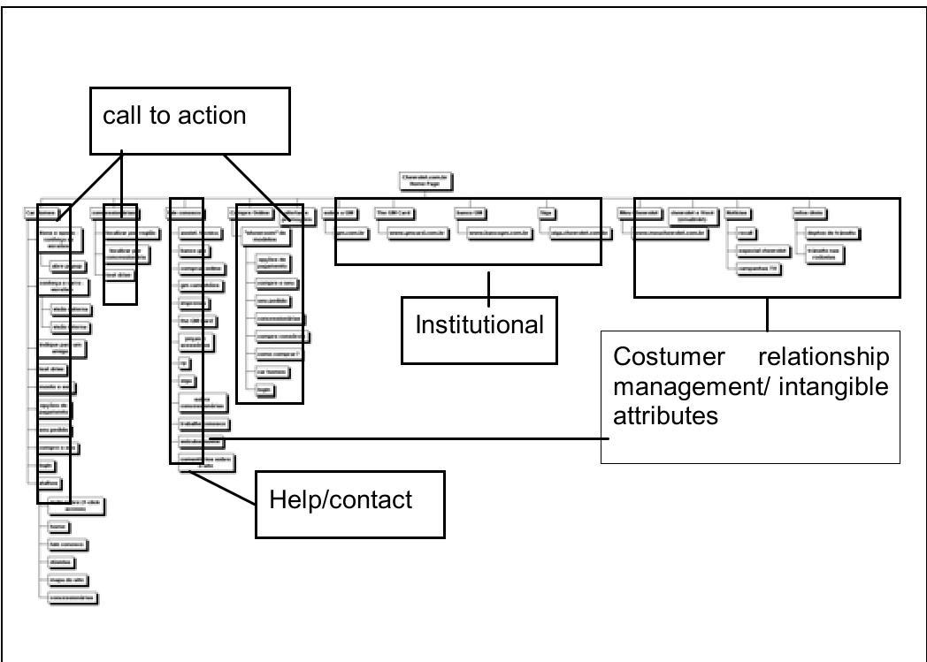
3. Information Structure Analysis
The navigation map is modeled to check for Taxonomy and Rhetoric.
- Do labels match the user’s mental model?
- Does the structure lead the user through a "Learning Route" (Awareness → Knowledge → Conviction → Purchase)?
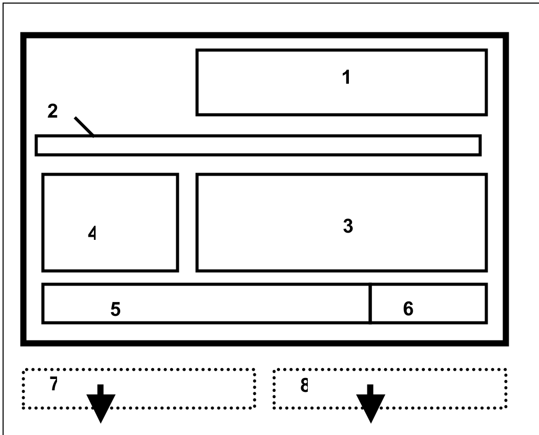
4. Recommendations
The output is a practical style guide aimed at reengineering the interface to reduce cognitive load and enhance the "Rhetorical Cycle."
Case Study: Reengineering a Car Website
The authors applied this to a car company. Even though the product (a car) is a High-Involvement purchase requiring significant information seeking, the site was hiding technical specifications and accessories behind login walls.
The Diagnosis:
- The homepage was a "large vertical layout" with hidden critical links (Recall, News).
- Excessive animations (aimed at mimicking TV) were sabotaging the "first right click" by diverting attention.
- Lack of "Bread Crumbs" made it impossible for users to build a mental model of where they were in the sales funnel.
Critical Insight: Usability as Strategy
The study concludes that usability professionals must act as multidisciplinary experts. If a site is "technically perfect" but results in low sales, it has failed the usability of the consumer's intent.
By aligning the Information Architecture with the Consumer Decision-Making Model, companies can reduce "Cognitive Dissonance" (buyer's remorse) and foster a smoother transition from curiosity to conviction.
Conclusion & Future Outlook
While published in 2005, the core principles of this paper remain hyper-relevant in the age of AI-driven UX and "Attention Economy." The takeaway is clear: A website is not a system to be operated; it is a conversation to be managed. Future work in this lineage now explores how these heuristics apply to mobile micro-moments and algorithm-driven personalization.