
Beyond the Timeline: Visualizing Twitter as a Dynamic Digraph to Enhance Discussion
Method of Visualizing Relations between Tweets to Facilitate Discussions via Twitter
This paper introduces a Twitter visualization system that replaces traditional linear timelines with a directed graph (digraph) interface to facilitate multi-user discussions. By representing tweets as nodes and replies as edges, the system enables real-time tracking of conversation flows and highlights noteworthy content based on social engagement metrics.
TL;DR
Twitter's linear timeline is efficient for "what's happening now," but it's a disaster for structured discussion. This paper proposes a digraph-based interface that transforms fragmented tweet threads into a cohesive visual map. By scaling nodes based on engagement and maintaining a real-time reply stream, the system significantly improves the productivity and clarity of online conversations.
The Problem with Verticality
Twitter was born as a microblogging service, but it evolved into a discussion platform. However, the UI never quite caught up. The authors identify three critical pain points:
- Relation Recognition: The "thread" view often obscures the parent-child relationship between tweets, especially when multiple sub-discussions occur simultaneously.
- Visibility of Attention: There is no intuitive way to see which tweet in a thread is the "hot take" without manually checking metrics for every post.
- Topic Sustainability: Real-time processing means old tweets are quickly buried, making it nearly impossible to "nurture" a long-term discussion.
Methodology: Mapping the Conversation
The authors treat a discussion as a directed graph , where is a tweet (node) and is a reply (edge).
1. Digraph Construction
The system uses a Breadth-First Search (BFS) approach to crawl the Twitter API. Starting from a "root tweet," it recursively fetches replies to build the tree. This ensures that even "stray" branches of a conversation are captured and visualized.
2. Real-Time Streaming
Unlike static tools like Togetter, this system maintains a live connection via Twitter’s "Filter" API. It monitors specific user IDs within the active tweet set and dynamically updates the graph as new replies arrive.
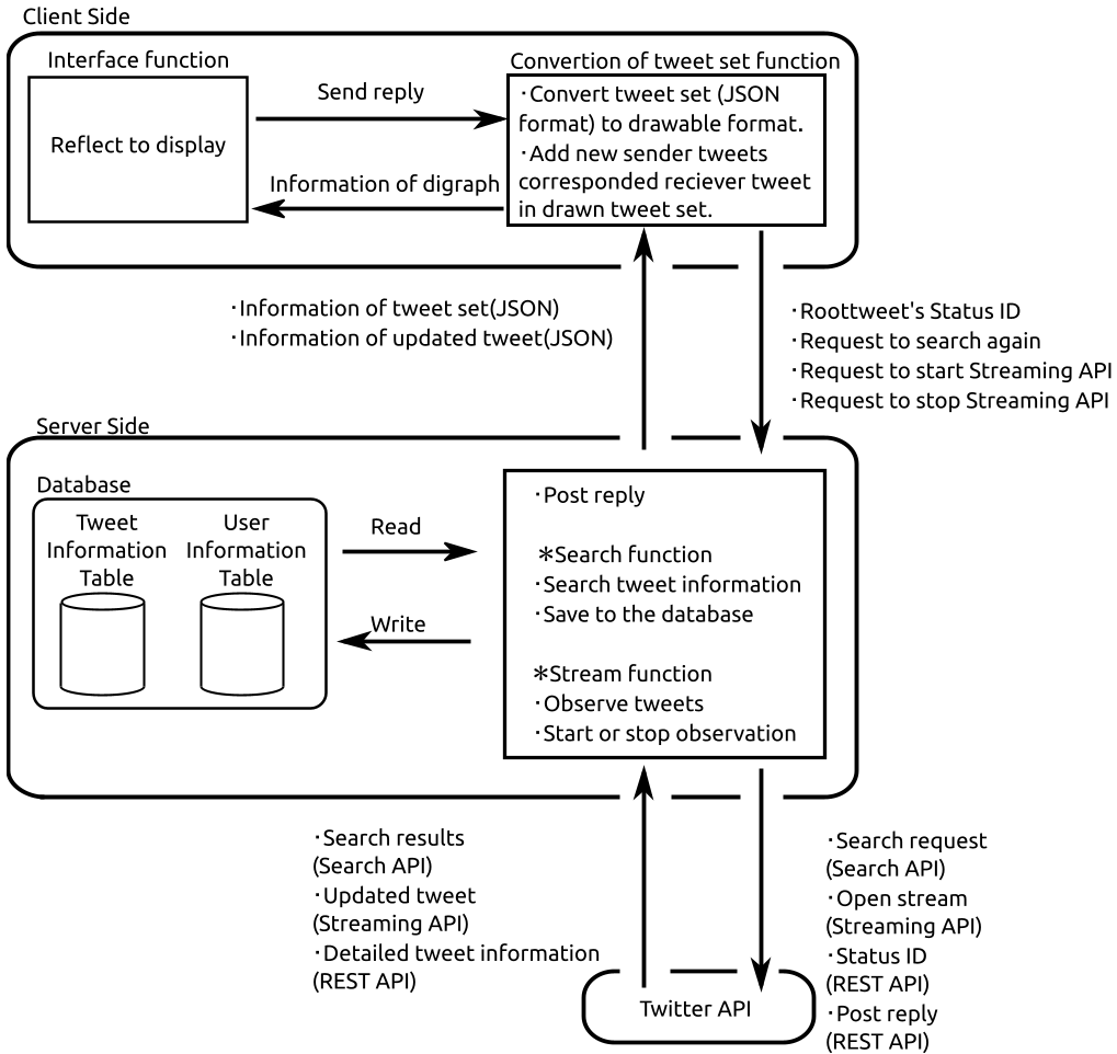 Figure 1: The system architecture showing the interaction between the Search, Stream, and Interface functions.
3. Visual Hierarchy
To solve the "Visibility of Attention" problem, the interface emphasizes nodes. A tweet with more Retweets or Favorites grows in size and shifts in color intensity, allowing users to instantly spot the most influential contributions.
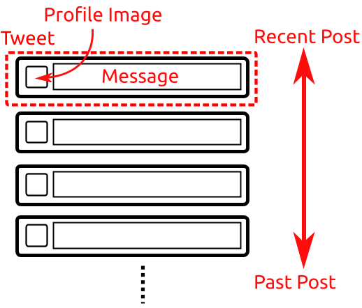 Figure 2: The proposed digraph interface showing the branching logic of tweets.
Experiments and Results
The authors conducted a controlled trial with university students, comparing their system against the official Twitter website across various discussion topics (e.g., favorite foods and animations).
Key Findings:
- Quantity of Content: Groups using the digraph system produced more tweets within the 10-minute limit (up to 47 tweets vs. 39), suggesting higher engagement efficiency.
- Ease of Understanding: Users rated the "understanding of relations" at 4.75/5.0, compared to a dismal 2.5/5.0 for the official site.
- Historical Context: The score for "confirming past tweets" was 4.5/5.0, proving that the spatial layout effectively solves the sustainability issue.
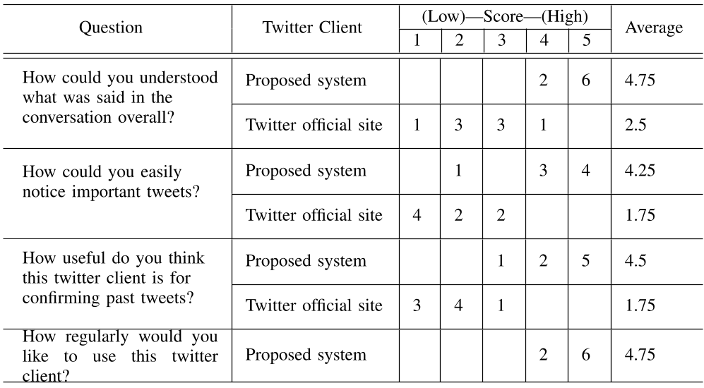 Table 1: User satisfaction rankings comparing the proposed system to the official Twitter client.
Critical Insight: Why This Matters
The fundamental shift here is from temporal order to logical order. In a standard timeline, context is sacrificed for recency. In a digraph, logic is preserved through spatial orientation.
The main limitation identified was latency; as the node count exceeds 50, client-side rendering (Ajax) begins to struggle. However, in the context of academic or focused group discussions, this "clutter" is a small price to pay for the ability to see the "flow" of an argument.
Conclusion
This work demonstrates that social media platforms are currently bottlenecked by their own UI. By applying graph theory to microblogging interfaces, we can transform a chaotic "stream of consciousness" into a structured "knowledge map." Future iterations could potentially incorporate sentiment analysis or automated clustering to handle even larger-scale public debates.