
TapShoe: Bridging the Gap Between Code and Perception in Mobile UI
17290_Modeling Mobile Interface Tappability Using Crowdsourcing and Deep Learning.
The paper presents a large-scale approach to modeling mobile interface "tappability"—the perceived interactability of UI elements. Using a dataset of 20,000+ labeled elements from 3,470 screens, the authors developed a deep learning model and a diagnostic tool called TapShoe that achieves 90.2% precision and 87.0% recall in identifying human-perceived tappable elements.
TL;DR
Mobile users often "hunt" for buttons, frustrated by elements that look tappable but aren't—or vice versa. This paper introduces a deep learning framework that learns to "see" interfaces like a human. By analyzing 20,000+ crowdsourced examples, the authors created TapShoe, a tool that automatically flags design mismatches, achieving a precision of 90.2% in predicting what a user will actually try to tap.
Background: The Crisis of Flat Design
In the era of skeuomorphism, a button looked like a physical object you could press. Today's "flat design" has stripped away these shadows and gradients, leading to a discoverability crisis. Designers often rely on intuition, but human perception is surprisingly inconsistent. Research shows that users misidentify non-clickable elements as tappable 39% of the time.
The "Why": Why Code Isn't Enough
A developer might set clickable=True in the code, but if the element is a tiny grey link at the top of a screen, a user might never perceive it. Conversely, a large, colorful icon that is not clickable is a "false affordance" that leads to "dead taps." The authors argue that we need a model that understands Signifiers—the visual cues that hint at functionality.
Methodology: How the Model Learns "Tappability"
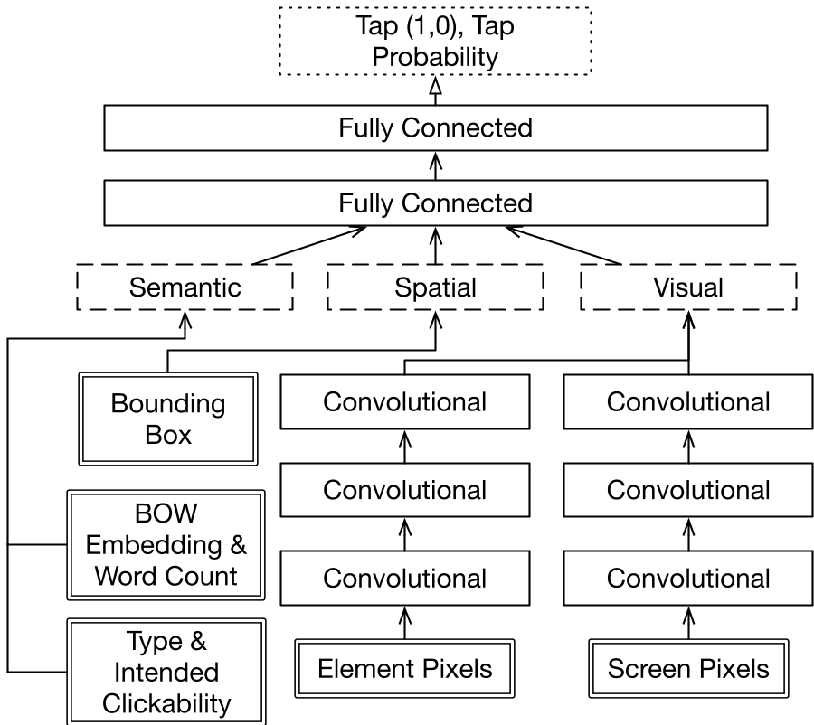
The researchers didn't just look at element types; they built a multi-channel deep learning architecture that processes:
- Semantics: Using Word2Vec embeddings to understand that "Submit" is more likely tappable than "Background."
- Visuals: CNN layers process both the local pixels of the element and the global context of the entire screen.
- Spatial Context: Size and location matter. For example, elements at the bottom of the screen are more frequently perceived as tappable due to thumb-reach conventions.
Key Insights: What Makes Something "Tappable"?
The study uncovered fascinating patterns in human perception:
- Color Matters: Tappable elements tend to use brighter clusters (Blues/Reds), while non-tappable elements are dominated by Grey/White.
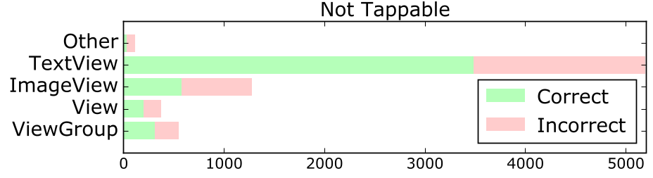
- Size Trap: Larger
ImageViewsare actually less likely to be seen as tappable; users perceive them as passive content rather than buttons. - The "Header" Blindness: People often fail to realize elements in the app header are tappable, as they treat that area as purely informational.
Experiments and Results
The model was validated using 10-fold cross-validation on the Rico dataset. It notably outperformed the ground-truth system metadata in predicting human behavior. While the system's internal "clickable" flag only had a 79.6% recall of what users thought was tappable, the model reached 87.0%.
TapShoe: A New Tool for Designers
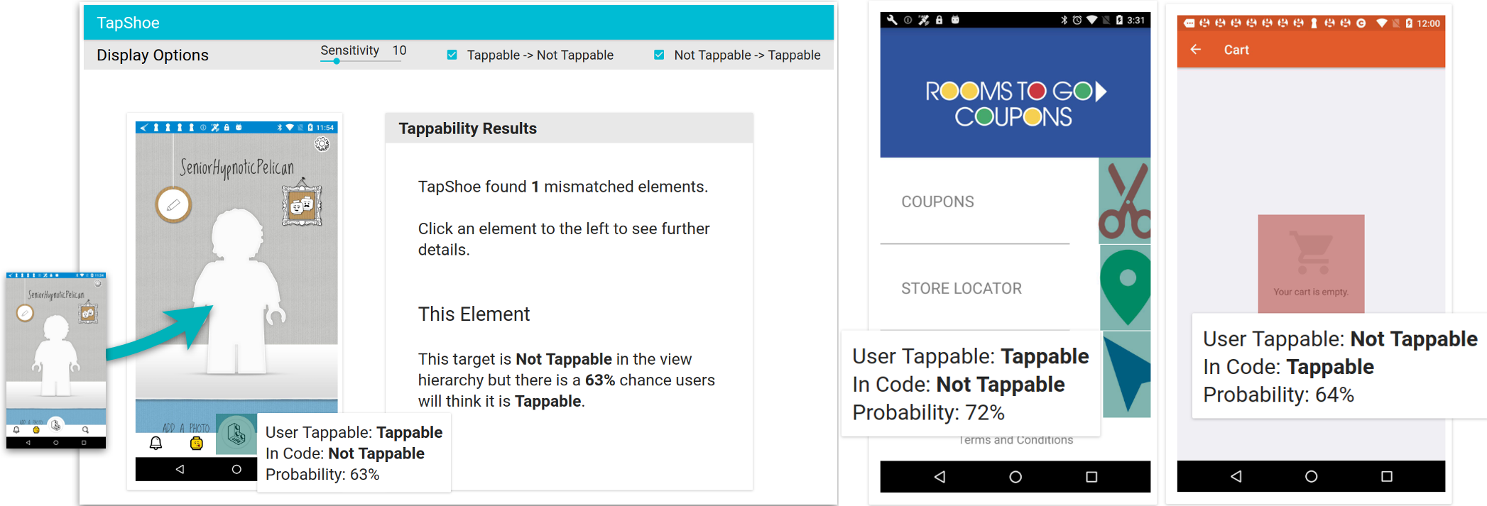
The authors packaged this model into TapShoe, a diagnostic interface. Designers can upload a mockup, and the tool highlights "mismatches."
- False Affordance: Elements that look tappable but aren't.
- Missing Signifier: Elements that are tappable but look "flat" or passive.
Critical Analysis & Future Outlook
Takeaway: This marks a shift from "Correctness" (does the button work?) to "Perception" (does the user know it's a button?).
Limitations: The model is currently Android-centric. UI conventions on iOS or in VR/AR environments differ significantly and would require new training data. Furthermore, the model predicts if someone will tap, but not why (e.g., is it the color or the font?).
Future Work: The logical next step is Generative UI Fixes—where the AI not only identifies the problem but suggests a redesign (e.g., "Add a 2px shadow to this element to increase tappability confidence").