
Scaling Social Discovery: A Visual Analytics Approach to Large-Scale Clustering
A novel visual analytics approach for clustering large-scale social data
This paper introduces a visual analytics framework for clustering multi-million scale social data using a "Divide-Analyze-Recombine" scheme. By integrating an improved incremental K-means algorithm with interactive visual tools like pixel charts and sensitivity maps, it achieves superior clustering quality and significant computational acceleration over traditional methods.
Executive Summary
TL;DR: This paper presents a novel visual analytics pipeline that tackles the scalability issues of clustering millions of social media users. By adopting a Divide-Analyze-Recombine scheme and an incremental K-means algorithm, the researchers transformed a non-linear bottleneck into a parallelizable, human-centric exploration process.
In the landscape of data science, this work sits at the intersection of High-Performance Computing and Human-Computer Interaction (HCI), providing a practical blueprint for steering complex machine learning tasks through visual interfaces.
The Scalability Wall in Social Data
Social data is a goldmine for understanding human behavior, but its sheer volume (millions of nodes) and heterogeneity (varying tags and behaviors) create a "scalability wall." Standard partitioning algorithms like K-means struggle because:
- Computational Complexity: Runtime grows non-linearly with data size.
- Parameter Blindness: Choosing the number of clusters () and assigning weights to features (like "Follower Count" vs. "Post Frequency") is often a shot in the dark without visual feedback.
The authors argue that we shouldn't just throw more hardware at the problem; we need to change the strategy of how the algorithm "sees" the data.
Methodology: Divide, Analyze, and Recombine
The core of the paper is a four-stage pipeline that bridges the gap between raw data and actionable insights.
1. Adaptive Data Division
Instead of clustering 5 million points at once, the system divides them into smaller, manageable subsets. The innovation here is the Pixel Chart. It allows analysts to ensure each subset is a "statistical mirror" of the whole. if the saturation of the cells (representing subsets) looks uniform across the chart, the division is valid.
2. Context-Aware Subset Clustering
The analyst focuses on the first subset to set the "DNA" of the clustering.
- Finding K: Using an elbow-method plot.
- Sensitivity Maps: A unique visual tool to determine attribute weights. By visualizing how cluster centroids shift when a specific attribute's weight is changed, the system calculates the "influence" of that attribute.
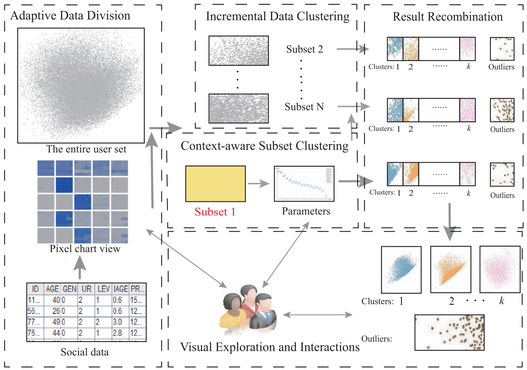 Figure 1: The conceptual pipeline from data division to visual exploration.
3. Incremental Recombination
Once the parameters are set for the first subset, they are propagated to all others. This Incremental Data Clustering uses the first subset's centroids as starting points for the rest, ensuring consistency and dramatically reducing the iterations needed for convergence. Finally, a hierarchical clustering step merges these subset-level results into a global view.
Empirical Results: Faster and Sharper
The team tested their system on a 4.8 million user dataset from Sina Weibo.
Performance Gains
The parallel implementation (PDR) outperformed standard K-means (STD) consistently. As increased, the time savings became more pronounced, showing an average acceleration of up to 100%.
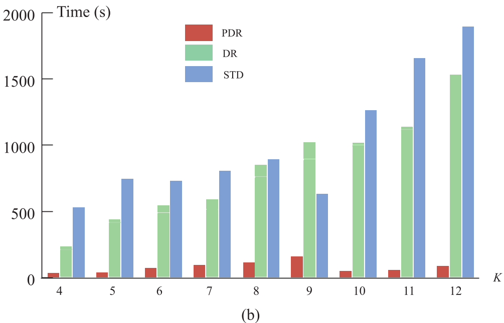 Figure 7: (a) Comparative clustering quality and (b) Performance benchmarks across different implementations.
Discovery of "Ghost" Patterns
Beyond speed, the visual interface proved its worth by identifying outliers. They found a specific group of users with millions of followers but nearly zero friends and "Bi-friend" (mutual follow) counts. These users were exclusively registered overseas, identifying them as potential bot accounts or unique celebrity entities that traditional automated clustering might have missed or merged into larger groups.
Critical Insight & Conclusion
The true value of this work lies in the Inductive Bias provided by the human analyst. Purely automated "Divide and Conquer" methods often fail because the "recombine" phase loses the global context. By using visual tools like sensitivity maps and pixel charts, the authors allow the human to maintain the global context while the machine handles the local computation.
Limitations: While the approach is robust for K-means, its application to density-based clustering (like DBSCAN) might be harder, as the "recombine" phase for non-spherical clusters is mathematically more complex.
Future Outlook: As social datasets grow toward the billion-user scale, this "visually-steered" parallelization will likely become the standard for exploratory data analysis, moving away from "black-box" batch processing toward interactive, real-time discovery.