
PONV: Decoding Social Network Evolution One Pixel at a Time
Pixel-Oriented Visualization of Change in Social Networks
The paper introduces Pixel-Oriented Network Visualization (PONV), a method for visualizing weighted social networks that evolve over time. By embedding temporal data as individual pixels within the cells of an adjacency matrix, the researchers enable high-density visual data mining of collaborative patterns.
TL;DR
Social networks are rarely static, yet traditional "spider-web" node-link diagrams struggle to show how relationships change over time without becoming a cluttered mess. This paper proposes Pixel-Oriented Network Visualization (PONV), a technique that transforms a social network matrix into a dense, interactive map where every single pixel tells a story of a specific moment in a relationship's history.
Background: The Limits of the Node-Link Paradigm
In the world of Social Network Analysis (SNA), we are obsessed with "who knows whom." However, as networks grow—reaching 50+ nodes and hundreds of links—the traditional graph layout (like spring embedding) starts to fail.
When you add the dimension of Time, the problem compounds:
- Snapshots are disjointed; you lose the flow of the narrative.
- Animations are flashy but suffer from "change blindness"—the human brain often misses subtle shifts between frames.
- Statistical Plots lose the individual context of who is interacting with whom.
The Insight: "Folded" Timelines in a Matrix
The authors suggest a paradigm shift: stop trying to draw lines and start treating the screen as a high-density data canvas. By using an Adjacency Matrix, where rows and columns represent actors, they create "Glyphs" in each cell.
How it Works:
Instead of a single number in a matrix cell representing total interaction, a Glyph is inserted. This glyph "folds" a 1D timeline (e.g., 365 days) into a 2D square (e.g., a 19x19 pixel block).
- Darker pixels = higher interaction at that specific time.
- Lighter/White pixels = zero or low interaction.
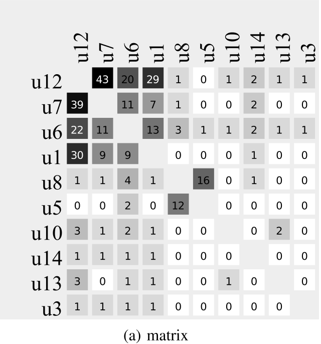 Figure: The transition from a simple weighted matrix (left) to a PONV matrix containing folded timelines (right).
Methodology: Choosing the Right "Fold"
A critical challenge in pixel-oriented design is the layout of the time-series within the glyph. The authors explored several patterns:
- Row-by-Row/Column-by-Column: Simplest to understand but can create "arbitrary vertical bars" if the width doesn't match a natural cycle (like a 7-day week).
- Snake Patterns: Maintain continuity by preventing "rips" at the end of a line.
- Space-Filling Curves (Hilbert/Z-Curve): Better for preserving locality but often confusing for users to read as an intuitive "timeline."
Ultimately, they found that calendar-aligned layouts (7-pixel wide rows) are the most effective because they leverage our natural understanding of weekly rhythms, making "weekend work" or "Monday meetings" immediately visible as vertical patterns.
Case Studies: Real-World Visual Data Mining
The authors applied PONV to Wiki collaboration data. In the Students Wiki case, they discovered a "dotted vertical bar"—a moment where a new term started, and everyone suddenly became active at once.
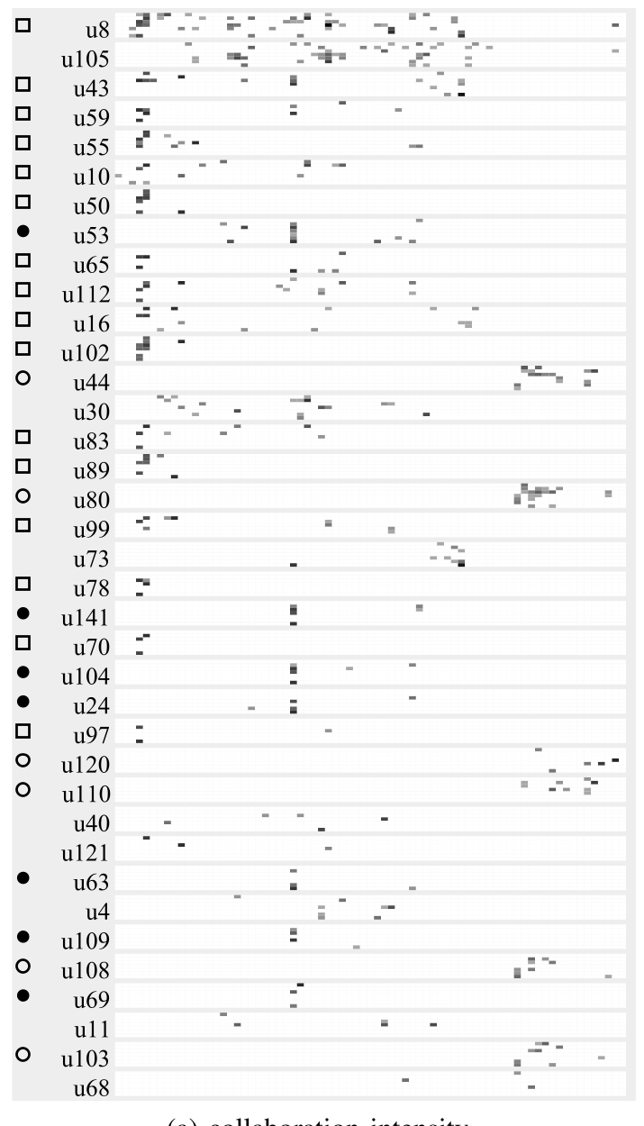 Figure: In this student network matrix, you can see how specific cohorts (blocks of rows) interact heavily during specific terms but remain silent during others.
In a Startup Wiki (Figure 9 in the paper), the visualization shows "Wiki growth at its best." As new employees join, they immediately "connect" to the existing core, creating a dense, growing triangular pattern that evolves from the top-left corner.
Critical Analysis & Conclusion
PONV isn't a replacement for traditional graphs; it's a specialized tool for Visual Data Mining.
Strengths:
- Scalability: Can handle much higher density than node-link diagrams.
- Pattern Recognition: Humans are evolved to see edges and rhythms in "static" images better than tracking moving dots in an animation.
- Exploratory Power: It allows researchers to spot "When did User A and User B stop talking?" or "Who are the weekend warriors?" without running complex queries.
Limitations:
- Learning Curve: The interpretation isn"t immediate; it requires "interested experts."
- Sparsity: In very sparse networks, the pixels are too scattered to form a recognizable pattern.
Future Outlook: The authors suggest that combining these pixel matrices with advanced sorting algorithms (to group similar users) will be the next step in making these dense "social fingerprints" even more readable.