
Lost in Translation: Why Facebook’s Privacy Design Fails Non-Expert Mobile Users
Communicability Evaluation of Privacy Settings on Facebook for Android
This paper presents a communicability evaluation of Facebook's Android privacy settings using two Semiotic Engineering methods: the Semiotic Inspection Method (SIM) and the Communicability Evaluation Method (CEM). The study focuses on a specific demographic—non-expert users in rural Brazil—and identifies significant gaps between designer intent and user understanding of privacy tools.
TL;DR
Even when a platform like Facebook provides robust privacy tools, they are useless if the user doesn't understand the "designer's language." This study evaluates Facebook’s Android app using Semiotic Engineering methods, finding that users in rural Brazil—despite being deeply concerned about privacy—cannot navigate the interface due to complex terminology (like "Synchronize") and hidden menus.
Background: The Communicability Gap
In the world of Human-Computer Interaction (HCI), Communicability is the litmus test for design: Does the interface successfully tell the user what the designer intended? For Facebook, the premise is a paradox—a platform built for exposure that must also provide tools for concealment.
The authors focus on a high-stakes demographic: Residents of Quixadá, a small city in Ceará, Brazil, who access the internet exclusively via Android smartphones and possess low technical skills. For these users, a privacy "breakdown" isn't just a minor UI annoyance; it's a real-world risk to their personal safety.
Methodology: Inspecting the "Metamessage"
To bridge the gap between design and usage, the research employs two powerful lenses from Semiotic Engineering:
- Semiotic Inspection Method (SIM): The evaluator acts as a "detective," looking for the messages embedded in icons (static signs), workflows (dynamic signs), and help texts (metalinguistic signs).
- Communicability Evaluation Method (CEM): Real users are observed performing tasks. When they stumble, their behavior is "tagged" (e.g., "Where is it?", "Oops!", "I give up").
The Interaction Scenarios
Users were asked to perform three critical privacy tasks:
- Enable Photo Sync (making phone photos automatically upload to a private album).
- Disable Messenger Location services.
- Enable Tag Review (approving posts before they appear on their timeline).
Methodology Detail: The Designer's Intent vs. Execution
The paper reveals a stark contrast. From an inspection standpoint (SIM), the designer tries to be helpful.
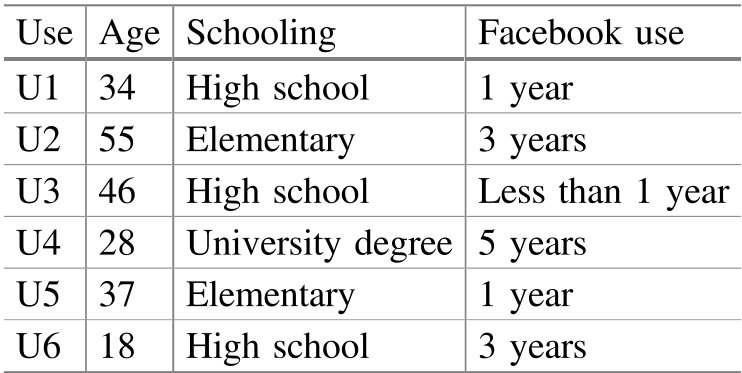 Table 1: The diverse yet non-expert profile of the participants in the CEM study.
The "Metamessage" found during inspection suggests: "We care about your privacy; here is a padlock icon and a 'Privacy Basics' tutorial." However, the execution relies on a "desktop-first" mental model. For example, the interface tells mobile users they can manage synced photos "when they connect to a computer"—an assumption that falls flat for a mobile-only population.
Experimental Results: The Anatomy of a Breakdown
When real users (U1-U6) touched the app, the "Designer's Message" was lost.
1. The Language Barrier
The word "Synchronize" was a major point of failure. Most users associated "syncing" with simply "creating an album" or "viewing photos." Because they didn't understand the term, they looked in the wrong place or incorrectly assumed they had finished the task (the "Looks fine to me" tag).
2. The Logic of Icons
The use of a gear icon caused significant confusion. In one part of the app, it led to "App Settings"; in the Chat menu, it only offered an on/off toggle. Users expected consistency (Inductive Bias) that the interface didn't deliver.
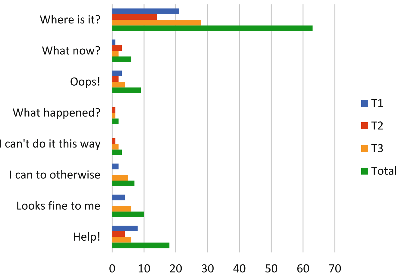 Graph 1: Distribution of tags identifying communication breakdowns across tasks.
3. Fear and Self-Policing
Perhaps the most poignant finding came from the interviews. One user (U4) stated: "I try to put as few things as possible so I do not need to use any privacy tools." This suggests that poor communicability doesn't just lead to errors—it leads to social exclusion and a "chilling effect" where users are too afraid of the technology to use it fully.
Critical Insight: Lessons for the Future
The research concludes with several actionable design "Takeaways":
- Vocabulary Realignment: Terms like "Synchronize" should be replaced with "Share phone photos to a private album."
- Contextual Help over Centralization: Facebook’s "Help Center" was buried. Users rarely leave a task to hunt for a manual; help must be embedded at the point of action.
- Visual Feedback: Users need immediate "Dynamic Signs" to confirm an action worked. In privacy, where effects are often "lagged" (e.g., someone tags you later), the interface must work harder to provide peace of mind.
Conclusion
This paper serves as a reminder that Privacy is a UX Problem. No matter how secure the backend is, if the user cannot navigate the "Semiotic Profile" of the application, they remain exposed. The subsequent versions of Facebook (moving "Sync" to the standalone 'Moments' app) confirm that the communication breakdowns identified here were indeed systemic flaws.
Final Takeaway: True SOTA in privacy is not just a better encryption algorithm; it is an interface that speaks the user's language.