
Proximity vs. Colour: Redesigning Force-Directed Layouts for Social Community Detection
Proximity, Communities, and Attributes in Social Network Visualisation
This paper investigates the effectiveness of Force-Directed graph layout algorithms and the pre-attentive visual feature of colour for identifying groups in social networks. By introducing simple modifications to the Fruchterman & Reingold algorithm that manipulate intra- and inter-community forces, the authors identify specific interaction patterns—such as the "A&R" (Attractive & Repulsive) model—that significantly improve human accuracy in community detection tasks for both structural and attribute-based groupings.
TL;DR
Can simple physics tweaks make social networks more "readable"? This paper evaluates how modified force-directed algorithms and colour coding impact a human's ability to count communities in social graphs. The findings are clear: for structural groups, boosting intra-community attraction and inter-community repulsion is king; for attribute groups, colour is irreplaceable.
Background Positioning
In the map of Network Science, this work sits at the intersection of Graph Drawing (GD) and Human-Computer Interaction (HCI). While researchers often focus on the mathematical accuracy of community detection (like Infomap or Louvain), this study explores the perceptual accuracy—how we actually see and count groups when they are laid out on a screen.
The Problem: The "Hairball" and Structural Bias
Most graph layout algorithms, like the classic Fruchterman & Reingold (F&R), aim for aesthetic balance: uniform edge lengths and minimized crossings. However, social scientists need to see communities. The authors identify a critical gap:
- Structural groups (friends of friends) often get blurred in dense layouts.
- Attribute groups (people with the same job but no direct link) are nearly impossible to see without specific visual aids.
Methodology: Hacking the Physics of Graphs
The researchers didn't build a new algorithm from scratch; instead, they "hacked" the forces in a standard force-directed model. By adding artificial attractive (ATT) and repulsive (REP) forces based on known community membership, they created six distinct visual conditions.
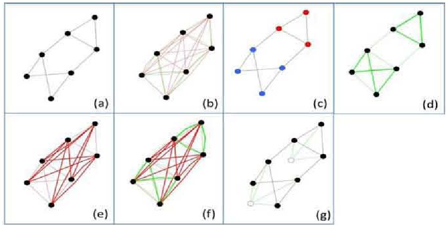 Fig. 1: Visual mapping of the force variants. Note how (f) A&R combines both strengthened attraction within groups and repulsion between them.
The experiment used LFR benchmark graphs (which mimic real-world social properties) and tested two logic types:
- Structural (ST): Groups are based on edge density.
- Attribute (AT): Groups are assigned randomly, ignoring edges (simulating multivariate data).
Experimental Results: Precision through Separation
The results provide a masterclass in how visual "pop-out" works:
- Structural Superiority: For groups defined by links, the A&R (Attractive & Repulsive) and ATT models dominated. They significantly increased the "white space" between clusters, leading to 94% accuracy in human identification, compared to just 63% for the standard F&R layout.
- The Power of Colour: In attribute-based tasks, where the graph's physical structure actually contradicts the group membership, Colour (COL) was the only reliable signal.
- The Failure of Anchor Nodes: Interestingly, the NOD method (using invisible "center" nodes) failed. It caused communities to overlap and occlude each other, creating a visual "hairball" that confused participants.
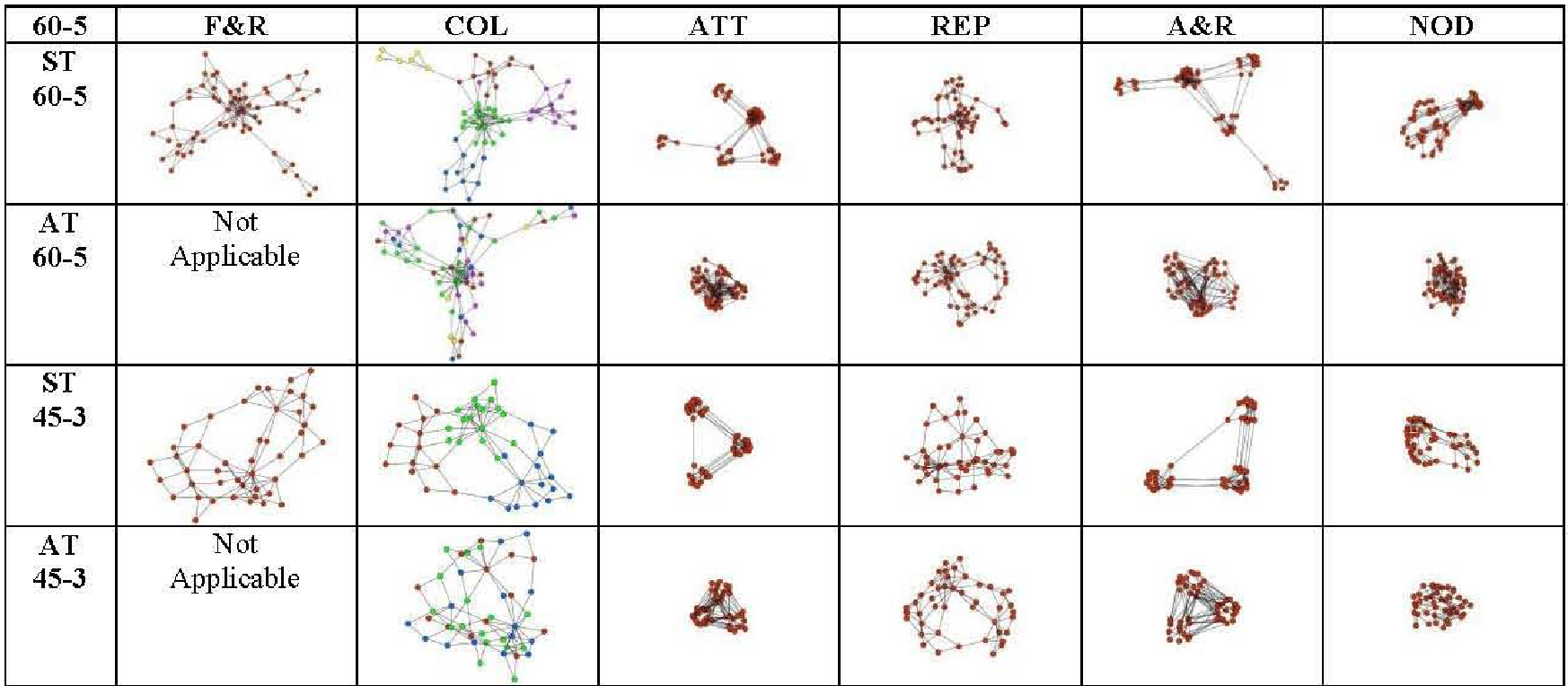 Fig. 2: Comparison of different layouts on a 60-node graph. The visual clarity of the A&R method in the top-right is evident.
Critical Analysis & Takeaways
Why A&R Works
The A&R algorithm's success lies in its ability to overwhelm the standard layout's "balancing" forces. By forcing nodes in different communities away from each other more than the standard repulsion, it creates distinct Euclidean islands. This leverages the Gestalt Principle of Proximity—our brains naturally assume things close together belong together.
Limitations
- Occlusion: As graphs scale, even A&R might lead to "bunched up" clusters where individual nodes are lost.
- Cognitive Bias: Participants were found to consistently underestimate the number of groups, suggesting that if clusters aren't perfectly separated, we tend to merge them mentally.
Final Conclusion
If your goal is to help users find groups in a social network:
- Use A&R Layouts if you want to emphasize the "physics" of the community.
- Always provide Colour as a primary channel, especially when groups are defined by external attributes rather than just who-knows-who.
This study proves that simple visual tweaks, grounded in psychology, are often more effective for end-users than complex mathematical optimizations.