
Visualizing Contagion: The Rhetoric of Social Network Analysis in Public Health
Rhetorical dimensions of social network analysis visualization for public health
This paper explores the application of Social Network Analysis (SNA) visualization in public health communication, specifically for disease transmission tracking. It proposes a rhetorical framework for using centralities (Degree, Eigenvector, and Betweenness) to transform abstract data into persuasive narratives that inform medical intervention.
TL;DR
This research bridges the gap between data science and technical communication by examining how Social Network Analysis (SNA) diagrams serve as rhetorical instruments in public health. By manipulating visual variables like node size and color based on centrality metrics, communicators can shift the narrative focus from "who is infected" to "how we stop the spread."
The Humanistic Gap in Data Visualization
Public health communication often relies on bar graphs or spreadsheets that strip away the "human story." The authors argue that epidemiology is fundamentally a narrative of human interaction. However, current SNA tools are often used as "black boxes" where software defaults dictate the message. The core challenge is: how do we use these tools to reveal critical transmission points without misrepresenting the underlying data?
Methodology: The Three Pillars of Network Centrality
To craft an effective rhetorical narrative, the paper highlights three mathematical concepts translated into visual cues:
- Degree Centrality: Identifying the "Hubs." These are individuals with the highest number of direct contacts. In a visualization, increasing their size immediately identifies potential "super-spreaders."
- Eigenvector Centrality: Identifying the "Influencers." This measures not just how many people you know, but how well-connected your contacts are. It highlights nodes that might be at high risk due to their proximity to other hubs.
- Betweenness Centrality: Identifying the "Bridges." These are the "weak ties" that connect two otherwise separate communities. In public health, these nodes are high-priority targets for intervention to prevent a local outbreak from becoming a widespread epidemic.
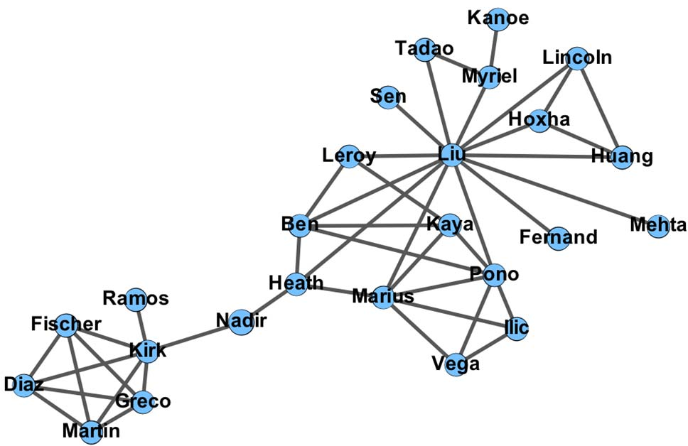 Figure 1: Simple SNA diagram illustrating the physical intuition behind high Degree (Liu), Eigenvector (Heath), and Betweenness (Nadir) centralities.
Visual Rhetoric in Action: Manipulating the Narrative
The authors demonstrate that by applying "Mapping Rhetoric," a technical communicator can change the entire meaning of a graph without changing the underlying data.
- Focusing on Intervention: By highlighting nodes with high Betweenness Centrality, a communicator can argue for resources to be allocated to "gatekeepers" who link different social clusters.
- The Power of Color and Scale: Figures 2 through 4 (shown below) illustrate how the same network can be visually re-weighted to prioritize different public health strategies.
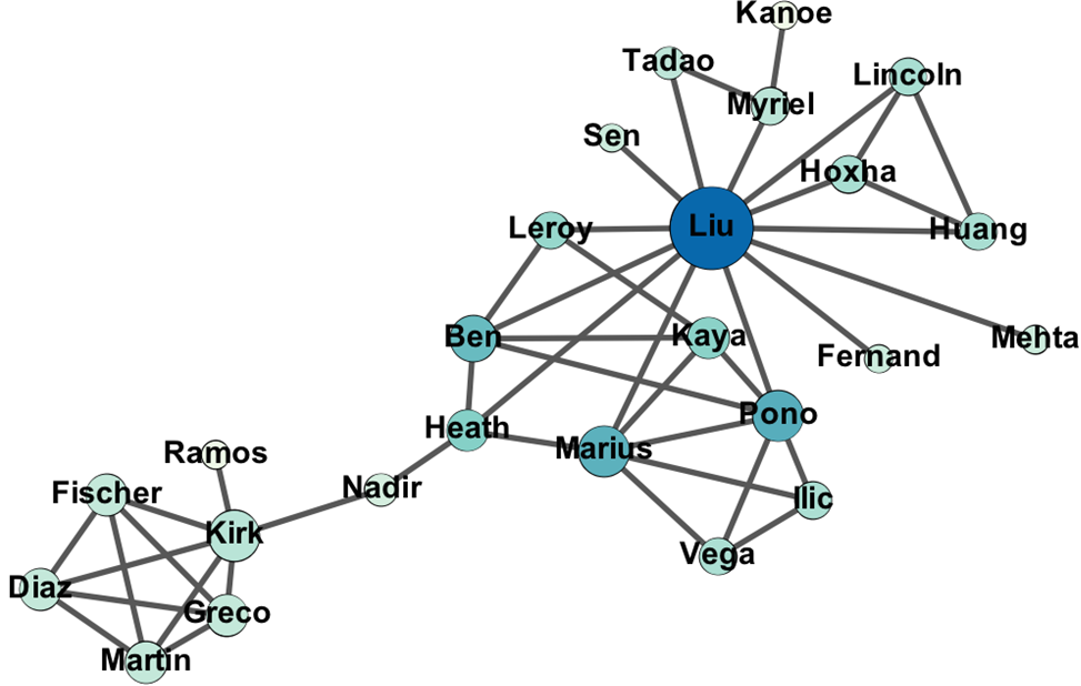 Figure 2: By increasing the size and darkness of nodes like Nadir and Heath, the visual narrative shifts to prioritize "Bridge" nodes that link distinct populations.
Critical Analysis: The Ethics of Design
A key insight of the paper is the "cautionary note." Every design choice involves a trade-off. For instance, moving a node to make a label more readable—a common practice in technical writing—distorts the spatial relationship and link length, which might be interpreted by experts as a measure of social distance.
The authors emphasize that software like Gephi has built-in biases. Technical communicators must develop "visual literacy" to ensure they are the drivers of the message, rather than the software's default algorithms.
Conclusion
Social Network Analysis is more than a mathematical exercise; it is a storytelling tool for public health intervention. By understanding the rhetorical dimensions of centrality, technical communicators can create diagrams that don't just show data, but advocate for life-saving actions. However, we must remain critical of our tools, acknowledging that every visualization "conceals as it reveals."
Takeaway for the Future: As we move toward more automated AI-driven visualizations, the humanistic ethic and rhetorical awareness described here will be essential to prevent data-driven "inhumanity" in public policy.