
Bianchi’s Color Wheel: Bridging the Gap Between Color Theory and Emotional HCI
&RP TXH FRU HX YRX" 8P HVWXGR VREUH FRUHV H HPRo}HV QD ,QWHUDomR +XPDQR-&RPSXWDGRU
This paper introduces the "Bianchi’s Color Wheel," a systematic framework mapping colors to Scherer’s Semantic Space of Emotion to support UI designers. By conducting a systematic review across seven databases, the authors establish evidence-based relationships between color properties (hue, saturation, brightness) and emotional dimensions (Valence, Arousal, Control).
TL;DR
Choosing the right color is more than an aesthetic choice—it's an emotional trigger. This paper presents Bianchi’s Color Wheel, a tool that maps specific colors and their properties (saturation/brightness) to Scherer’s Semantic Space of Emotion. By moving beyond "subjective intuition," the authors provide a systematic, evidence-based roadmap for designers to evoke specific psychological states in users.
Problem & Motivation: The Subjectivity Trap
In Human-Computer Interaction (HCI), color is a primary dimension of visual understanding. It affects cognitive processes and aesthetic judgment before a user even processes the content of a page. However, the authors identify a significant "Designer's Dilemma":
- Intuition over Science: Most designers choose colors based on subjective preference rather than psychological impact.
- Fragmented Research: Prior studies often focus on a single color or a vague set of "abstract emotions" (e.g., "modern," "clean"), which are difficult to translate into specific UI goals.
- Dimensional Neglect: Traditional color theory often ignores how Saturation and Brightness—not just Hue—dictate emotional intensity.
Methodology: Mapping Emotions to the Spectrum
The core innovation of this work is the alignment of color with Scherer’s Semantic Space, which categorizes emotions based on:
- Valence: Pleasantness vs. Unpleasantness.
- Arousal: Activation vs. Calmness.
- Control: Feeling of power vs. Lack of power.
The Systematic Synthesis
The authors reviewed 23 high-impact publications and books, applying a set of "Conflict Resolution Rules" to filter out contradictory data. For instance, if studies disagreed on whether a color was "positive" or "negative," the authors looked for the overwhelming consensus or the most significant delta in reporting.
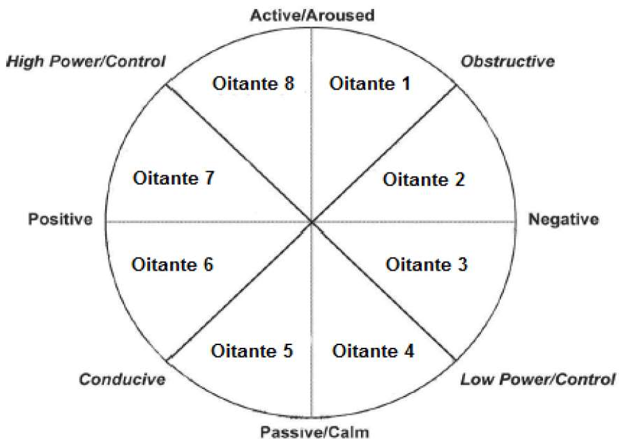 Figure 1: The adaptation of Scherer's model used to categorize emotional responses.
The Core Contribution: Bianchi’s Color Wheel
The research concludes that Hue brings us to the emotional room, but Saturation and Brightness turn the lights on.
1. The Resulting Mapping
Through their analysis, the authors established several "Ground Truths":
- Blue and Green: Consistently linked to low arousal (calmness).
- Red, Orange, and Yellow: Universally linked to high arousal (+E) and a sense of control (+C).
- Grey and Black: Linked to negative valence and low arousal/control.
2. Defining Specification
The authors went a step further by defining specific HSB (Hue, Saturation, Brightness) configurations for each emotional quadrant:
- High Valence/High Arousal (+V, +E): Requires 100% Saturation and 100% Brightness.
- Negative Valence/Low Arousal (-V, -E): Found at 70% Saturation and 50% Brightness.
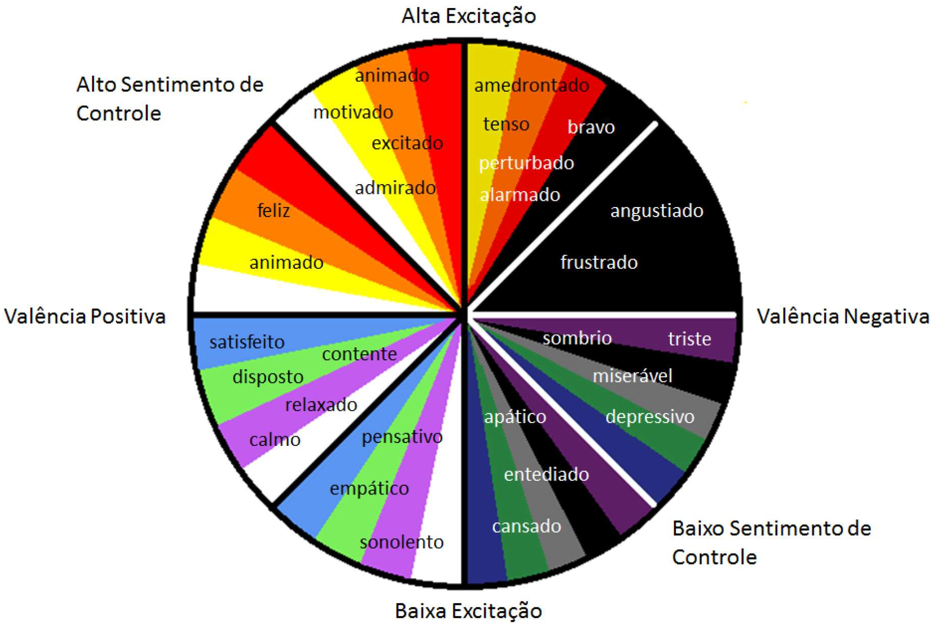 Figure 2: The final Bianchi’s Color Wheel, providing a visual guide for emotional elicitation.
Critical Analysis & Future Outlook
While Bianchi’s Color Wheel is a massive step toward objective emotional design, the authors acknowledge several constraints:
- Cultural Context: Color meanings are not universal; "white" may signify purity in one culture and mourning in another.
- Element Isolation: The study looks at color in isolation. In a real UI, typography and imagery interact with color to create a holistic emotional "gestalt."
- The "Pink" Gap: Some colors, like pink, lacked enough empirical data in the literature to be definitively mapped, highlighting areas for future research.
Conclusion
Bianchi’s Color Wheel transforms color from a decorative element into a functional tool for "Emotional Engineering." For the technical designer, this provides a much-needed bridge between the art of design and the science of human psychology.
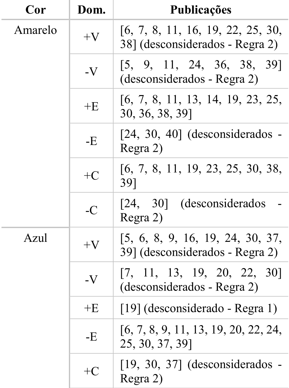 Figure 3: Consensus analysis of color-emotion relationships from the systematic review.