
SAVIZ: Bridging the Trust Gap in AI-Powered Crisis Informatics
8814_SAVIZ interactive exploration and visualization of situation labeling classifiers over crisis social media data.
This paper introduces SAVIZ, an interactive visualization platform designed for humanitarian first responders to explore "situation labeling" classifiers applied to crisis social media data. It utilizes fastText embeddings and t-SNE projection to map noisy automated labels (e.g., food, medicine, water) onto a 2D space, providing a web-based, portable interface for large-scale Twitter data.
TL;DR
In the wake of a disaster, automated AI tools attempt to categorize thousands of tweets into actionable needs (food, water, medical aid). However, these "situation labeling" models are often noisy and untrustworthy. SAVIZ is a new interactive visualization platform that allows non-technical first responders to explore these AI outputs spatially, audit errors, and gain real-time situational awareness through an intuitive, web-based interface.
The "Black Box" Problem in Crisis Response
During humanitarian emergencies, the DARPA LORELEI program and other initiatives use systems like ELISA to process social media streams. The goal? To automatically tag messages so responders know where to send water or medicine.
The reality is messy. Data from low-resource languages, mangled machine translations, and heavy emoticon usage result in classifiers with performance often below 70% F-measure. When an AI mistakenly labels a meaningless string of text as a "medical need," first responders lose trust in the technology. Without a way to visualize the provenance or the distribution of these labels, advanced AI remains a social challenge rather than a solution.
Methodology: From Raw Text to 2D Maps
SAVIZ addresses this by turning the "black box" into a "glass box." The system follows a streamlined, unsupervised pipeline:
- Data Ingestion: It takes raw Twitter streams (e.g., collected via CrisisLex) and their corresponding labels from any classifier.
- Embedding Generation: Using Facebook Research’s fastText, it maps short messages into a 100-dimensional vector space. Unlike traditional methods, this captures the semantic "neighborliness" of tweets.
- Dimensionality Reduction: The system uses t-SNE (t-Distributed Stochastic Neighbor Embedding) to project these 100D vectors into a 2D plane.
- Interactive Rendering: Built on the Bokeh library, the final visualization allows users to zoom, filter by category, and draw bounding boxes to inspect specific clusters of reports.
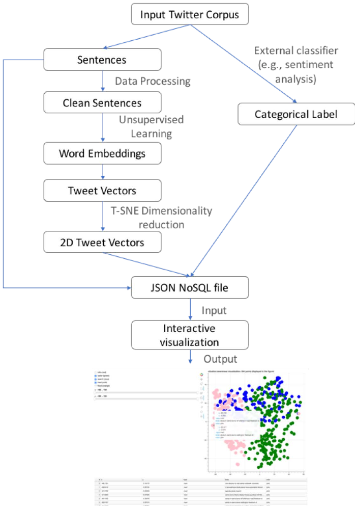 Figure 1: The SAVIZ workflow—from raw crisis data to interactive browser-based visualization.
Real-World Scenarios: Ebola and Nepal
The authors validated SAVIZ using two distinct, high-pressure datasets:
Case 1: The Ebola Crisis
Visualizing 18,224 tweets, SAVIZ revealed a crucial insight: while "medicine" was a predictable primary green label (as seen in Figure 2), "water" emerged as an equally significant cluster. This spatial clustering helped researchers realize that water and sanitation were being discussed as frequently as medical treatment—an insight that might be buried in a standard spreadsheet of labels.
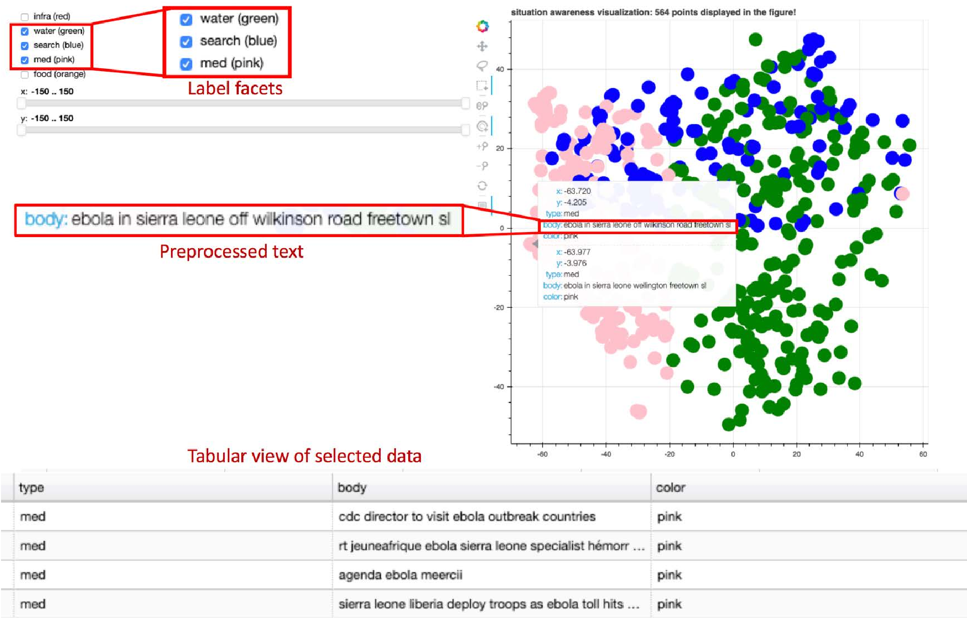 Figure 2: The SAVIZ interface showing the Ebola dataset. Different colors represent different categories of humanitarian needs.
Case 2: The Nepal Earthquake
Processing 29,946 points from the 2015 earthquake, the system demonstrated its "backward compatibility" with legacy crisis platforms while handling thousands of tweets with no lag, proving it can be deployed in standard web browsers without specialized hardware.
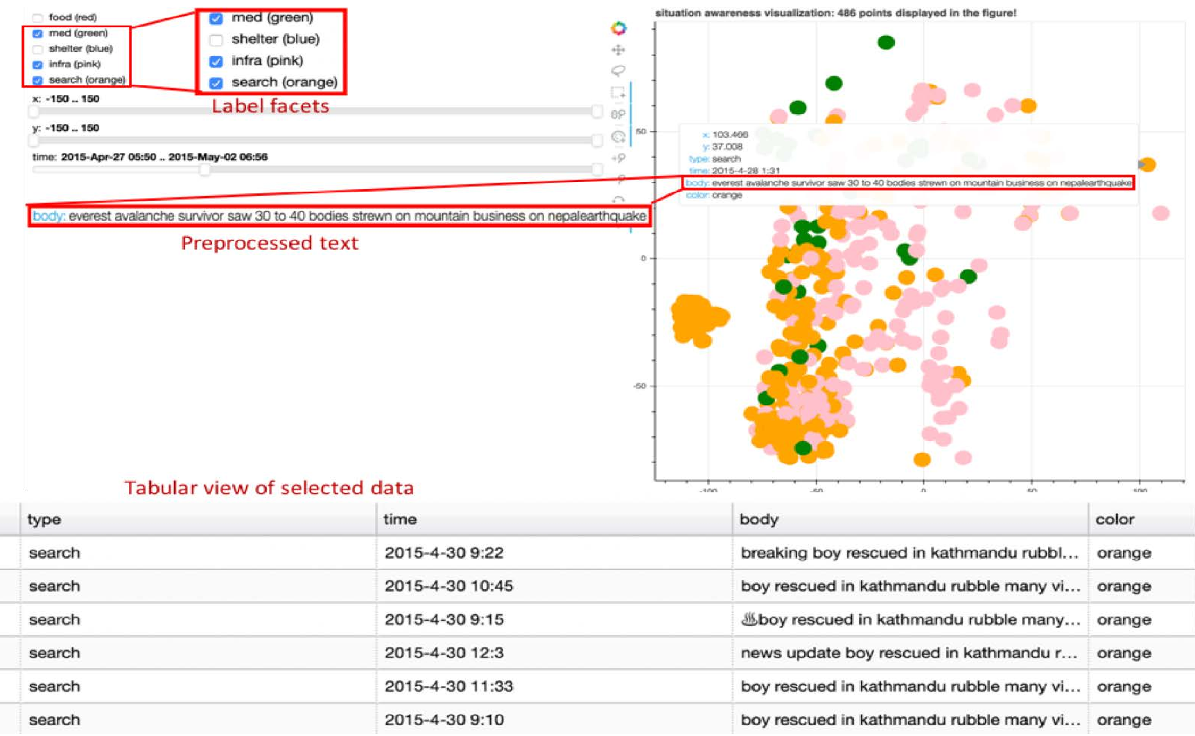 Figure 3: Clustered situational reports from the Nepal earthquake data.
Critical Insight & Future Work
The core value of SAVIZ isn't just "showing dots on a map"—it's about uncertainty management. By grouping similar tweets together, responders can instantly see if a whole cluster is mislabeled or if a specific region is reporting a surge in demand for "shelter."
Limitations: Currently, SAVIZ is a read-only exploration tool. The labels are static once imported. The Road Ahead: The authors plan to implement "interactive annotation," where users can correct a label on the map, and the system uses that feedback to re-train the underlying classifier in real-time. This turns the visualization into a powerful tool for Active Learning.
In conclusion, SAVIZ proves that in the high-stakes world of disaster relief, the best AI is not necessarily the most "accurate" one, but the one that humans can best understand and correct.