
SentiCompass: Mapping the Emotional Pulse of Twitter Through Time
SentiCompass: Interactive visualization for exploring and comparing the sentiments of time-varying twitter data
This paper introduces SentiCompass, an interactive visualization system designed to explore and compare sentiments in time-varying Twitter data. It combines Russell's 2D circumplex model of affect with a "time tunnel" perspective projection to visualize how sentiment dimensions (valence and arousal) evolve over time.
TL;DR
SentiCompass is a sophisticated visualization tool that moves beyond "positive vs. negative" sentiment analysis. By plotting tweets on a 2D "Affective Space" (Pleasantness vs. Energy) and stacking these observations into a "Perspective Time Tunnel," it allows researchers to see not just what people feel, but how those complex emotions shift during major global events.
Background & Positioning
In the landscape of social media analytics, most tools provide simple line charts of sentiment polarity. SentiCompass positions itself as a more nuanced alternative, bridging the gap between high-level temporal overviews and deep psychological modeling. It is a refinement of spatial-temporal visualization techniques, specifically designed for the high-velocity, emotionally charged nature of Twitter.
Problem: The Limits of Unidimensional Sentiment
Why do typical sentiment graphs feel incomplete? Because "negative" can mean many things. Being "sad" (low arousal) is different from being "angry" (high arousal), yet both are "negative."
Existing work fails in two major areas:
- Simplification: Reducing emotion to a 1D scale loses the nuances of human reaction.
- Temporal Fragmentation: It is hard to compare the emotional "shape" of 10:00 AM versus 11:00 AM when data is spread across disconnected views.
Methodology: The 2D Affective Space and the Time Tunnel
SentiCompass adopts Russell’s Circumplex Model, which maps sentiments onto two axes:
- Valence: The degree of pleasure (Unhappy to Happy).
- Arousal: The degree of activation (Sleepy to Excited).
The "Time Tunnel" Innovation
Instead of a standard timeline, the authors developed a perspective projection.
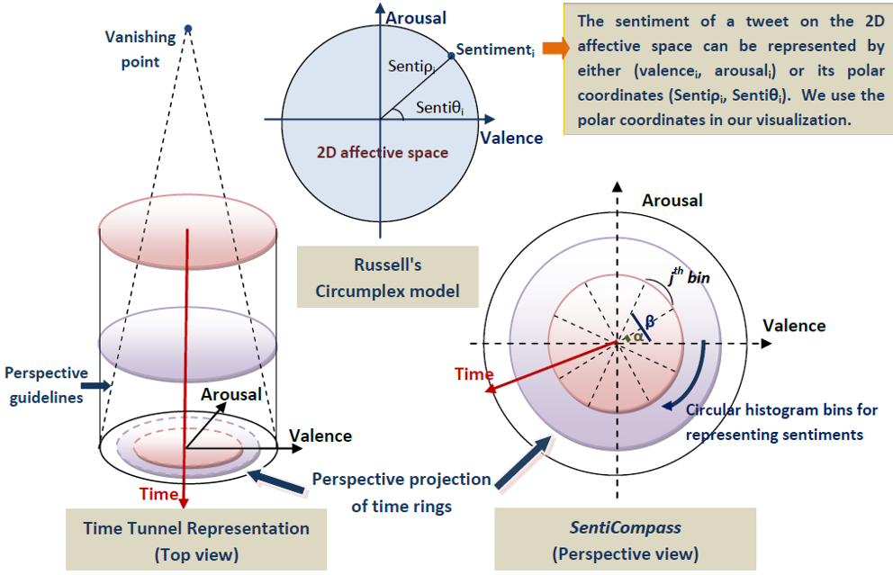 Figure 2: The visual metaphor combining the polar sentiment wheel with a perspective projection.
Each "ring" in the tunnel represents a time segment. By looking "into" the tunnel, the user sees a history of sentiment. The most recent data is the largest, outermost ring, while older data recedes into the center, allowing for a unique comparison of "emotional volumes" across a continuous timeline.
Experimental Insights: Rugby and Elections
The effectiveness of SentiCompass is validated through two distinct scenarios:
1. The Highs and Lows of Sport
In a match between Wales and New Zealand, SentiCompass captured the moment a stalemate broke. During the second half, the "Tense" sector of the wheel spiked significantly, reflecting the fan anxiety as the score gap widened.
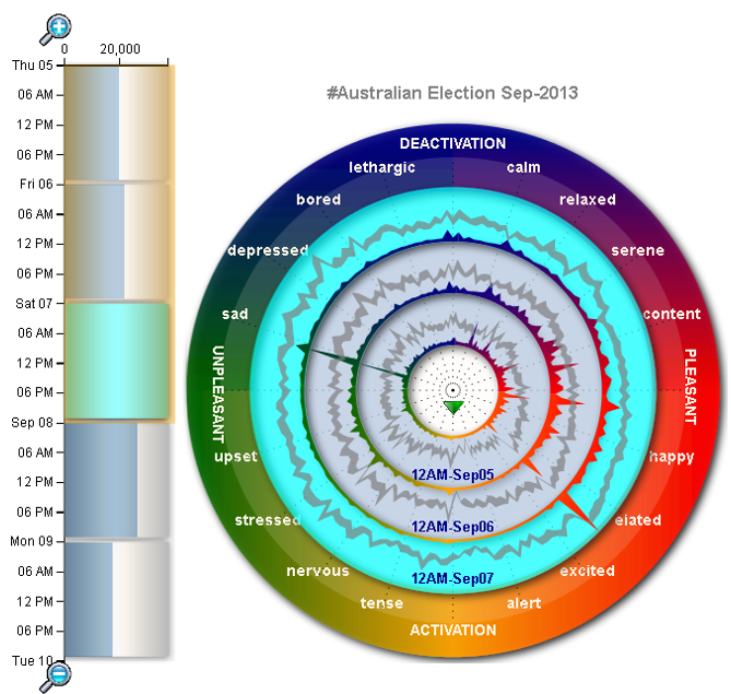 Figure 3: Visual comparison of two rugby matches, showing different emotional densities.
2. Political Shifts
During the Australian election, the tool visualized a clear transition:
- Pre-Election: Polarized clusters around "Sad" and "Content."
- Election Day: A massive shift toward "Excited" and "Elated" (High Valence, High Arousal).
- Post-Election: A calm-down effect, moving toward "Relaxed" (High Valence, Low Arousal).
Critical Analysis & Conclusion
SentiCompass represents a significant step forward in Affective Computing. By using perspective projection, it solves the problem of "visual clutter" that often plagues temporal data.
Takeaway: This work demonstrates that the "shape" of sentiment is just as important as its direction. For brands or governments monitoring events, seeing an shift from "Relaxed" to "Tense" provides an early warning system that a 1D "Positive/Negative" chart would miss.
Limitations: The system currently relies heavily on a pre-defined dictionary (ANEW). In an era of sarcasm and rapidly evolving slang, a purely dictionary-based approach may miss context. Future iterations would benefit from integrating Transformer-based models (like BERT or RoBERTa) to better populate the 2D affective space.
SentiCompass: Interactive Visualization for Exploring and Comparing the Sentiments of Time-Varying Twitter Data.