
Beyond Node-Links: A Time-Based Visual Framework for User Classification in Social Health Networks
A Time-based Visualization for Web User Classification in Social Networks
This paper introduces a visual analytics framework designed for classifying and analyzing web user behavior in health-related social networks. By replacing traditional node-link diagrams with interactive, time-based scatter plots, the system enables an intuitive exploration of multidimensional datasets from the "Walk 2.0" physical activity portal.
TL;DR
Analyzing user behavior in social networks often results in "hairball" node-link diagrams that obscure more than they reveal. This paper presents a visual analytics framework that shifts the focus to time-based scatter plots, allowing researchers to track how users transition between behavioral states like "Publisher," "Lurker," and "Annotator" over months of participation in a health portal.
The "Information Overload" Problem in Social Analytics
The rise of Web 2.0 has transformed health interventions into interactive social ecosystems. However, the data produced by these platforms—combining session lengths, engagement metrics, and social interactions—is often overwhelming.
The authors argue that existing node-link visualizations (the traditional standard for social networks) are insufficient for:
- Temporal Dynamics: They don't easily show how a user changes from active to inactive.
- Multivariate Integration: It’s difficult to correlate social connectivity with session data like "average time spent on site."
Methodology: The Interactive Scatter-Plot Framework
The core innovation lies in the Classification-Visualization-Analysis loop. Instead of focusing on who is connected to whom, the framework focuses on what users are doing and how that changes over time.
Behavioral Stereotypes
The system classifies users into four distinct categories:
- Publisher (●): High-activity users creating original content.
- Annotator (■): Users who add value to others' content (e.g., "likes" or comments).
- Lurker (♦): Passive consumers who browse but do not contribute.
- Inactive (×): Users who haven't interacted for an extended period (e.g., 30 days).
System Architecture
The visualization interface is divided into four functional panels:
- Mapping Panel: Allows the analyst to assign variables (Total Time, User ID, Posting Count) to X and Y axes.
- Main Panel: The interactive scatter plot where node shapes represent classifications.
- Details Panel: Displays granular data for a selected individual.
- Date Slider: The time-machine of the system, enabling the playback of user behavior history.
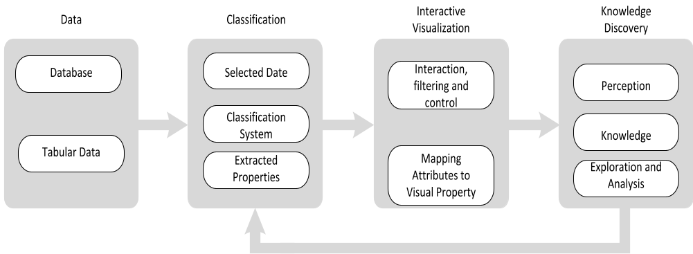 Figure 1: The proposed visual analytics framework showing the pipe from raw data to knowledge discovery.
Clinical Case Study: The Walk 2.0 Project
The framework was tested on the Walk 2.0 dataset—a randomized controlled trial investigating web-based physical activity trackers.
Key Findings from Visualization:
- Growth Tracking: By moving the date slider, researchers could visualize the network expanding from 18 users in early 2011 to 705 users by late 2013.
- Behavioral Evolution: The system identified a specific user (Index 86) who transitioned from a high-volume "Publisher" back to an "Inactive" state, despite increasing their publishing count by 214% during their active phase.
- Classification Scarcity: Real-world data showed that "Annotators" were surprisingly rare, often being a transitionary phase for new users before they either became Publishers or Lurkers.
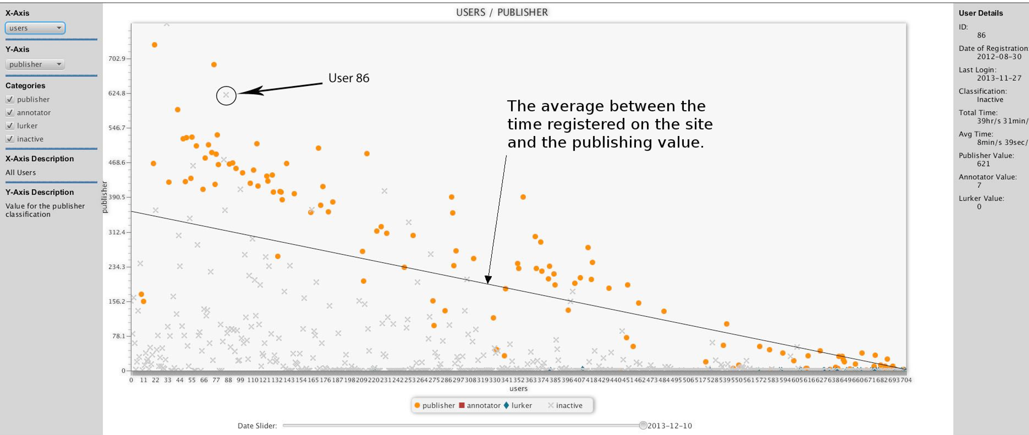 Figure 2: Scatter plot mapping User Index vs. Publishing Value. The linear trend indicates that older users tend to produce more content.
Critical Insight: Why This Matters
The shift from Topological Views (links) to Attribute Views (scatter plots) reflects a broader trend in data science: the need to understand state transitions. In a digital health context, knowing that a user is a "Lurker" is useful, but seeing them become a Lurker after a month of high "Publisher" activity is a diagnostic signal that the intervention is losing its efficacy.
Limitations and Future Work
While effective, the current framework relies on 2D mapping which limits the number of visible dimensions at once. The authors suggest future validations will involve formal usability studies with health researchers to compare this "visual storytelling" approach against traditional raw data mining.
Conclusion
This study provides a practical, scalable method for simplifying the complexity of social network data. By prioritizing time as a primary filter and using familiar scatter plots, the framework turns a chaotic "hairball" of interactions into a clear narrative of user engagement and health behavior trends.