
DyVT: Bridging Time, Space, and Personalization in Social Network Visualization
A Toolkit to Support Dynamic Social Network Visualization
This paper introduces the Dynamic Visualization Toolkit (DyVT) and its accompanying XML-based language, DyVTML, designed to visualize complex social networks. The system achieves SOTA integration by simultaneously handling temporal animations, geospatial mapping (via Google Maps), and personalized aesthetics in a unified framework.
TL;DR
Social networks are inherently dynamic, yet most visualization tools treat them as static snapshots. This paper presents the Dynamic Visualization Toolkit (DyVT), which utilizes a specialized XML language (DyVTML) to integrate temporal animations and geospatial mapping into a single view. By separating data structure from visual appearance, DyVT allows researchers to see not just who knows whom, but where and when those connections evolved.
Background: The Limits of Static Graphs
In the landscape of Social Network Analysis (SNA), "structural bias" is a persistent hurdle. Most tools focus on the topology of a network at a single point in time. However, social relations are fluid; they emerge, strengthen, and decay. The authors argue that understanding these dynamics is essential for reasoning about complex systems. Previous attempts to solve this typically focused on only one dimension—either time (animations) or space (maps)—but rarely both.
The Core Innovation: DyVTML and ADML
The meat of the paper lies in its data modeling. To handle the complexity of rich social data, the authors proposed a two-pronged XML strategy:
- DyVTML (Dynamic Visualization Toolkit Markup Language): Extends GraphML to include temporal slices and geospatial coordinates. It acts as the "source of truth" for the network's evolution.
- ADML (Appearance Data Markup Language): A lighter, secondary schema that stores user-defined styles (colors, icons, sizes).
Why decouple them?
- Reduced Redundancy: You don't need to redefine a node's color every time its position changes in a time-slice.
- Performance: When a user changes a color setting, the system only re-parses the tiny ADML file rather than the massive DyVTML dataset.
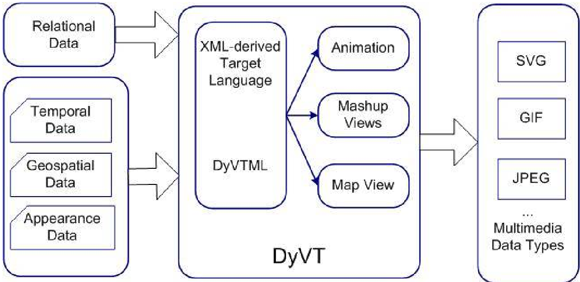 Figure 1: The conceptual framework of DyVT showing the integration of disparate data sources into a unified XML-based visualization.
Methodology: From Raw Data to Animation
The DyVT workflow operates across three tiers:
- Database Tier: Extracts raw mailing list data (like the PROLEARN project) and maps IP addresses to physical city locations.
- Enrichment Tier: Refines this data into the DyVTML format, defining the "Who, When, and Where."
- Visualization Tier: Implements the Kamada-Kawai (KK) layout—a force-directed algorithm that minimizes the "energy sum" of the graph to ensure visual clarity.
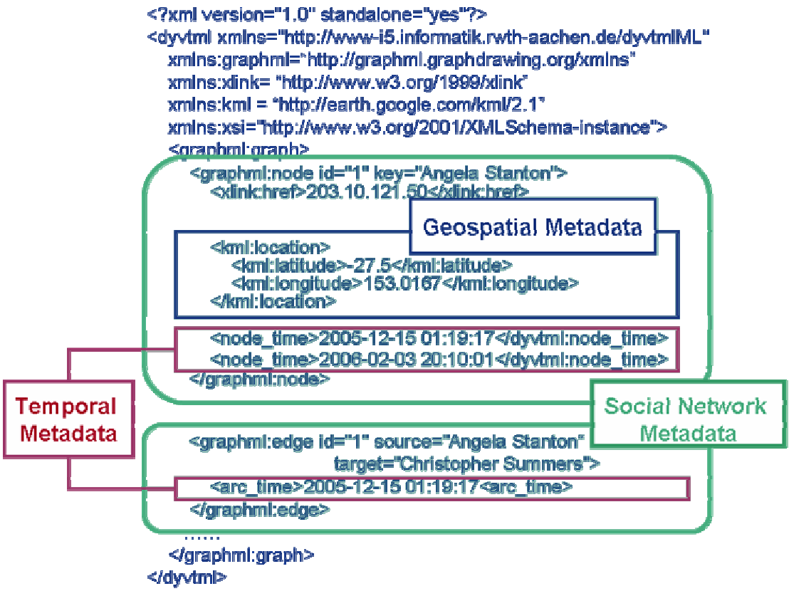 Figure 2: The structure of DyVTML, illustrating how temporal and spatial data are nested within the graph elements.
Experimental Insights: Mapping the EU PROLEARN Network
The authors tested DyVT on a real-world dataset of European mailing lists. By visualizing the communication flow, the tool could generate:
- Animations: Showing how new members joined the mailing list over months.
- Map Views: Using the Google Maps API to plot exactly where participants were located geographically.
The Ablation-style evaluation (task-oriented usability testing) showed that even less-experienced users could effectively identify patterns in temporal data that were previously invisible in static representations.
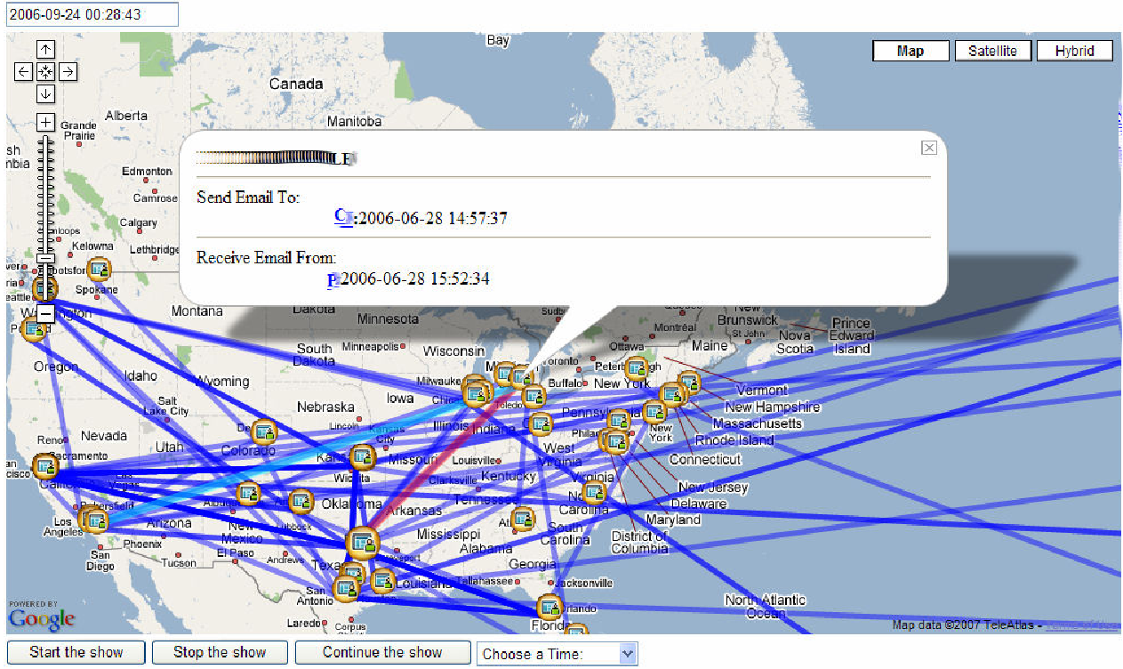 Figure 3: A screenshot of the DyVT interface visualizing email communication events atop a geographic map.
Critical Analysis & Future Outlook
While DyVT is a significant leap forward in multi-dimensional visualization, it faces two main challenges:
- Scalability: Node-link diagrams become "hairballs" as nodes increase. The authors suggest a matrix-based representation as a future alternative for large-scale graphs.
- Semantic Complexity: Current links represent simple email exchanges. Future work needs to address "multi-relational" networks where actors are connected by multiple different types of interactions.
Conclusion: DyVT proves that by leveraging flexible XML standards, we can move beyond static charts into intuitive, spatiotemporal "movies" of human interaction. This has massive implications for understanding everything from corporate communication to the spread of online communities.