
Visual Truths: Uncovering the Discrepancy Between Text and Images in Social Media Crisis Events
Towards Understanding Crisis Events On Online Social Networks Through Pictures
The paper introduces an automated 3-tier pipeline to analyze large-scale visual content on Online Social Networks (OSNs) during crisis events, specifically the 2015 Paris Attacks. Utilizing Google Inception-v3 and OCR techniques, the study compares visual themes and sentiment against traditional textual analysis across 57,000 Facebook images.
TL;DR
In the wake of the 2015 Paris Attacks, social media was flooded with content. Most researchers looked at the words; this paper looks at the pictures. By deploying an automated 3-tier pipeline, the authors analyzed 57,000+ Facebook images to find that images often tell a story completely different from text—uncovering hidden misinformation, positive waves of solidarity, and conspiracy theories that "text-only" mining would have missed entirely.
The Blind Spot in Social Media Mining
Traditional crisis informatics relies on NLP (Natural Language Processing) to gauge public sentiment. However, the human brain processes visuals much faster and with more emotional resonance. Existing studies were either limited to text or restricted to small-scale manual image coding (usually under 1,000 images).
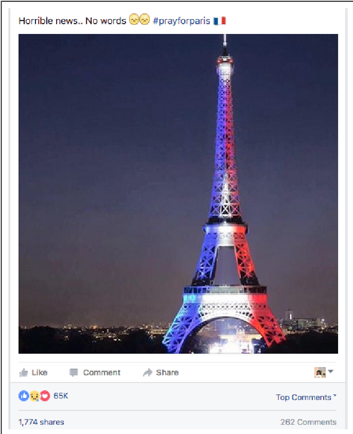
The authors argue that by ignoring images, we are missing a massive portion of the data. Even more dangerously, sentiment in text often contradicts sentiment in images. A post might say "Horrible news" (negative) while the attached image shows the Eiffel Tower in French colors (positive/supportive). Without a way to bridge this gap at scale, our understanding of public reaction is flawed.
Methodology: The Helix 3-Tier Pipeline
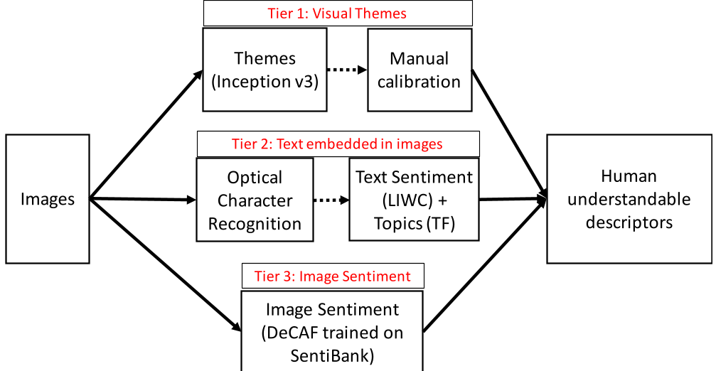
To process 57,000+ images without a massive team of human annotators, the researchers built an automated pipeline combining Computer Vision (CV) and Deep Learning:
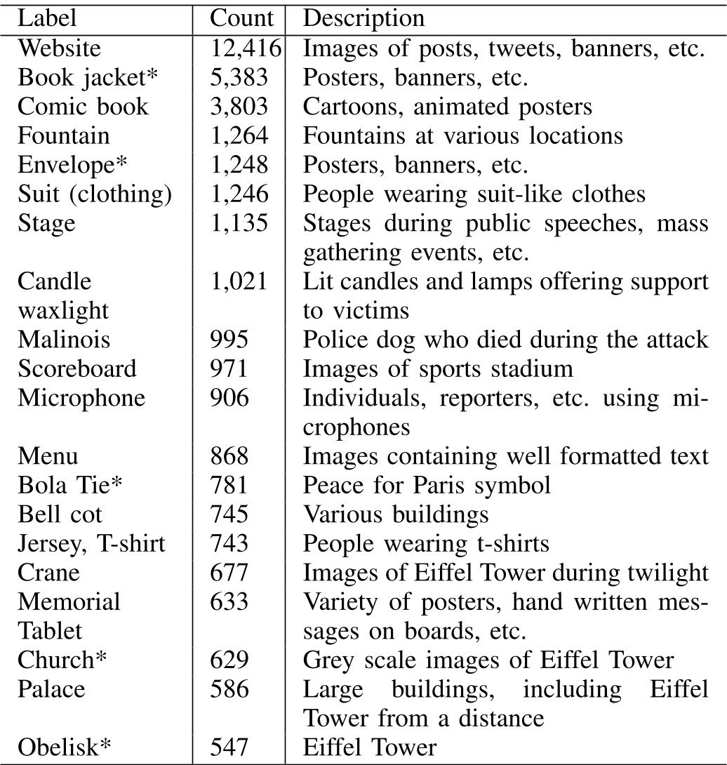
- Tier 1: Visual Themes (CNN-based Classification): Using a pre-trained Inception-v3 model, they categorized images into high-level human-understandable labels. They applied a clever "re-calibration" trick: since CNNs naturally group similar-looking things, they manually renamed top labels (e.g., "bolo tie" became "Peace for Paris symbol") to fit the specific context of the crisis.
- Tier 2: Text-in-Image (OCR): Using PyTesseract, they extracted text trapped inside memes, banners, and screenshots.
- Tier 3: Image Sentiment (Transfer Learning): They used DeCAF to transfer features from a general recognition model to a sentiment detection model trained on Western-style Adjective-Noun Pairs (ANPs).
Key Findings: The "Positivity" of Crisis Images
One of the most striking results was the sentiment divergence.
- Positive Images vs. Negative Text: While news text was dominated by words of death and destruction (Negative), over 60% of images portrayed positive sentiment—focusing on candles, solidarity, and the "Pray for Paris" movement.
- The Misinformation Gap: Two of the top 10 visual themes were linked to misinformation. One viral image claimed a Muslim security guard at the stadium was a hero (later debunked), and another spread incorrect details about a police dog's death. Interestingly, these narratives were vibrant in images but nearly invisible in pure textual analysis.
- Conspiracy Theories: Text extracted from images (Tier 2) revealed sensitive political discussions about "passports" and "refugees" that didn't appear in the main post text, suggesting that users use images to bypass automated text filters or spread "false flag" theories.
Experimental Evolution & Temporal Trends
The paper tracked sentiment over a 12-day period. Text sentiment was initially negative but moved positive as support poured in. However, image-text (text inside pictures) followed the opposite path: it started positive but turned negative as backlash against refugees and conspiracy theories gained traction.
Critical Insights & Future Work
The research proves that multi-modal analysis is no longer optional for OSN monitoring. The authors candidly acknowledge limitations, such as the 70% accuracy of the sentiment model and the challenges of OCR with calligraphic text.
However, the industry takeaway is clear: Law enforcement and crisis response teams must look beyond keywords. Images are the primary vehicle for both solidarity and subversive misinformation. Future iterations of this pipeline could integrate more advanced "Attentional" models or Vision-Language Models (VLM) to further bridge the gap between pixel and meaning.
Conclusion: In the digital age, a picture doesn't just worth a thousand words—it often tells a completely different story than the ones we are reading.