
From Quantified Self to Conversations: Reimagining Healthcare Visualization
Valuable Visualization of Healthcare Information: From the antified Self Data to Conversations
The Valuable Visualization in Healthcare (VVH) workshop advocates for "Human-Data Interaction" (HDI) to transform raw healthcare data into actionable insights. It presents a framework and a series of case studies—ranging from clinical dashboards to personal health monitoring—that emphasize the synergy between data visualization and narrative-driven sense-making.
TL;DR
The "Valuable Visualization in Healthcare" (VVH) framework shifts the focus from mere data display to Human-Data Interaction (HDI). By emphasizing interactivity and "data telling," this research demonstrates that complex medical datasets—such as parallel coordinates and heat maps—become significantly more informative and actionable for both doctors and patients when they support active exploration and narrative construction.
Contextual Positioning
In an era of "Big Data," healthcare faces a paradox: we have more data than ever (from wearables to social media), yet clinicians and patients often feel overwhelmed. This work serves as a foundational call to action, positioning itself at the intersection of Human-Computer Interaction (HCI) and Data Science. It argues that the "Social Value" of information is only realized when data is made legible through intuitive, interactive design.
The Problem: The "Literacy Gap" in Healthcare Data
Prior work in clinical dashboards often treated users as passive recipients of "static" information. The authors point out two critical failures:
- Heterogeneity of Users: A policy maker needs different insights than a patient tracking their heart rate.
- Multidimensional Complexity: Traditional tables cannot capture the correlation between, for example, lifestyle habits, sensor data, and clinical outcomes.
The "Literacy Gap" occurs when laypeople or busy clinicians cannot navigate these complex datasets, leading to a "failure of appropriation"—where the data exists but is never used to improve health outcomes.
Methodology: Human-Data Interaction (HDI) & Data Telling
The core insight of the VVH workshop is that visualization should facilitate conversations. This is achieved through:
- Interactive Georeferencing: Turning public health data into zoomable heat maps.
- Parallel Coordinate Diagrams: Allowing users to see population-level tendencies and inter-dimensional correlations simultaneously.
- Data Telling: The process of co-producing stories from data, helping patients follow a "narrative" of their health journey rather than just reading numbers.
 The workshop brings together practitioners from diverse fields to bridge the gap between informatics and clinical practice.
Experiments & Results: The Power of Interactivity
The authors conducted a user study involving 29 family doctors with extensive experience. They tested the efficacy of two specific visualization types:
- Interactive Maps: These were perceived as "much more useful" for recognizing environmental risks (like exposure to carcinogens) compared to static datasets.
- Parallel Coordinates (PC): While PCs are traditionally considered complex, the study found that adding interactivity (allowing doctors to filter and browse patient dimensions) led to a massive jump in perceived informativity (from 0.65 to 0.96).
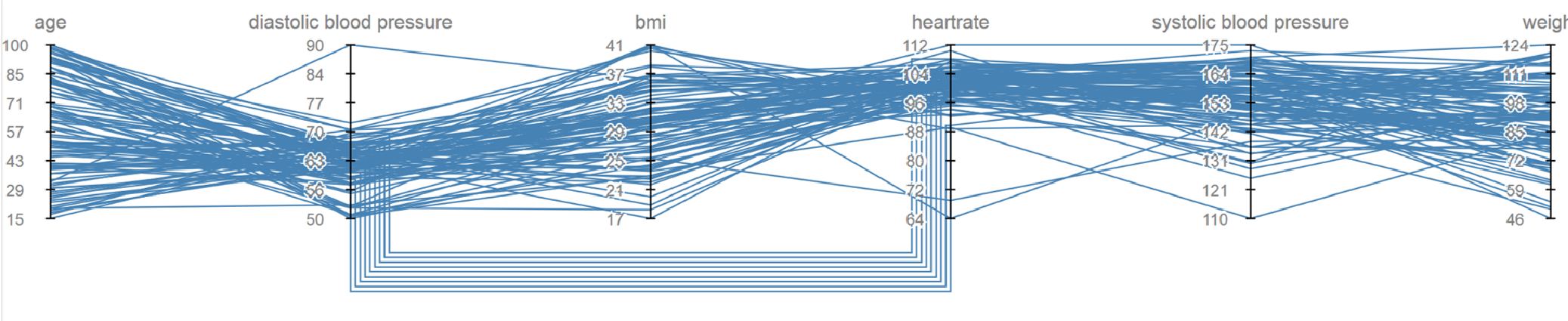 Figure 1: Parallel coordinates used to visualize patient data across multiple dimensions, highlighting population-level correlations.
Deep Insights & Future Outlook
The VVH framework suggests that the future of healthcare technology isn't just "smarter AI," but "better interfaces."
Critical Takeaways:
- Interactivity is Not Optional: For high-stakes clinical decisions, the ability to "interrogate" the data (zooming, filtering, browsing) is what converts data into knowledge.
- Social Value: Information gains value when it can be shared and discussed. Tools like the "Electronic Multimedia Health Record" (FSEM) aim to turn a static medical record into a dynamic portal for shared decision-making.
Limitations & Future Work:
The authors acknowledge that while interactivity helps, "ease-of-use" remains a hurdle. Future research must explore how to reduce the "implementation barrier" for mobile devices and how to integrate Argumentation Theory—using visual tools to help doctors and patients weigh the pros and cons of different treatment paths.
In conclusion, this work highlights that for healthcare data to be truly "valuable," it must transition from a silent record into a participant in the clinical conversation.