
VisLab: Shattering the Ivory Tower of Visualization Science
VisLab: Crowdsourcing Visualization Experiments in the Wild
VisLab is a crowdsourcing platform designed to democratize visualization experiments by allowing practitioners, researchers, and educators to deploy web-based user studies. It utilizes scaffolded templates for perception and cognition tasks, enabling rapid evaluation of design choices without requiring deep statistical or programming expertise.
TL;DR
VisLab is a new online platform that allows anyone—not just academics—to run rigorous experiments on their data visualizations. By providing pre-built templates for perception and memory tasks, it bridges the gap between design theory and real-world practice, turning the internet into a massive laboratory for "in-the-wild" visualization testing.
The Gap Between "Hunches" and Hard Data
In the world of data journalism and business intelligence, designers often create complex visuals like Tornado charts or Muller plots. When asked why they chose a specific layout, the answer is usually "it felt right."
While academic research provides a foundation (like knowing that bar charts are generally better than pie charts), it often fails to address the unique, messy data distributions found in the wild. Historically, testing a new chart type required:
- Hiring a developer to build an experiment site.
- Recruiting and paying dozens of participants.
- Conducting complex statistical analysis.
VisLab aims to eliminate these barriers, moving visualization science from the laboratory to the community.
Methodology: Standardizing the Science
The core innovation of VisLab is its Scaffold Templates. The authors analyzed over 141 recent visualization experiments to identify a "Standard Operating Procedure." They found that successful online studies consistently use pre-surveys, screening for color blindness, and specific task types like Compare, Identify, and Recall.
The Three Pillars of Testing
VisLab offers three primary templates that cover the most critical design dimensions:
- Graphical Perception: Testing how accurately users can judge values (e.g., comparing lengths vs. angles).
- Memorability: Testing which parts of a visualization stick in a viewer's mind.
- Attention Tracking: Using tools like BubbleView to see where users are actually looking.
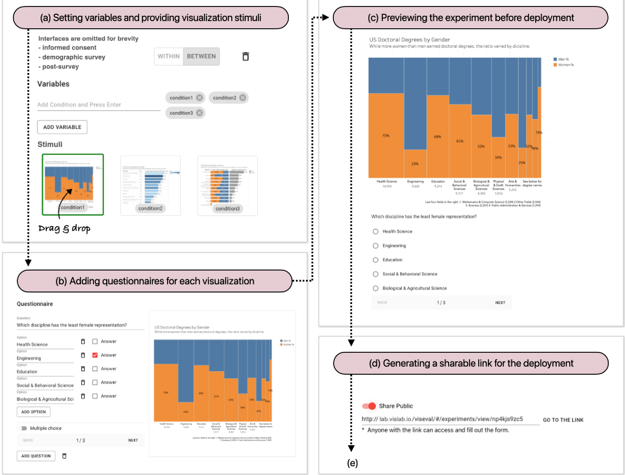 Figure 1: The VisLab workflow: from drag-and-drop design to a shareable link and automated analytic dashboards.
From Experiment to Insight
One of the hardest parts of research is "closing the loop"—turning raw data into a decision. VisLab includes an Analytic Dashboard that handles the heavy lifting. Instead of wrestling with R or Python scripts, practitioners get immediate visual feedback on accuracy, response time, and "click maps" (heatmaps of user attention).
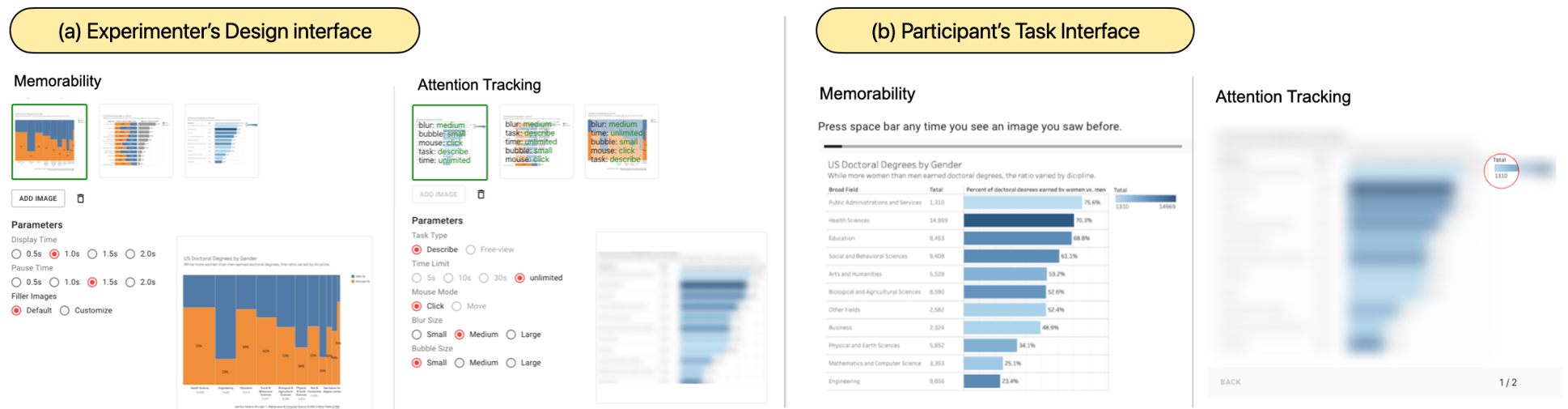 Figure 2: Participants experience a streamlined task interface, while experimenters view real-time performance metrics.
Why This Matters: The Rise of Practitioner-Sourcing
The most profound takeaway from the VisLab project is the shift toward Practitioner-Sourcing. By allowing journalists and designers to run their own "citizen science" projects, we create a massive, open-source repository of what actually works in data communication.
Instead of blindly following dogmatic rules like "Never use pie charts," a designer can now spend 10 minutes setting up a VisLab link, share it on Twitter, and have statistically significant proof of which version of their chart is more effective for their specific audience.
Conclusion and The Road Ahead
VisLab is currently limited to three main templates, but it lays the groundwork for a future where visualization guidelines are living documents updated by real-world data rather than static papers from 1984.
However, the platform currently faces limitations in longitudinal tracking (since it avoids user sign-ups to keep friction low). Future iterations aim to include more complex statistical testing and the ability to "fork" existing experiments—allowing the community to build upon each other's research like they do with code on GitHub.
Final Thought: If you've ever argued with a colleague about whether an interactive map is "too distracting," VisLab is the tool designed to end that argument with data.