
Visualizing Football History: Decoding the World Cup through Dynamic Network Analysis
Visual Analysis of History of World Cup: A Dynamic Network with Dynamic Hierarchy and Geographic Clustering
The paper introduces three novel visual analysis methods—Wheel, Radial, and Hierarchical layouts—to represent the FIFA World Cup history as a dynamic network. By integrating centrality analysis and geographic clustering, the authors successfully reveal long-term dominance patterns and specific year-by-year performance outliers in a social network context.
TL;DR
Analyzing nearly a century of World Cup data requires more than simple charts. This paper introduces three sophisticated layout techniques—Wheel, Radial, and Hierarchical—that treat the history of football as a dynamic social network. By leveraging Centrality Analysis and Union Graphs, the authors provide a framework that reveals the "Expected" (dominant powers like Brazil) and the "Unexpected" (dark horse runs) while maintaining a consistent visual context over time.
Problem & Motivation: The Complexity of Evolving Records
Sports data is inherently dynamic and hierarchical. However, most visualization tools treat time-series data either as static snapshots or fluid animations where nodes jump around, destroying the viewer's "Mental Map."
The authors identified a gap: how do we visualize a network where both the topology (who played whom) and the attributes (ranking/importance) change every four years, all while respecting geographic groupings? The challenge lies in balancing global historical context with local tournament details.
Methodology: The Architecture of Hierarchy
The core innovation lies in the Union of Graphs . By calculating the Degree Centrality on the union graph, the authors create a permanent "Coordinate System" for every country.
1. Radial Layout
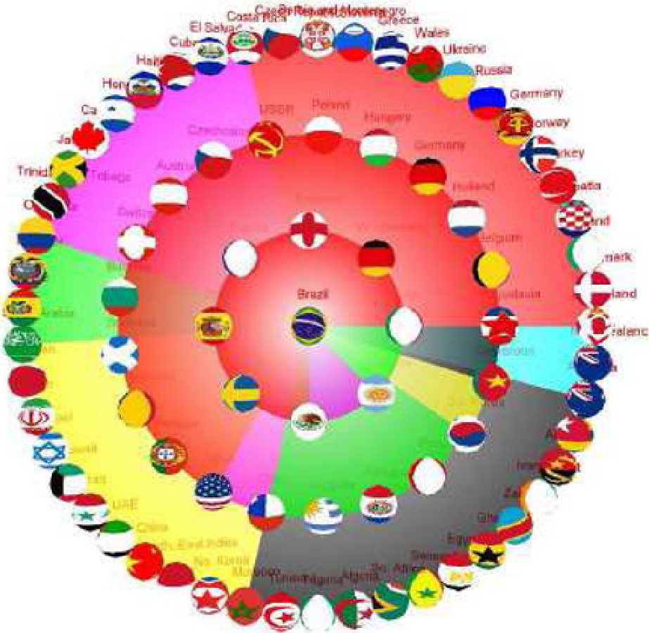
In the Radial Layout, the overall winner (Highest Centrality) sits at the center. Other nations are categorized into "Strong," "Medium," and "Weak" groups, placed on concentric circles.
- Global Analysis: A node's position (which circle it's on) shows its historical status.
- Local Analysis: The node's size reflects its performance in that specific year.
2. Hierarchical & Wheel Layouts
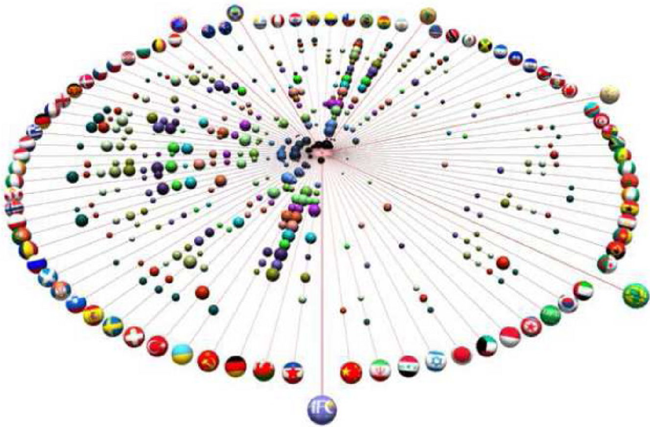
The Hierarchical layout translates the circles into parallel layers, which reduces edge crossings and makes continental comparisons (color-coded regions) more linear. The Wheel layout, meanwhile, provides a high-level "overview" where concentric rings represent years, making it easy to track a single country's trajectory across decades.
Experiments: Confirming the Expected, Discovering the Unexpected
The researchers applied these methods to the FIFA dataset (1930–2006). The visuals immediately validated historical facts:
- The Expected: Brazil, Italy, and West Germany consistently appear in the innermost circles or top layers with large node sizes.
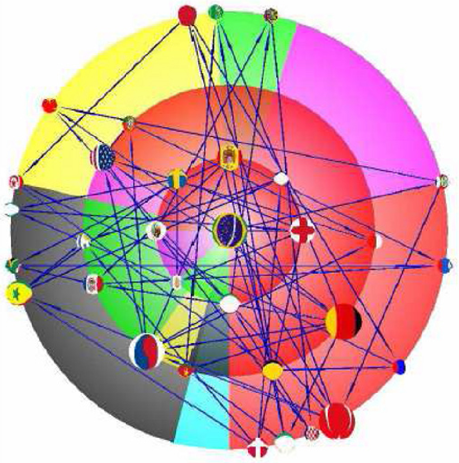
- The Unexpected: In the 2002 Radial Layout, Turkey and South Korea appear as massive nodes in the outer circles. This visual "anomaly" instantly flags their famous semi-final runs—teams with low historical centrality achieving high seasonal performance.
The progression also shows the Expansion of the Game. Maps from 1930 show heavy clustering in Europe (Red) and South America (Green), whereas 1994 and 2002 show a much more distributed geographic spread, reflecting FIFA's expansion to 32 teams.
Critical Analysis & Conclusion
Takeaway
The study proves that Centrality-based layout is not just for static social networks; it is a robust tool for temporal data. Using the Union Graph as an anchor is a brilliant way to prevent "Visual Flicker" in dynamic data.
Limitations
- Edge Crossings: In the Radial layout, the "who-beats-whom" lines can become a "hairball" as the number of teams grows.
- Centrality Metric: The paper relies on Degree Centrality. While efficient, it might overlook "Giant Killers" who win few games but beat very high-ranking opponents (which could be solved by PageRank or Eigenvector centrality).
Future Outlook
This methodology is highly transferable. Beyond sports, this could be used to visualize Corporate Competition (market share as hierarchy) or Evolution of Programming Languages (popularity as centrality), providing a stable stage to witness the drama of technological change.