
NetEvViz: Decoding the Evolution of Social Networks through Edge Color Coding
Visual Analysis of Temporal Trends in Social Networks Using Edge Color Coding and Metric Timelines
NetEvViz is an extension of the NodeXL Microsoft Excel template designed for the visual analysis of dynamic social networks. It introduces a temporal "Timeline" for tracking graph metrics and a dual-header "Timeslider" with edge color coding to compare network states across different timestamps.
TL;DR
Visualizing how social networks change over time—who joins, who leaves, and which relationships endure—is notoriously difficult. NetEvViz solves this by extending the popular NodeXL tool with a "Timeslider" and "Metric Timeline." It uses a clever 6-category edge color-coding scheme to show the differences between two points in time within a single, static layout, allowing analysts to see the "before, during, and after" of network evolution at a glance.
Problem & Motivation: The "Static" Trap
Social networks are inherently dynamic. However, most visualization tools treat them as static entities. When researchers try to visualize dynamics, they usually resort to:
- Small Multiples: Side-by-side snapshots that are hard to compare visually.
- Animations: "Movies" of moving nodes that often cause the user to lose their "Mental Map" as nodes jump around.
The authors recognized that NodeXL, while powerful and widely used due to its Excel integration, lacked the functional "Start Time" and "End Time" logic required to track these changes effectively.
Methodology: The NetEvViz Framework
1. The Metric Timeline
Before diving into specific nodes, an analyst needs the "big picture." NetEvViz introduces a Timeline that samples the network at uniform intervals (5, 10, or 15 steps) and plots global metrics:
- Node Count and Edge Count over time.
- Graph Density (Edge-to-Node ratio).
This allows users to identify "spikes"—such as a sudden burst of Twitter activity during an election—and zoom into those specific time periods.
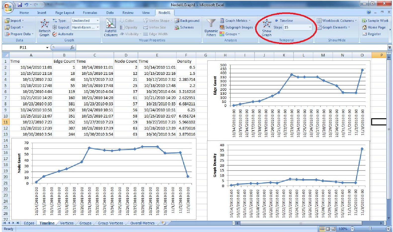 Fig 1: The Timeline showing the evolution of Twitter metrics during the 2010 midterm elections.
2. Dual-Header Timeslider & Color Coding logic
The core innovation is the Timeslider. Instead of selecting a single moment, it uses two headers ( and ) to create a window. Edges are then automatically colored based on their lifecycle:
- Gray: Neutral (does not exist in the selected window).
- Green: "Past" (existed at but gone by ).
- Blue: "Future" (didn't exist at but appeared by ).
- Red: "Persistent" (existed at both timestamps).
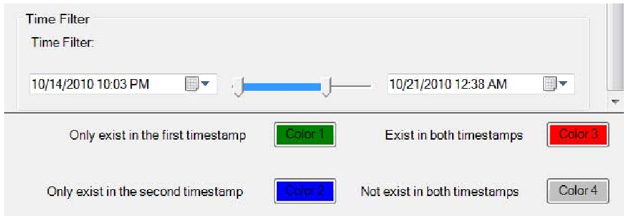 Fig 2: The Timeslider UI allowing users to map specific colors to temporal categories.
Experiments & Case Study: The 2010 Midterms
The authors tested NetEvViz on a Twitter dataset of the Georgia gubernatorial race. By comparing activity on October 26 vs. November 6, they could visually distinguish between "stale" conversations and "rising" political topics.
In their usability study, participants noted:
- Strengths: The ability to edit data directly in the Excel sheet and see the graph update is a massive productivity boost.
- Weaknesses: "Edge Occlusion" (too many overlapping lines) remains a challenge, and selecting exact seconds on a slider can be finicky.
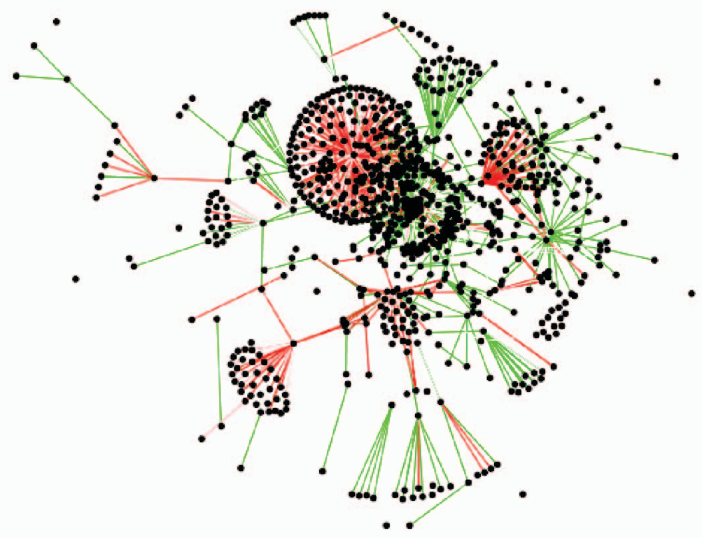 Fig 3: A comparison showing the original NodeXL static layout vs. the temporal color-coded version.
Critical Analysis & Conclusion
NetEvViz successfully bridges the gap between complex dynamic network theory and practical, everyday analysis. By utilizing the Excel infrastructure, it lowers the barrier to entry for social scientists and journalists.
Future Outlook:
- Node Dynamics: Currently, the focus is on edges. Future iterations could color nodes to show "churn" (users joining/leaving).
- Metric Expansion: Adding "Clustering Coefficients" to the timeline would allow users to see when the network becomes more "tight-knit" or "polarized" over time.
- Scalability: For networks with millions of edges, the Excel/NodeXL architecture may hit performance bottlenecks, suggesting a need for more efficient sampling algorithms.
Overall, NetEvViz proves that you don't always need 3D animations to see time; sometimes, a well-chosen color palette and a slider are far more effective.