
Deciphering 12 Years of Politics Through Faces: A Visual Analytics Approach to News Video
11502_Visual Analytics of Political Networks From Face-Tracking of News Video.
This paper presents a visual analytics system for analyzing political networks derived solely from face-tracking in news videos, bypassing traditional text analysis. Applied to a 12-year archive of NHK News 7, it achieved a SOTA demonstration of "presidentialization" trends in Japanese media through multi-level graph abstractions.
TL;DR
Researchers have developed a visual analytics system that maps the evolution of the Japanese political landscape over 12 years using nothing but face-tracking from news videos. By analyzing 2,102 hours of NHK broadcast data, the system reveals hidden structural shifts, such as the "presidentialization" of the media and the strategic rise of political successors, all through a multi-level graph abstraction.
Visual Intuition: Beyond Textual Analysis
While political monitoring traditionally revolves around text—transcripts, keywords, and sentiment—the visual domain carries an often unmeasured semiotic power. How often a politician appears and who they are "seen" with in a news segment shapes public perception more viscerally than the words spoken. The core challenge is bridging the gap between raw pixels (face detection) and high-level political insights (cabinet stability and opposition representation).
Methodology: The Four Pillars of Abstraction
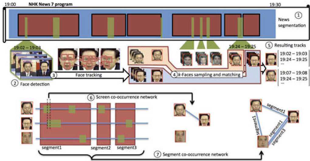
The authors solve the data sparsity problem of simultaneous appearances (politicians rarely share the screen in a single shot) by utilizing news segment co-occurrence. If two figures appear in the same story, a link is forged.
1. The Multi-Level Pipeline
The system operates across four coordinated levels:
- Cabinet View: An entry point using Jaccard similarity to show how "politically different" one administration's media coverage is from another.
- Network View: A node-link diagram where node size reflects "coverage" (frequency) or "betweenness centrality."
- Timeline View: Parallel horizontal lines tracking the pulse of a politician's media presence.
- Face-Track Player: The ground-truth layer where experts can verify the context of a detection.
Deep Insight: "Star-Shaped" vs. "Dense" Topologies
The most compelling finding of this study is the structural difference in how news is framed for different parties.
- LDP (Liberal Democratic Party): Typically results in a "Star-Shaped" topology. The Prime Minister sits at the absolute center, reflecting a media strategy of "presidentialization"—portraying the PM as a solitary, powerful leader.
- DPJ (Democratic Party of Japan): Shows a denser, more egalitarian network. Media coverage suggests a "board of leaders" rather than a single dominant figure.
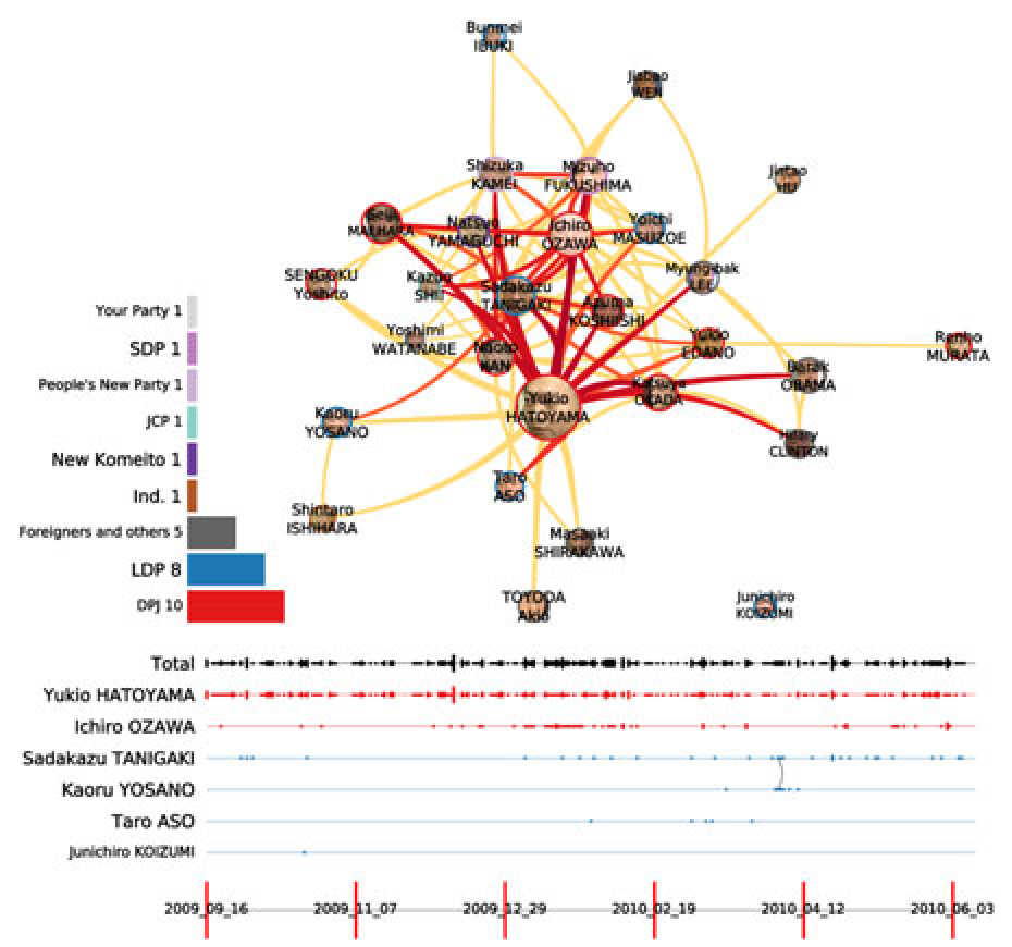 Fig: Abe's first cabinet (star-shaped) vs denser opposition networks.
Case Study: The Strategic Rise of Shinzo Abe
The system captured the "passing of the baton" from Koizumi to Abe. In early cabinets, Abe’s importance grew visually (node size and centrality) even before he assumed office. By analyzing the timelines, the researchers could pinpoint exactly when coverage transitioned, showing that the media was effectively "preparing" the public for Abe's leadership through increased visual frequency.
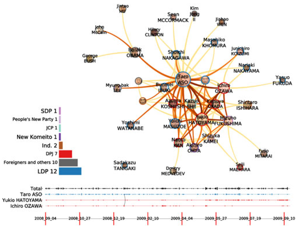 Fig: Visualizing the transition of power and the growth of Abe's centrality in the media network.
Critical Analysis & Future Directions
The system's reliance on "coverage" instead of "airtime" (the total duration of appearance) was a necessary compromise due to the current limitations of face-tracking recall. While highly accurate, the tracking can be sensitive to "erratic motions" and editorial choices like split screens, which challenge the current Euclidean distance matching.
Future Work
The next frontier for this research involves:
- Sentiment Integration: Not just who is on screen, but are they in a "conflict" or "cooperation" context (e.g., using split-screen detection to signify negative ties).
- Multi-Channel Comparison: Comparing NHK (public) with private broadcasters to detect institutional bias.
Conclusion
This paper elevates face-tracking from a simple recognition task to a sophisticated tool for social science. It proves that the "way we see" our leaders is as quantifiable and structured as the "way we talk" about them, providing a powerful new lens for media scholars.