
SocialVis: Decoding Collaboration Patterns through Visual Analytics
Visual Analytics of Social Networks: Mining and Visualizing Co-authorship Networks
The paper introduces SocialVis, a visual analytic tool designed for mining and visualizing co-authorship networks. It integrates frequent pattern mining with a 2D coordinate-based visualization to reveal multi-researcher collaboration teams, their exact composition, and collaboration frequencies.
TL;DR
SocialVis is a specialized visual analytic tool that breaks away from traditional "spaghetti" node-link diagrams. By combining frequent pattern mining with a structured 2D visualization, it allows users to pinpoint exactly how many papers a researcher has published, identify specific multi-person collaboration teams, and distinguish between partial and complete author lists in co-authorship networks.
Problem & Motivation: The "Clutter" of Social Networks
In the study of social networks—specifically co-authorship networks—we often want to know more than just "who knows whom." We need to know:
- Frequency: How often do these individuals collaborate?
- Team Composition: Does a group of three researchers actually work together as a unit, or are they just linked through a series of pairwise connections?
Standard tools fall short here. Node-link diagrams become unreadable as the number of edges grows (the "hairball" effect). Hypergraphs and Bipartite graphs try to show group memberships but suffer from overlapping clusters and crossing lines that make counting frequencies a manual, error-prone task.
Methodology: The Architecture of SocialVis
SocialVis approaches this by treating social interaction as a data mining problem first and a visualization problem second.
1. Frequent Pattern Mining
The tool treats each publication as a "transaction" and each author as an "item." By applying frequent pattern mining (algorithms like FP-Growth), SocialVis identifies groups of researchers (itemsets) that appear together frequently in the dataset.
2. The 2D Mapping Logic
Instead of arbitrary node placement, SocialVis uses a structured 2D space:
- X-Axis: Researchers (sorted alphabetically or by publication volume).
- Y-Axis: Frequency (the number of publications).
3. Iconic Representation
SocialVis uses a specific visual grammar to avoid the ambiguity of traditional graphs:
- Individual (Diamond): Represents a single researcher’s total output.
- Pair/Team (Line with Nodes): A horizontal line connecting researchers indicates a collaboration. The height (y-value) tells you the joint publication count.
- Complete Team (The Bar Symbol): A bar
▐at the end of a line signifies a "complete" team, meaning no other co-authors were involved in those specific papers.
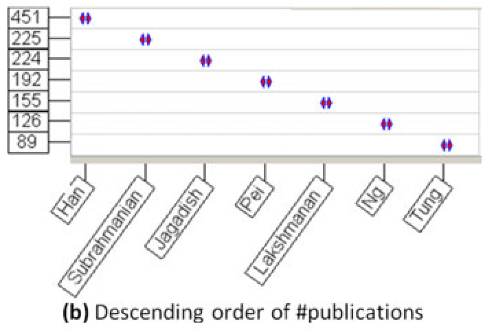 Figure: SocialVis demonstrating publication counts for individuals (diamonds) and collaboration lines.
Experiments & Results: Augmented Cognition
The researchers conducted a case-based evaluation with 18 participants to test "Augmented Cognition"—the ability of the tool to extend the user's mental capacity for problem-solving.
Key Findings:
- Intuitiveness: 78% of users understood the system with zero training.
- Precision: Unlike node-link diagrams, where users had to "guess" the weight of thick lines, SocialVis users could read exact values directly from the Y-axis.
- Team Insight: Users successfully differentiated between researchers who could work together (upper bound) and those who actually wrote papers together (exact frequency).
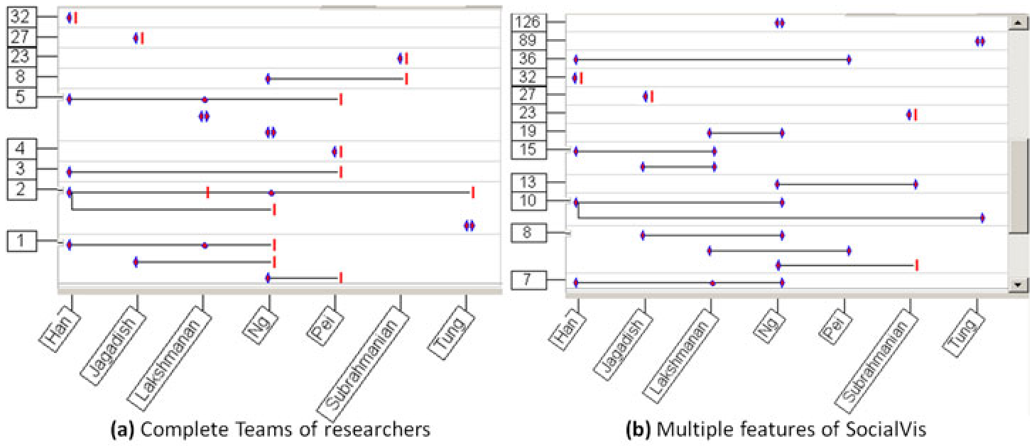 Figure: The tool supports different views, including descending order of publication and multi-feature overlays for large-scale networks.
Critical Analysis & Conclusion
SocialVis represents a significant shift from topological visualization (focusing on the shape of the network) to quantitative visual analytics (focusing on the data within the network).
Takeaway: The power of SocialVis lies in its ability to transform abstract "links" into measurable "patterns." It proves that for academic ranking and expert recommendation, the frequency and exclusivity of collaboration are just as important as the existence of the connection itself.
Limitations & Future Work: While excellent for frequency analysis, the current version may lose some of the "global" structural insights (like pathfinding between distant nodes) that traditional graphs provide. The authors are looking to extend the tool by adding temporal dimensions (when papers were published) and spatial dimensions (venues), which would add even more depth to the "sociology of science."