
Visual Analytics in Urban Computing: Bridging Big Data and Human Intelligence
Visual Analytics in Urban Computing: An Overview
This paper provides a comprehensive survey of Visual Analytics (VA) in Urban Computing, categorizing urban data types and specific visualization techniques for spatio-temporal properties. It introduces a dual-output framework: one for interactive data exploration and another for "Visual Learning," which integrates human insight into machine learning pipelines.
TL;DR
As cities become increasingly digitized, we are drowning in data but starving for actionable insights. This survey by Zheng et al. moves beyond simple dashboards to propose a framework for Visual Analytics (VA)—a discipline that marries the raw computational power of AI with the creative, heuristic-driven strengths of human experts. By categorizing urban data into six pillars and introducing the concept of Visual Learning, the paper outlines a roadmap for building truly "Smarter Cities."
The Core Conflict: Why "Auto-AI" Isn't Enough for Cities
Urban environments are the ultimate "dirty data" scenario. Factors like air quality, human mobility, and energy consumption are deeply interconnected. While automated data mining can find correlations, it often fails at:
- Contextualizing Anomalies: A sudden drop in taxi traffic might be a sensor error or a scheduled marathon—only a human knows the cultural calendar.
- Handle Sparse Data: When GPS pings are infrequent, pure algorithms struggle with "semantic uncertainty."
- Multi-Disciplinary Integration: Cities require insights from economists, civil engineers, and environmentalists—disciplines that AI cannot yet synthesize autonomously.
Methodology: The Anatomy of Urban Visual Analytics
1. The Data Taxonomy
The paper classifies urban data into six categories: Human Mobility (GPS/RFID), Social Network (Geo-tagged posts), Geographical (Road networks/POI), Environmental (Air quality), Health Care, and Energy Consumption.
2. Solving the Spatio-Temporal Challenge
The authors highlight three primary ways to visualize city data:
- Point-Based: Good for individual events (pickups/drop-offs) but suffers from clutter.
- Region-Based: Useful for macro-patterns (Choropleth maps) and inter-district flows.
- Line-Based: Essential for trajectory analysis. To solve the "clutter" problem, the paper showcases techniques like Edge Bundling (grouping similar trajectories) and Kernel Density Estimation (KDE).
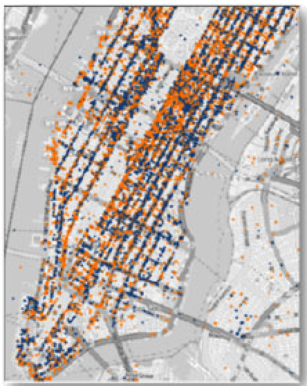 Figure: Representative visual designs including heatmaps, flow maps, and circular time axes used to handle urban spatio-temporal properties.
3. The "Visual Learning" Framework
The most forward-thinking contribution of this survey is the definition of Visual Learning. Instead of treating AI as a black box, it integrates VA into three stages:
- Cohort Construction: Humans help label data or select the most informative samples (Active Learning).
- Model Construction: Experts interactively refine features or neural network parameters to avoid overfitting.
- Result Tuning: Experts "audit" model outputs and adjust them, which the machine then learns from to improve its next iteration.
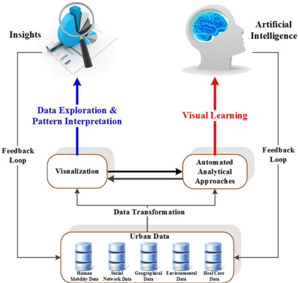 Figure: The dual-path framework of Urban Visual Analytics, distinguishing between pattern interpretation and iterative visual learning.
Case Studies and SOTA Comparison
The survey reviews several heavy-hitters in the field:
- TelCoVis: Uses telco data to find population "co-occurrence" (social hubs).
- Whisper: Uses a sunflower metaphor to trace how social media rumors spread through physical space and time.
- iVizTRANS: A visual learning tool for detecting commute patterns, where human planners label a small subset of "home-work" pairs to train a city-wide classifier.
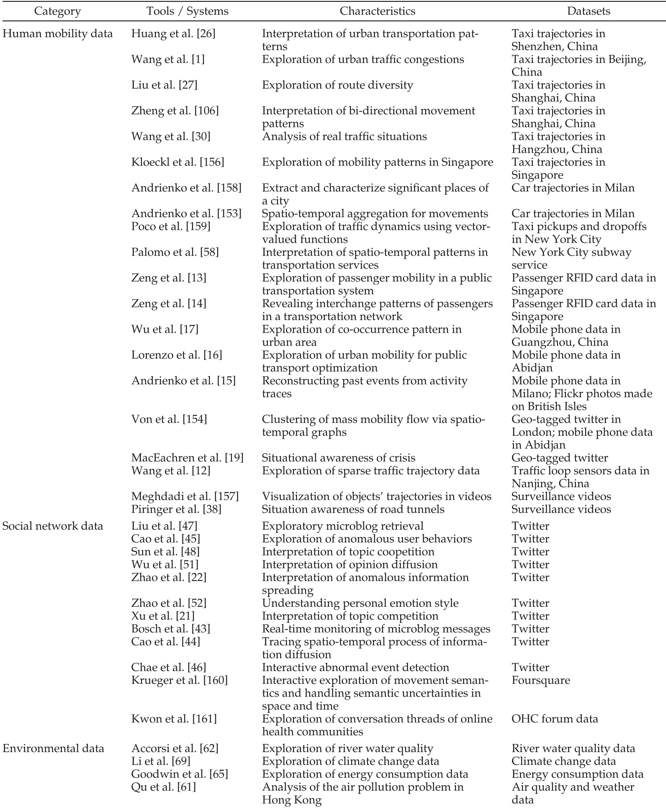 Table: An overview of visual analytics systems categorized by data types and their specific urban characteristics.
Critical Analysis & Future Directions
The survey concludes that while we've mastered the "Point and Line" phase of visualization, the industry faces four major hurdles:
- Scalability: Visualizing millions of trajectories without losing local detail.
- Uncertainty Visualization: How do we visually represent "missing" data or sensor errors so that the user doesn't make a false inference?
- Cross-Domain Fusion: Developing a single system that can correlate weather patterns, social media sentiment, AND traffic flow simultaneously.
- Crowdsourcing: Moving beyond expert-only tools to "citizen science," where residents participate in the analytics loop.
Takeaway
This work cements the idea that Visual Analytics is not just about making "pretty charts"—it is a critical logic layer in the urban computing stack. For researchers, the next frontier is not a more powerful GPU, but a more intuitive interface that allows a "Human-AI" hybrid to navigate the complexity of the modern metropolis.